Posts

Blue and White: British Printed Ceramics

Image
Lovely exhibition at the Victoria and Albert Museum on English blue and white china. I have to admit I am very biased towards this show as my parents collected blue and white and I grew up in a house full of it and with conversations about the different factories and the inspirations for the designs. I now have a small display in my bedroom of the pieces I kept from the collection. I liked the fact this show combined the original works and contemporary takes on them but at times felt the contemporary takes took over. I so want a set of the Richard Rogers plates with the Thames running across them but 6 plates took up a lot of space in a small show. The themes were good and my favourite section was the one called “Life and times – everyday life and famous people” as this had more of the early 19th works in it plus more of the genres that my parents collected. I loved the commemorative works and felt quite emotional over a Vauxhall Gardens plate. I think my Father knew ...

Russian Avant Garde theatre: War, revolution and design

Image
Fascinating exhibition at the Victoria and Albert Museum on Russian theatre from 1913-1933. I began this show on the corridor by the theatre galleries in which the museum often hold small shows and displays so I was expecting it to be about 5 cases in size so I lingered there! Then I turned a corner and it went on into the galleries and actually turned out to be quite a large exhibition! I found it fascinating as it became not only a history of the theatre but also a history of art and design in Russia at that time.   It was interesting to see the radical art which fed into the Revolution and then the effects of Stalin. I had studied the Russia from the Revolution to the Cold War at O level but never thought of it in terms of art before! I particularly liked a section in the middle with a series of small set models. I did wonder how actors moved on some of the more sets which had stairs and floors at odd angles. Similarly how they would have worn some of the Cubis...

In Black and White: Prints from Africa and the Diaspora

Image
Small exhibition at the Victoria and Albert Museum of prints from African over the last 40 years. The show pointed out that print is a very democratic medium and is often used for protest works as they are a cheap way of spreading a message. For that reason these works are very linked to time and place. There were a number of Chris Ofili works including some intricate etching made in one sitting which represent different places in Barcelona where they were made and a print called “RIP Stephen Lawrence” made to raise money for the campaign. I loved an image by Willie Cole of an iron from above. It was a striking picture called “Loyal and Dependable” which described the iron but also referred back to descriptions in slave auction catalogues. I also liked Tony Phililip’s “History of the Benin Bronzes” which showed the bronzes being bought, auctioned and displayed in museums (captivity) again a reference back to slavery.

Staying Power: Photographs of Black British Experience 1950s-1990s

Image
Interesting exhibition at the Victoria and Albert Museum exploring the work of black British photographers and images of black Britain. I found the show a bit thin and there is actually more information about the photographers on the website. It would have benefited from a bit more commentary about the pictures. I did however like the fact that they were there to be viewed as images not as a history of black Britain although they were hung chronologically. My favourites were the pictures from the 70s with the wonderful retro hair and shoes. I overheard   two ladies going round reminiscing about their platform soles and their mother’s reaction to them. It’s always lovely to hear people engaging with the images. I also liked the pictures of headdresses and hair styles by J.D. ’Okhai Ojeikere which were wonderfully textural. The headdresses, pictured from above, looked like Renaissance drapery studies. I was amused to see Yinka Shonibare’s “Diary of a Victorian Dandy...

Weston Cast Court

Image
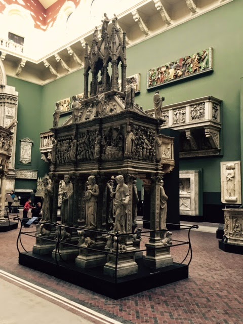
Wonderfully restored Weston Cast Courts at the Victoria and Albert Museum. I have always loved these spaces and the silliness of having casts of statues and pieces of architecture huddled together. It’s like taking a walk round European cities. They look so much better now they have been redecorated and refreshed. I love the Italian gallery which is sparser and now a lovely pale green colour. It’s nice to see old friends such as the Gates of Paradise from Florence and where else could you see so many Michelangelo’s together! The Northern European room is more packed and darker. It retains that slightly dusty feeling it had. It’s wonderful to have whole doorways and facades of churches! My favouites are the tombs of the Angevin kings. I think a couple of them may still be being cleaned as I couldn’t find Eleanor. Review Telegraph  

Nam June Paik

Image
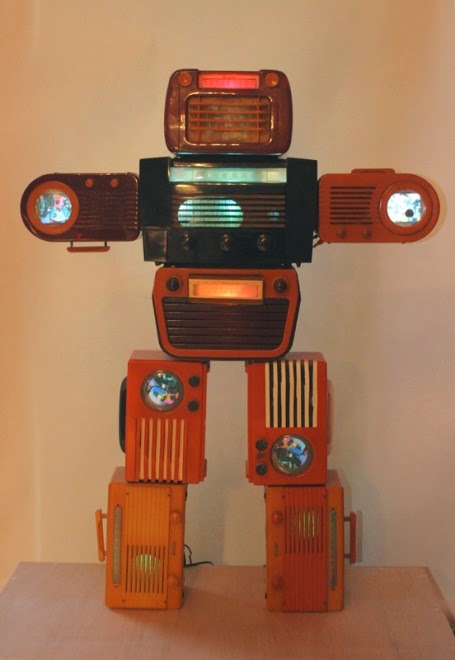
Quirky exhibition at Tate Modern of work by the pioneer of media art, Nam June Paik. These works combined images on screens with objects, often those used to make them or deliver them. OK that’s not a great way of describing it so have an example, two old televisions showing images of famous Nixon broadcasts with magnetic coils in front of them which distorted the image. Oddly enough he looked more sincere when distorted. I also liked “Three eggs” which included a an egg being filmed, it’s image on a TV and a real egg in a TV box. Although these works were from the 1960s they felt very fresh and quirky. I mush prefer them to acres of humourless contemporary video art!

Marlene Dumas: the Image as Burden

Image
Interesting exhibition at Tate Modern looking at the work of Marlene Dumas which I’d describe as expressionist portraits. I admit at first look I wasn’t too convinced by these pictures as they looked quite slap dash but on closer looking the draftsmanship was much more refined. I liked the fact that the room introductions were quotes by the artist which gave insight into her working methods.   I didn’t really connect to them emotionally. I liked the “Black Drawings” sequence which was a series of heard studies with different degrees of finish and abstraction. I also liked the picture of the artist’s daughter “The Painter” which is at first a rather menacing image of a child with what look like bloodied hands however on reading the commentary she had been painting in the garden! A lot of the work was based on found images from photographs and magazines and this technique reminded me of Sickert! Reviews Times Guardian Telegraph Independent Evenin...