Posts

Showing posts from March, 2016

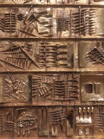
Jan Fabre: Knight of the Night

Image
Strange exhibition at the Ronchini Gallery of work by Jan Fabre. OK I’ll admit I’d done a lot on the day I saw this so I’d probably had art overload! Yes even I can do too much! The show consisted of a video, made in 2004, of the artist, in medieval armour battling himself for five hours in what looked like a warehouse. Why would you do that? Did the video last 5 hours? Who would watch it? This was shown with sculptures made from the wings of scarab beetles with of pieces of armour or skulls. I did like the skulls in wonderful iridescent colours. However some of the quotes from the artist sent me running for a reviving cup of tea! “As I write this my ego is starting to float around the living room.”   I think having typed that I’m off for another one! Closed on 12 March 2016  

Ernesto Cánovas: Multiplied

Image
Atmospheric exhibition at Halcyon Gallery of new work by Ernesto Cánovas. The large pictures on wood panels split into sections consisted of found images and plain coloured panels. I liked the fact the wood grain showed though the images giving a real sense of them as made objects. They made me think of Hopper as they had a nostalgic feel to them. Closed on 13 March 2016

A History of Thunder

Image
Innovative exhibition at the Fine Art Society combining works on the theme of war by important 20th century artists with an installation by Michael Petry. The works included a wonderful Eric Kennington head of a soldier in pastel with a blue background giving it a Renaissance feel. There was also a relatively smoothly textured Ginner of the building of HMS Prince of Wales. I loved a set off lithographs by Ethel Gaban including one of salvage workers. A nice hang was Nevinson and Nash prints both from 1918 shown side by side. The installation by Petry called “Battle of Jericho” pulled the whole thing together with a series of large Morano glass pebbles in different colours. The stones will be sold throughout the show and removed as they are sold so the installation is gradually destroyed. Closes on 24 March 2016

The Print Show: Artist Printmakers 1800-1975

Image
Lovely exhibition at the Fine Art Society of prints from the 19th and 20th century. This show felt like name the artist and there they were! The earliest was a rare William Blake of Chaucer’s pilgrim before alterations and printed for Blake himself on thin paper as a proof copy.   There were some Frank Auerbach nudes which I’d seen at Pallant House and lots of Sickerts! I loved the pictures of horses working in London by Robert Bevan one of the Camden Town Group which were so like his paintings. Also a great print by Stanley Spencer of “The Marriage of Cana”. I’m not sure I’d seen a print by Spencer before. My favourites were two pictures of the view from a window in Dieppe by C.R.W. Nevinson, one of the harbour and one of a woman looking out at the view. Closed on 10 March 2016

Chillida: Rhythm – Time – Silence

Image
Small exhibition at the Ordovas Gallery of three works by Eduardo Chillida. The three works are rarely seen and were made of steel and granite. One in the middle seemed to change shape as you walked round it, giving different views through a circular structure all balanced on one end. I loved the granite work which looked like a big park bench. I so wanted to sit on it! I liked the square cut though it and the way the light shone through these spaces. Closes on 23 April 2016    

Mark Walllinger: ID

Image
Thoughtful exhibition at Hauser & Wirth of new work by Mark Wallinger. The bulk of the show were the ID paintings which were large canvases looking like the ink blot pictures used as an analytical tool by Freud but made by the artist using sweeping his paint-laden hands across the two sides of the canvas in symmetrical gestures. I loved the effect of the room but wonder what they would look like individually in a gallery. I preferred the second gallery which consisted of an installation and three videos. The installation was a full sized replica of the New Scotland Yard sign but with mirrored sides.   I loved the way it reflected the room but didn’t reflect the people in it as it was so tall. My favourite piece was a video installation on four screens showing the same tree on a roundabout as someone drove round it. The screens were synced to show the same view in each of the seasons. I though this as lovely calming work giving a sense of time passing. Closes on 7

Gabo’s Monoprints: a Family Collection

Image
Interesting exhibition at the Alan Christea Gallery of prints by the Russian sculptor Naum Gabo. He started print making when he was sixty and began with wood sawed from a table leg. He focused on twelve images called Opus I-XI of which he made different variants of tone, orientation and texture. It was fascinating to see these different variants and to see what difference colour made to an image. The images themselves had quite a sculptural form. Closed on 12 March 2016  

Boyd & Evans: Overland

Image
Stunning exhibition at the Flowers Gallery of new photographic works by Boyd & Evans. These were wonderful large pictures made up of up to 100 individual photographs put together into large views with a heightened sense of reality. They were of scenes from the Western USA and ranged from panoramic landscapes to tender views of dilapidated buildings. The panoramic pictures reminded me of the huge American Sublime landscape paintings from the 19th century and in reading the press release again I notice that the artists started off painters. The pictures had a real sense of painters observational eye. I loved “Shafer Trail Utah” in which the orange rock in the middle seemed to jump out at you. Also “Tonopah NV” where lines on the road led your eye to a rocket in the desert, a wonderful blending of the natural and manmade. Closed on 12 March 2016

Pure Romance: Art and the Romantic Sensibility

Image
Delightful exhibition at the Redfern Gallery looking at romantic works from the 1920s to the present day. This was a beautifully hung show which set up gentle dialogues between the pictures helping your brain make connections between them. In some cases there were pictures by an artist and photos of them and there were lots of ballet references. I loved black and white photographs of Ballet Russe dancers taken from magazines with coloured enamel swathed over them in a very natural fashion by Linder. Also a photograph of the dancer Michael Clark by Snowdon shown in high heels with a sleek dog. Oh and how can I forget some lovely Cecil Beaton photographs including one of Gilbert and George. There were lovely set designs by Christopher Wood and a nice Keith Vaughan of a Yorkshire lane. My favourite however was a picture of two books on their side and a turquoise mug with red flowers in it against a plain background by Alessandro Raho. Closed on 27 February 2016.

Anthony Whishaw: Paintings from the mid-1960s to late 2015

Image
Colourful exhibition at Browse & Darby of work by Anthony Whishaw from throughout his career. The pictures seemed rather a mixed bag of styles buy I liked them and was drawn to abstracted landscapes and views. Like other work I had seen that day, some of his canvases included stuck on patches and bits of thread to give texture. I liked an early work called “Life Class St Martin’s” which showed an abstract view of a life class in shades of terracotta and green. It took a while for my eye to make it out but once you picked out the figures it was very atmospheric. My favourite picture was the one attached which was a recent work and called “Seascape”. I loved the wonderful patterned sea and the flat composition. Closes on 31 March 2016.  

The Calder Prize 2005-2015

Image
Interesting exhibition at Pace London marking ten years of the Calder Prize for contemporary artists who have made exemplary work early in their career which could be interpreted as a continuation of the legacy of Alexander Calder. Work by the prize winners was shown next to work by Calder himself and having been to the Calder exhibition at Tate Modern it was good to see more of his work in a different context. I was most drawn to the work of Zilvinas Kempinas and loved his 2009 work “Flux" which was a circle of tape floating over a platform which was being made to dance in the air with a fan suspended over it. I found it very calming and loved the way it floated in and out of your space. I also liked Tomas Saraceno’s “Cumulus Filaments” which look up the corner of one room and consisted of a thin wire ball shape held in place by thin lines of fishing lines like rays coming out of the ball. It was such a delicate structure to take up such a large space. Clos

Arnaldo Pomodoro

Image
Interesting exhibition at Tornabuoni Art of work by sculptor Arnaldo Pomodoro from across his career. The works were all in a very shiny bright bronze giving them a 1970s feel. They were often of a definite shape but with shapes escaping from them. I liked the split sphere giving an earthquake life effect. I also liked the large relief in the window which reminded me of Ghiberti’s “Gates of Paradise” on the Baptistery in Florence even though they were abstract in design. Closes on 16 April 2016

Martyn Brewster - recent paintings

Image
Vibrant exhibition at Waterhouse and Dodd of recent work by Martyn Brewster. These were abstract works but used classic colour contrast techniques. They were worked on textured canvases with patches of cloth and thread stuck. There was an overwhelming sense of wonderful shades of blue but I also like his winter day series painted in shades of grey yet handled like colour which were an odd echo to the Bruegel in Black and White at the Courtauld. Closes on 24 March 2016  

Narelle Jubelin: Flamenco Primitivo

Image
Strange exhibition at Marlborough Contemporary of work by Narelle Jubelin consisting of small pictures in petit point referring to great works by modernist artists and bronze cast of packing material. See I said strange! The title of the show was taken from the opening section of a performance by a contemporary Flamenco singer who wears a Francis Bacon t-short and a video of him was playing in the gallery. I’ve read the commentary a few times now and I still don’t understand the link. The petit point or needlework pictures were small which did make you look closely at them and think about the original artists they are based on but as I am not a great fan of modernist art they left me a bit cold. I did however like the castings of packing material which were hung on the wall. I always love the strange shapes in packaging which reflects the shadow of the thing that was in them. And this was an interesting way of elevating the mundane by using bronze and imagination. Clo

Tilson: The Stones of Venice

Image
Colourful exhibition at Marlborough Fine Art of new work by Joe Tilson inspired by Ruskin’s “Stones of Venice”.   These were big bold pictures of Venice mainly using an image of colourful medieval tiles with a picture of a church inset into them. The pictures were named after the churches. Another style involved the same sort of image but emerging from giant envelopes liked postcards. Some of the pictures also showed inscriptions of obsolete forms of the city’s name. I am off to Venice later in the year and this was a great reminder of the colours and vibrancy of the city. I can’t wait! Closes on 2 April 2016

Jeff Zilm: Some Screen Mods

Image
Intriguing images at the Simon Lee Gallery by Jeff Zilm made by extracting the images and sound tracks from films which become an emulsion with which he then paints a black and white abstract image named after the original film. Or at least I think that’s it! I think he paints the image the commentary just said the film is “transcribed in its entirety onto a single canvas” from looking closely I think that means painted using all the emulsion from a single film after peering closely at the image.   The images themselves are quite ethereal and slightly play with your eyes. I liked the fact the canvases were prepared with screen paint used by home movie enthusiasts so that the support represents a movie screen. Also the fact each picture was named after the original film giving integrity though from the original. I did however hear my mother’s voice in my head with one of her favourite phrases “It’s clever but it’s not art”! I liked the images but did feel they were mor

Joseph Crawhall: Masterworks from the Burrell Collection

Image
Delightful exhibition at the Fleming Collection of work by Joseph Crawhall, a contemporary of the Glasgow Boys. The upper floor put him into context by showing work by the Glasgow Boys with some beautiful pictures such as The Bridge, Crowland by James Guthrie with lovely square brush strokes and an Arthur Melville of Cairo. Downstairs were the works by Crawhall himself starting a wonderful picture of a girl on a bicycle in water colour with spare brushstrokes and a dog running beside her to give a sense of speed. I loved the attached picture of a hunt with a sea of expressive dogs’ heads at the bottom and the huntsmen as lumps of red on the horses. I thought it had a feeling of William Nicholson prints. He was known for his pictures of horses, including two here of horses’ bottoms and for his whimsical works such as Road Hog in shades of grey and red of a fast car running down people and animals. He also spent a lot of time in Tangiers. Closes on 12 March 2016

Wolf Suschitzky's London

Image
Lovely exhibition at the Photographers’ Gallery of black and white images of London in the middle of the last century by street photographer Wolf Suschitzky. Suschitzky came from Austria and there is a feeling of these being images by an immigrant looking in on a society and seeing its idiosyncrasies and charm. He also made films and documentaries and there is a sense of narrative about the pictures. There was a beautiful picture of men looking off a London Bridge into fog on the river. I also loved one of two men in a fairground swing and one of the stretch of the Embankment I walk along nearly every day.   I a lso loved the picture I have used here of St Paul’s though the bomb damage in the war. Closed on 6 March 2016  

Rosângela Rennó: Rio-Montevideo

Image
Intriguing installation at the Photographers’ Gallery by Rosângela Rennó using images taken by Aurelio Gonzalez for the Uruguayan Communist newspaper El Popular which were hidden in anticipation of a military coup and only found 30 years later. The installation consisted of a series of vintage projectors which you walked around, pressing a red button on each to get it to project one of the images on the white walls. It gave a real sense of walking amongst the images and having some control over them. I didn’t however get any real sense of what the images were of and about. It became more about the projectors than the images but I did think this was a really innovate way of producing a show. Closes on 3 April 2016  

Saul Leiter: Retrospective

Image
Retrospective at the Photographers’ Gallery of work by Saul Leiter considered to be a pioneer of colour photography. I was interested to see Leiter had also been a painter and you could see a painter’s eye in the work both in its abstract quality with a Rothko like feel and in the layer of images. On picture called Marianne used about 4 reflected images to create a real depth to the image. The commentary said he aimed to capture a fleeting impression of day to day life, however at times I found this sometimes so fleeting that you weren’t quite sure what the image was. I liked the use of quotes from Leiter around the show which gave an insight into his approach particularly that a photograph is a “Souvenir of an unfinished world”. Closes on 3 April 2016. Review Guardian    

Easter Rising 1916: Sean Sexton Collection

Image
Interesting exhibition at the Photographers’ Gallery of work drawn from one photographic collection looking at the role of photography in the move to Irish Independence with the Easter Rising as a focal point. It started with how photography was used to present an iconography of Ireland and to spread images of the evictions of the 1880s. It was interesting to see a picture of Captain Boycott, from who we take the word Boycott, who was a land agent in the evictions. I don’t think I’d ever seen a picture of him. It was also interesting to see there had been a market for images of nationalist leaders going back to the 1850s. The Easter Rising itself was represented mainly by pictures of the aftermath due to the limitations of photography at the time. It’s interesting that these images were sold as postcards and the sense of how quickly people came out to look at the damage. Now the area is rebuilt it is strange to see pictures of what it looked like then. I was rather in

Steve McCurry

Image
Stunning exhibition at Beetles + Huxley of work by photo journalists Steve McCurry. In 1979 he was the first photographer to go into Afghanistan smuggling film in sewn into his clothes and he is best known for the picture of the young Afghan girl with green eyes. He focuses on the human cost of war. He has an amazing sense of composition for a picture, giving many of his works a painterly quality. I loved one from 2006 of a man in Bamiyan Mosque where the main plain of the picture was a two tone wall in which there was a window through which you saw a mad reading with a picture on the wall. It became three rectangles within each other. He produces beautiful, insightful portraits particularly those of the people of Tibet taken from 1999 to 2001. I also loved his portrait of a portrait photographer in Afghanistan which somehow included McCurry in the photo as you felt a connection between the two photographers. My favourite picture was Clover Gatherers from the Yem

Beaton in Vogue: The Man, the Magazine, The Century

Image
Good lecture at the National Portrait Gallery by Josephine Ross talking about her biography of Cecil Beaton. She went through his life focusing on the work he did for Vogue. His first pictures in the magazine were of a student production in 1924 and at first his main work for them was illustrations and cartoons on society life. I had not known about the incident in the late 1930s in the US when he slipped racist and anti-Semitic comments into a drawing which led to him being blacklisted by Vogue until 1939 when he was called upon to take photographs of the Queen Mother which made her image as a wife and mother. I was interested in his work during the Second World War and it set up an interesting parallel with the Lee Millar exhibition at the Imperial War Museum. She also outlined his renaissance in the 1960s photographing the Paris collections right up to his death in 1980.

Exposed: The Naked Portrait

Image
Small exhibition at the National Portrait Gallery looking at portraits of people naked and discussing how they can represent vulnerability or self-assurance It was nice to see Vanessa Bell’s portrait of David Garnett and see it hung next to Duncan Grant’s of Mallory. The show pointed out that the Vanessa is a rare picture by a woman of a naked man. There was a lovely Leigh Bowery by Bruce Bernard taken at one of his sittings for Lucien Freud. I find it strange that a man who was remembered in his lifetime for extravagant costumes is now better known for being without clothes. I also liked a Germaine Greer by Polly Borland where it had been Germaine’s idea to be naked as she thought that is she was pictured clothed on a bed It might look like a nursing home! Closes 11 September 2016

Vogue 100: A Century of Style

Image
Stylish exhibition at the National Portrait Gallery to mark the centenary of London Vogue. There is a room on each decade and it is arranged so that you back in time around the show but move forwards to the present day again at the end with a magazine from ever year of the century. I thought this worked well expect that in the early rooms it mentioned the influence of earlier photographers who you hadn’t yet seen in the show. You did need some knowledge of the history of fashion photography to get the most from it. I liked that each room had a different style to them which recognised the times but also gave the show great variety. The labelling and commentary was very good telling you about photographers, sitters and clothes but the whole stylish presentation of the show somehow put you off reading the detail. I would say that it wasn’t so much style over substance but style mugging substance. He substance was all there you just got diverted from it. The show was as m

Delacroix and the Rise of Modern Art

Image
Clever exhibition at the National Gallery looking at the art of Delacroix and how he influenced later generations of artists. As ever it was well worth taking the audio tour particularly as the gallery seemed to have done away with the lovey little booklets they used to produce with the picture descriptions in them. This was leading to huddling around the labels. Please back the booklets, they were really innovative helped the flow around the shows. The audio told you a lot more about why Delacroix was so influential talking about dates of major exhibitions and his writings. I liked the theming of the rooms, keeping pictures of a similar subject together. I think my favourite was the flower room which also seemed to have much brighter light levels and was a blast of colour. It included a very strange early Van Gogh I’d not seen before of a vase of flowers. The real surprise in the show were two pictures by Bazille, an Impressionist who died at 29 in the Franco-Prussia

Introduction to “Delacroix and the Rise of Modern Art”

Image
Excellent lecture at the National Gallery on their current Delacroix exhibition given by James Heard. James did a good job at setting Delacroix in the context of his time talking about the two fashionable styles of Romanticism represented by Delacroix and Classicism as shown by Ingres. He talked us though some of the Delacroix pictures in the show telling us what was different about them before looking at how he influenced later artists. He was particularly interesting on the fact that some of the influences came from Delacroix’s writings on art and he explained this well using some of the works in the last room.

Bruegel, not Bruegel

Image
Small exhibition in the print gallery at the Courtauld Gallery looking at the main copyists and imitators of Bruegel. Work by Bruegel was in great demand which led to honest and not so honest copyists of his style. The main artists it looked at were Jacob Savery and his brother Roelandt. Jacob tended to do landscapes and often signed them Bruegel however he back dated many to a period when Bruegel himself seems not have done any landscape work. Roelandt concentrated on figures which were not passed off as my the master but were of a similar style. The best picture though was the master himself and was a stunning picture of a storm on the River Schelde with a view of Antwerp in the background, The work was dominated by the wonderful overpowering water. Closes on 17 April 2016

Botticelli and Treasures from the Hamilton Collection

Image
Delightful exhibition at the Courtauld Gallery featuring works from the Hamilton Collection bought in 1882 by the Berlin Museum. At the centre of the show are the drawings by Botticelli to illustrate Dante’s Divine Comedy. I have seen these before in a Royal Academy show a number of years ago and they make up a wonderful 15th century comic strip. I love the detail in them and yet they are so delicate. I must admit hell and purgatory are much more fun than heaven. I think my favourite were one groups of sinner whose punishment seemed to be to jump down a man hole with their feet on fire, this lend to a wonderful groups of naked lower torsos with little flames coming out of their feet. I just love the fact these are drawn by Botticelli’s won hand for Lorenzo di Pierofrancesco de Medici and you can even see the pencil drawing under the ink and that changes he made during the thinking process. The drawings were show with manuscripts from the same period often open on page

Bruegel in Black and White: Three Grisailles Reunited

Image
Interesting exhibition at the Courtauld Gallery which brought together the three existing grisaille paintings by Brueghel the Elder. Grisaille is the art of painting in shades of grey and Brueghel was the first artist to produce standalone works in this format. The three pictures are “Death of the Virgin”, “Christ and the Woman taken in Adultery” and “Three Soldiers”.   The best section was on the Courtauld’s own picture “Christ and the Woman taken in Adultery” as it looked at the life of the picture and included the earliest print version of it and a coloured version by Brueghel's son. The original pictures was given to Borromeo on Brueghel's death but Borromeo returned it as he felt the gift was too generous bit only after he had a copy made which was also in the show. I also loved a picture thought to be a copy of a Brueghel called “Visit to the Farm” which was a wonderful full vision of everyday life on a farm. I particularly liked the dog in the cradle! C