Posts

Showing posts with the label posters

From Then to Now 90 Years of Glyndebourne Posters

Image
Small exhibition at Glyndebourne Opera House highlighting posters from the companies 90-year history. Over the years there has been a tradition of commissioning contemporary artists to design the posters and there was a good blend of the old and new ones commissioned to mark the anniversary. Of the new ones I l loved a shadowy Antony Gormley and works by Conrad Shawcross and Edmund Du Waal using old techniques. Closed 8 September 2024    

National Theatre Posters: A Graphic Design History from 1963 to 2017

Image
Interesting exhibition at the National Theatre looking at how the theatre has used posters and graphic design to advertise the plays and build a brand. This was a colourful show and well described as it went through the five artists who have designed over 1700 posters in this 54 year period. It also talked about the fonts which they used the evolution of the theatre’s logo. It talked about how you have to be able to read the picture on a poster from across a street. Striking examples included a wonderful red poster for Maggie Smith’s “Hedda Gabler” her head taking up most of the space, a classy poster in blue, black and white with gold lettering for “The Wild Duck” and from more recent times the striking poster for “The Silver Tassie”. There was also an interesting display on creating the image for the recent “A Taste of Honey” which used a collage of images to build a convincing scene and another on how graphic design can be used in all aspects of a production using “...

Poster Girls

Image
Colourful exhibition at the London Transport Museum of posters designed by women over the last 100 years. Since 1908 and the appointment of Frank Pick as head of underground publicity, London Transport had taken a progressive view of commissioning posters including using a lot of women artists. In the early 20th century design was seen as a more viable option for women artists than entering the main art market. The show included nice biographies of the artists alongside lovely examples of their works. It also showed how these posters were on the cutting edge of design and were a driver of the Art Deco and post Second World War style as well as reflecting it. I loved a section on Anna and Doris Zinkelsen who were portrait artists and set designers. There was a nice portrait of Anna as a member of the St John’s Ambulance in the Second World War alongside her posters for them. Also Freda Lingstrom, who went on to be head of BBC Children’ s TV and created Andy Pandy and t...

War posters

Image
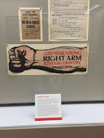
Nice little exhibition in the Prints & Drawings Gallery of Brighton Museum of First World War posters from their collection. Posters were the most effective way of reaching an audience at this period before radio and television and this show included a nice selection. Some of them were very wordy rather than visual. I loved the recruiting poster which advertised “No man under canvas” during the training period. Goodness if you were worried about sleeping in a tent goodness knows what they made of what came later! I also liked a big cut out arm with the slogan “Lend your strong right arm”. The display also included posters for the home front such as an advert for cookery classes in Brighton.

Print Club London: Summer Screen Prints

Image
Small exhibition at Somerset House by members of the Print Club London. To coincide with the Film4 Summer Season at Somerset House, 16 illustrators were asked to design a post of one of the films on show. My favourite was Steve Wilson’s poster for “The Untouchables” because the design filled the whole poster incorporating a pin stripped suit, a gun and an Italian Renaissance colonnade. However I also had a sift soot for “Badlands” by Rose Stallard but probably because of the loose Bruce Springsteen link.

Poster Art 150

Image
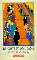
Fun exhibition at the London Transport Museum of advertising posters for London Underground to mark its 150th anniversary. They were arranged by theme some of them quite amusing like the section on how over the years the Tube has been advertised as a way to avoid the weather both hot and cold! I loved the section which advertises the sense of opportunity of the city which the Tube opens up and the opposing side advertising that the Tube can take you out of the city too. The 1920s and 30s seem to have been the golden age presenting a great view of a vibrant and exiting city. By the 1970s London Underground moved from commissioning artists to working with advertising agencies as posters were no longer their main advertising medium. Favourite posts was the Graham Sutherland “Go out into the country” of an office scene with an imagined landscape in an artistic think bubble.   Closely followed by a lovely 1920s picture of penguin to advertise London Zoo.   ...

1972 Olympic posters

Image
Very small exhibition at Pallant House in Chichester of posters for the 1972 Munich Olympics. When I say very small I really mean it, one side of a corridor! The posters were designed by the leading Pop Artists of the day such as David Hockney. I found then interesting as Munich is the first Olympic I remember quite well and so these showed the design trends of my childhood. Also a good attidote to the post 2012 Olympics come down!

See Scotland by train

Small exhibition at the Museum of Scotland of Edinburgh to showcase their collection of Scottish railway posters. I have always been interested in travel posters and how railways companies and others used good contemporary artists to design them. In this show I like “Waverley Station” by Brendan Neiland which was a broken up Hockneyesque image. They had both the original and the poster.  There was also a good section on the Forth Bridge .