Posts

Showing posts from February, 2017

Hair by Sam McKnight

Image
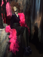
Unusual exhibition at Somerset House looking at the work of Sam McKnight a hair stylist working with photographers and creative teams for 40 years. He has worked on 190 Vogue covers. I must admit this was a whole new world to me! I’ve had the same hairstyle for well over 10 years and like something which takes no effort in the morning. This show talked a lot about how hair can set a mood and be a mark of change in life. It was quite image heavy but I loved the two main displays at either end showing off work he had done for the catwalk. I must admit probably more for the clothes than the hair but I did appreciate that this was all part of the look. At one end was a display of Vivienne Westwood clothes with big hair and at the other end Karl Lagerfeld for Channel with sleeker styles. Upstairs there were wigs in display case but on the whole the story was told with photographs. It was interesting to see the work he’d done with different women with quite a large section

International Fashion Showcase 2017

Image
Eclectic exhibition at Somerset House organised by the British Council, British Fashion Council and Mercedes Benz as part of London Fashion Week to showcase emerging international designers with over 80 designers from 26 countries. There was a loose theme of local\global. Most of the show was a series of countries that had taken rooms and featured a selection of their designers. Some stuck more closely than others to the local/global theme and some were arranged more like installations than a display to show off the clothes. Can I have a small whinge here at exhibitions which use flashing lights in their displays? I find this very distracting and I find it hard to look at the thing which is meant to be on show. On the whole most of the clothes weren’t that practical and I’m not sure I’ll be wearing them for the office. I did like the Indian display which had an interesting striped woollen suit on it and other designs on a pastoral theme. I fell for some handbags in the Egy

Bloomsbury Art and Design

Image
Delightful exhibition at the Courtauld Gallery looking the design work of the Bloomsbury Group and the output of the Omega Workshops. Roger Fry founded the Omega Workshop in 1913 with the idea of giving artists creative freedom and injecting a sense of fun into interior design. I loved the quote from him “we have suffered for too long from the dull and stupidly serious”! Work produced by the workshop was not signed by individuals. The exhibition included lots of the Omega reference designs which would be used as models on any objects. There was a also a great collection of rug designs and it was wonderful to see an original carpet shown with them. The explanations also talked about how Fry worked with manufactures to get the designs translated into objects. Along the centre of the room was a display case with a selection of the ceramic designs many of them thrown and made by Fry. I loved a blue terrine with a tiger handle and a lovely large green vase. They had exampl

Reading Drawings

Image
Interesting exhibition at the Courtauld Gallery looking at drawings with inscriptions or writing on them. The commentary gives a good overview of why there might be writing from simply the artist’s signature possibly with a date, through colour notations, collector’s stamps, adding a narrative or writing unrelated to the picture and there were good examples of all these reasons. There was a nice sketch by Rubens for the Creation of the Animals of a swooping God and expressive lions with a gamp in the middle in which he’d written “creation of man” which was going to be a different sketch to work up the detail but he’d indicated where that motif would fit. I loved Juan de Juanes study of an altarpiece with two different versions for the patron to choose from and calculations of the cost and a recipe for gilding glue on the back. It gave a real sense of a working artist. Similarly there was a drawing by the school of Raphael with a list of food for the week on it! As it’s

Cagnacci’s Repentant Magdalene

Image
Small exhibition at the National Gallery looking in detail at a painting of the Magdalene by Cagnacci on loan from the Norton Simon Museum in Pasadena. This artist is best known for painting seductive half-length female nudes often in the guise of a mythical figures and this picture has an element of that in that the central figure of the Magdalene was quite sensual. She is shown at the moment on repentance having thrown off her find clothes and dropped her jewellery box and lying on the floor being comforted by her sister Martha. A figure of virtue in the form of an angel chases off a figure of vice as a devil in the background. This moment isn’t mentioned in the bible but was being discussed by theologians in the 16th and 17th centuries. I loved the way her clothes were lying on the floor in a heap and the detail in which her jewellery was shown. Looking at it is a great way of studying the accessories of the time, saying which I want her lovely blue and gold shoes with

Australian Impressionists

Image
Beautiful exhibition at the National Gallery of work by four Australian artists painting in the Impressionist style Tom Roberts, Charles Condor, Arthur Streeton and John Russell. The show focused at first on the three artists who worked in Australia and made a point of how they were helping to define the national identity at a time which covered the centenary of Captain Cooks discover of the continent in 1888 and the formation of the country in 1901. I loved the section on their 1889 9 x 5 exhibition which features small works painted on the reverse of cigar box lids 9 in by 5 in in size in deep wooden frames with a gold inner frame. These were loose but concentrated pictures such as a lovely one of the bend in the road in the rain. I liked the contrast between the city and rural pictures. The city ones were darker but showed a pride in what had been built and established in a short time. I liked one by Streeton of the Railway Station at Redfern with a vast expanse of

Andrew Salgado : TEN

Image
Lovely exhibition at Canada House of work by Andrew Salgado from the last ten years. These were wonderful large portraits and self-portraits in fantastic bold colours. They used words and motifs within the picture to express the character and mood of the person. The best example of that is one called “Afterlife/Osiris” where the man has an eye on the back of his hand, a cross and heart on his cheek and words in the border. I loved a smaller picture called “Wisher” of a man holding a rose. At first glance it’s a romantic picture then you notice that the small square of orange on the stem is a 99p price tag implying that the rose is artificial. My favourite was the large red one called “Fin de Siècle” with a figure in a black coat looming from a dark red background with a striking red hand. Closes on 28 February 2017  

Painters’ painters

Image
Varied exhibition at the Saatchi Gallery looking at the work of nine contemporary artists specialising in painting. If you read my blog regularly you may have realised I have a bit of a thing against bad, sloppy contemporary painting so to stay positive I’m going to focus on the two artists I liked best in this show. You can take my usual complaints as read about some of the others. It was a shame that all the artists were men partially as there were some interesting women painters on show on the top floor but these turned out to be left over from a previous show. I liked Raffi Kalenderian in the first room who has a good eye for using pattern as part of the work. At the end of the room was a very striking work of zebras against a field of trees and standing in a meadow of flowers. The whole this was a study in stripes. I liked the fact he paints from life for his figure studies. My favourite of his pictures   was a study of a hotel bedroom but the picture was dominated by

Andy Warhol: Talking pop

Image
Colourful exhibition at the Halcyon Gallery of graphics, portfolios and original works on paper and canvas by Andy Warhol. These works spanned Warhol’s career from a picture of a shoe from 1955 which I quite liked through to some series of works from the 1980s. The later works were big bold series of works. I rather liked the “Cowboys and Indian” series off figures from the Wild West and the upstairs room was dedicated to the 1982 series of 10 prints called “Endangered Species”. My favourite pieces were a series of takes on the Ucello picture of St George and the Dragon as it was interesting to see Warhol tackle an art historic subject. By varying the colours it made you look more closely at the composition. Closes on 4 March 2017

Women artists: a conversation

Image
Interesting exhibition at the Fine Art Society of work by contemporary female artists who had been invited to respond to the work of Gluck which was being shown downstairs. There were some nice works in this show but I wasn’t too sure how they had been influenced by Gluck. I liked a new picture of a young girl by Ishbel Myerscough a confident figures against a red background. I also liked the set of small drawings of people set out like cards on a desk with words written next to them on the display by Phoebe Boswell. My favourite piece was a chandelier made from wine glasses, stained with lipstick, by Susie Murray called “Here come the girls”. It was a fun work and an interesting design idea. Closes on 28 February 2017  

Gluck

Image
Fascinating exhibition at the Fine Art Society of work by Gluck, a female artist working in the early 20th century. I’d not come across Gluck before which surprised me as would have thought in my reading about the Bloomsbury Group that she might have appeared. First and foremost I loved her work but she also led a fascinating life with a string of female lovers and various arguments with the art world. I loved her pictures of flowers including a beautiful one of Arum lilies in an ornate vase on a marble shelf against a cream background. I loved its smooth finish very redolent of the 1930s. There was also a stunning double portrait, a self-portrait of her with Nesta Obermer, one of her lovers. There were some lovely small pictures such as a loose sketch of someone painting in a landscape and an unusual composition “Before the Races” which was mostly a beautiful blue sky with a low line of the race course and a small group of tiny horses and men in one corner. I wa

Maxwell Doig

Image
Super exhibition at Messum’s of new work by Maxwell Doig. I loved the strange super real quality of these works yet when you looked at the surface of painting it was dappled and made up of many colours. The buildings he painted were mainly of Yorkshire and has a wonderful industrial but rural feel. A lottery win would see me buy a wonderful picture called “House”, yes you’ve guessed it of a wonderful house in a townscape. I also liked his figure work again done in this fine stippled style and some nice picture of fishing boats in bright colours. Many thanks to the gallery owner who came over the talk to me about the work and to recommend some upcoming shows at the gallery.   Closes on 10 March 2017  

Norman Dilworth: Tide & Time

Image
Interesting exhibition at the Redfern Gallery of sculpture and drawings by Norman Dilworth. This was an interesting assortment of work from small scale sculptures made up of cubes and boxes set at angles to create complex shapes to wall sculptures of metal were the spaces left empty by the holes in the structure became part of the composition. My favourite was a wall of what looked like real and mock 3D letters which looked like an optician’s eye chart. However on the whole I felt I needed a bit more explanation of what the work was trying to do to appreciate it better. Closes on 2 March 2017

Patrick George

Image
Charming exhibition at Browse & Darby of work by Patrick George who died last year. These pictures used a nice pale colour palette. They were quite thinly painted with an unfinished, dissolving feel to them. I particularly liked his long flat landscapes. On the whole I preferred his smaller pictures which seemed more concentrated by my favourite was a large one called “New Fence to the Right” which was a lovely composition with a fence cutting through it. Downstairs were some delightful drawings by George many of which were studies for the works upstairs. I particularly liked the one shown here of two horses bottoms. Closes 3 March 2017

Robert Rauschenberg

Image
Eclectic exhibition at Tate Modern looking at the life and work of Robert Rauschenberg. I must admit I went to this show with a certain amount of trepidation as I’m not that keen on conceptual art but I loved it! The whole thing had more of a sense of humour than I expected. There were works that if you saw new work like this now would look clichéd but because Rauschenberg was one of the first to do this sort of work it felt fresh and exciting. Rauschenberg had been involved in a lot of performance art and is often hard to reproduce this n a gallery setting but this show had excellent videos of the dance work and a good section of photographs and programmes shown alongside an interactive sculpture called Oracle which incorporated the sound of radios and running water. My favourite pieces were the stuffed goat! Who can resist a stuffed goat in a rubber tyre! The commentary said he had found the goat in a second hand show and wanted to restore its dignity. I’m not sure

Art Nouveau: Art and design 1900

Image
Delightful day organised by the London Art History Society at Birkbeck College looking at the art and design of the Art Nouveau led by Ann Anderson. The day was divided into four lectures with plentiful breaks for coffee and lunch. In the morning Ann led us through a good overview of the main motifs of Art Nouveau style with really good visual examples from different countries and in different mediums. She also talked about the different between this style and the arts and crafts movement. The second talked looked at who this art was for and how people bought the objects. I had not come across Samuel Siegfried Bing, the owner of the Art Nouveau Gallery, the Liberty’s of Paris. Ann gave us a good overview of what we might have been able to buy there. She also talked about the Paris exhibition of 1900 and how that led and influenced style. In the afternoon we looked at two producers of this period. We began with Rene Lalique focusing in particular on his jewellery. Ann

Women artists: Rosalba Carriera

Image
Interesting workshop at the National Gallery looking at the life and work of Rosalba Carriera. One in a series of afternoon’s on women artists. The session was led by Lucrezia Walker and she was very good at putting the work of this acrylic portrait artist in the context of the time. She pointed out how Carriera’s background meant that she had to build a life for herself and how she approached her art in a very business-like way. I loved the idea that Carriera realised that sitting for a portrait could be boring so she encouraged people to bring their friends along and ran the studio like a literary salon. No wonder all the people in her work look like they are having fun. I was particularly interested in the idea of her going off to the French court to work taking with her most of her family. Her brother in law was also an artist and her sisters helped her in her work. What an exciting trip that most have been. In the second half we went to the gallery to look at the

Fourth Plinth Shortlist

Image
Nice exhibition at the National Gallery of the five shortlisted sculptures in the next round of the Fourth Plinth Commission. I always enjoy seeing new works unveiled for the vacant plinth in Trafalgar Square. It’s interesting to see them on a small scale and try to imagine how they will scale up and fit in the space. It’s good that the public can vote and fun to wait to see if the world has agreed with you and how the piece works in reality. My vote went to Michael Rakowitz’s “The Invisible Enemy Should not Exist” a reproduction of the winged bull which stood at the gate of Nineveh and was destroyed by ISIS in 2015. I loved Assyrian art so would really enjoy seeing this in the square. I love the fact it was partly chosen as it’s was the same dimensions as the plinth. The plan is to create the colour on it using old Iraqi date syrup cans and that industry has also been destroyed by the fighting. This mirrors the idea that the panels on the base of Nelson’s Column are made

Anselm Kiefer : Walhalla

Image
Fantastic exhibition at White Cube, Bermondsey of new work by Anselm Kiefer. I loved the contrast in this show between the dark, oppressive lead lined installation areas and the bright white spaces for the large scale pictures. Your first view was a dark dormitory with beds down the sides complete with lead bedding. Your eye was drawn to the end a photograph of the back of figure walking away from you. This was a really oppressive and yet beautiful space. The mood was enhanced by the health and safety sheet you were handed before you went in to warn you not to touch the lead! Off this to the right of this corridor were other dark installation spaces. I loved the room which seemed to recreate his studio with lengths of film, more lead sheets, burnt objects in safes and more things than your eye could take in. If you turned into the rooms to the left you were greeted by white spaces which a mix of sculptures and large scale paintings. One room just had a spiral staircas

Josef Frank : Patterns – Furniture - Painting

Image
Colourful exhibition at the Fashion and Textile Museum of work by the Austrian textile designer Josef Frank who moved to Sweden in the mid 1930s. My instinct on seeing these designers was that they were from the 1970s but Frank had stopped doing textile designs by the mid-1950s. Many of most vibrant materials were from the 20s and 30s. I loved his use of bright colours often against a white background. It was a nice touch to include modern furniture upholstered in the material and to encourage you to sit on the chairs. I also liked a room setting in the first section and the display using swathes of material to create corridors of colour through the gallery. On the upper floor there were lovely paintings by Frank. He had always painted but took it up more seriously when he spotted designing. Again these were very colourful watercolours of still lives and landscapes. Closes on 7 May Review Telegraph

Zandra Rhodes: The Archive Collection

Image
Small exhibition at the Fashion and Textile Museum of new outfits based on classic designs by Zandra Rhodes. Rhodes has kept an archive of her work throughout her career and with stylist, Grace Woodward, has based this collection for the retailer Matches on that archive. There was a nice video of Rhodes being interviewed about her most iconic designs and what made them special to her. There were then about 8 outfits including one based on a dress worn by Donna Summer on an album cover and one worn by Princess Diana for a trip to India in 1986. My favourites were two made of one frill made by sewing a frill of material up the structure of the dress in a swirling spiral. An additional touch on these was the lovely covered spherical buttons. Closes on 7 May 2017  

Lockwood Kipling: Arts & Crafts in the Punjab and London

Image
Beautiful exhibition at the Victoria and Albert Museum on the life and work of the architect and designer Lockwood Kipling.   I only knew of Lockwood Kipling as the father of Rudyard so I found this exhibition really enlightening. He designed some of the terracotta plaques on the museum itself then moved to India in 1865 to teach at a school of art and industry in Bombay.   Although his remit had been to teach European arts he took an interest in and promoted the Indian arts. I liked the fact the show included the work of his pupils as well as him. The exhibition also looked at how the British used arts and crafts to promote the idea of the British Raj both in India and back in Britain. Here were super videos to show the buildings Kipling designed in each city he lived in commissioned from current students at the colleges he taught at. A nice touch! I loved a series of watercolours of craftsmen working particularly one of a wood carver holding the work with his