Posts

Showing posts with the label colour

The Artist’s Palette

Image
Interesting online lecture from ARTscapades looking at artists’ palettes. Alexandra Loske, director of the Royal Pavillion in Brighton and author of books on colour, introduced her book on palettes starting by telling us how it came about. She saw palettes as a way that artists organise colour. Her aim had been to find 50 real palettes and use these as route into talking about the artist and where possible identifying the painting for which it might have been used. She talked us through as selection of these. However as she struggled to find 50 real palettes, she broadened this into looking at them in paintings. She talked about how artists use palettes as a symbol of their art in self-portraits. I’ve used a photo of a palette converted into a clock that I bought a few years ago to illustrate this post and at the end of the talk it was fun for the artist, Maria Bell-Salter, who moderates the ARTscapades events and is always surrounded by her paintings on Zoom, to show us her p...
Colour Revolution: Victorian Art, Fashion and Design

Image
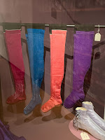
Fascinating exhibition at the Ashmolean Museum looking at colour in Victorian Britain. I had assumed it was going to be about the dyes that were invented in the 19th century but it was much more complex. After a quick look at why we think of the Victorian era as dark it then examined different aspects of colour from Ruskin’s calls to represent the natural world and its colours, through the revival in Medieval colours and the effect of Darwin and the recording of species of animals. It also looked at colours which came from global expansion on both via colonialism and the opening up of Japan. There was a section on dyes and the greater supply of colours for colouring. I particularly loved the brightly coloured stockings. A real discovery from me was the idea of the Tanagra craze, polychrome terracotta statuettes from the 4th century BCE. It explained how the style and soft colours influenced artists like Whistler. I’d not come across them before. Closed 18 February 2024. ...

The Art of Colour

Image
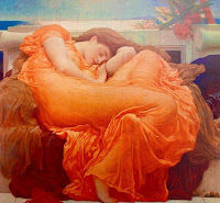
Quirky online lecture form ARTScades examining the hidden meanings of pigments in art. Kelly Grovier, author of “The Art of Colour: The History of Art in 39 Pigments” felt that there are layers we don’t understand when we look at colour and that it can it point to something outside the work. She came up with the interesting thought that we don’t question studying the depth of meaning of words in literature so why not examine colour in art. She used a selection of examples with good illustrations. She asked whether the use of bone black, made from ground bones, could give overtones of death in a work? The effect of toxic paints on artists and how Giotto’s skull was identified by the presence of the minerals in the pigments he used in the bone. “Flaming June” by Frederick Leighton, shown here was used to talk about how little orange was used as a colour when it could only be created using saffron which was very expensive but once Chrome Orange was manufactured it could be more wid...

The Symbolism of Colour

Image
Interesting online lecture from the National Gallery discussing how to look at colour in pictures and what it might be telling us. Taking pictures from the galleries collection Belle Smith looked at what colour in a painting and how it is used might be telling us about what the artist is trying to tell us. In many of the works colour is indicating status or wealth from showing the Virgin Mary in expensive ultramarine or red, to the role of an intense black in the 17th century. She used a wide range of images. I was interested in the idea that the variety and rhythm of colour use in Jacopo de Cione’s “Coronation of the Virgin” from around 1370 could be referring to the visual depiction of divine harmony. I’ll think about that next time I look at the work. I found using two pictures to talk about indigo and slavery a bit of an odd side issue in this talk. As she had said this talk wasn’t about pigments but use of colour. Neither of these pictures seemed to use blue to imply indigo...

In Colour: Sickert to Riley

Image
Stunning exhibition at Charleston Farmhouse looking at the impact of colour in 20th century art. Curated by the designer Cressida Bell, Vanessa Bell’s granddaughter, the exhibition shows a selection of paintings without labels against rich coloured walls to emphasis the colours in them. You do get a leaflet to tell you what the pictures are to give some description from Cressida about why she chose the works. I loved the mix of work in this show.  There are some great loans to this show with pictures not only from Charleston’s own collection but also from the British Council, Hepworth Wakefield, Pembroke College Oxford and York Art Gallery. It was lovely to see Francis Cadell’s “The Embroidered Cloak” from the Ferens in Hull, an old favourite. The pictures looked fantastic against the vibrant, dark coloured walls and were hung in a roughly similar and contrasting colour palette to show off the colours in the works. It really made you look carefully at the works and a...

Breathing Colour by Hella Jongerius

Image
Thoughtful exhibition at the Design Museum by designer, Hella Jongerius, looking at how colour behaves. The show is divided into sections which look at how light affects colour at different times of day morning, noon and evening and consists of objects in installations to demonstrate the effect these condition have on our perception of colour and shape.   There was a fascinating light box to demonstrate metamerism, the idea of colours looking different in different light conditions. It had various painted shapes in different colours which you could move the objects around under different light effects. Your perception was that the objects had changed colour dramatically. My favourite installation was a circle of large ceramic vases with samples of various natural glazes on them looking like a giant physical colour wheel. Closes on 24 September 2017 Review Times

Colour and Vision

Image
Fascinating exhibition at the Natural History Museum which addressed lots of questions about vision. How did it evolve? Do animals see as we do? Without an eye to see it does colour exist? What is the benefit of colour? In my rare philosophical moments I sometimes wonder if we all see colour in the same way or whether we just think we do because we give it words based on comparisons, but this show left me lots more musings! I loved the idea that at the dawn of life the world was monochrome as organisms didn’t have eyes so there was no point in colour. The first vision was just telling light from dark but as eyes evolved behaviour changed to complement this. If your predator could now see you, you had to move more or develop a trick to put them off eating you! I loved the section on seeing colour. Humans just see three colours but our brain integrates these and merges them using memory. Primitive creatures see and receive more colours but only because their brains can’t then...

Making colour

Image
Fascinating exhibition at the National Gallery looking at the history of colour and pigments. The first room looked at the science of colour, what the primary colours are and how they are used and the colour wheel. I would have liked a bit more on this as I am fascinated by how colours work together and had hoped this would fill that gap in my knowledge a bit better. However the rest of the show was brilliant as it took a color in turn blue, red, yellow, purple, green and gold and silver and looked at the different pigments which have been used over the centuries to create that colour. There were examples of the minerals etc which had been used and a good video on how pigments were mixed with oil or egg to create paint. It also discussed how some of the colours had changed over time and why they may appear differently to us now. All aspects of the show were illustrated by pictures from the collection. The whole thing was really interesting and also a chance to see som...

Shades of grey: painting without colour

Image
Innovative exhibition at the National Gallery of Ireland in Dublin looking at painting without colour. It touched on Grisaille, painting in monochrome used to create sculptural forms and the effect of grey weather and had a good cross section of artists including Rembrandt, Millet, Constable, Orpen and Mantegna. There were two contrasting pictures of women asleep. A very sensual Goya and a very cool detached picture by Dod Proctor. I loved an illusionary plaque by Pieter Jan Balthazar de Gree which was so realistic you wanted to touch it. This was a really nice idea for an exhibition.

Colour

Talk at the Charleston Festival on colour by Julian Bell and Frances Spalding. This was a fascinating talk which began with each of them talking about their recent books. Julian Bell’s is called “Mirror of the World : a new history of art” and Frances’s in “John Piper, Myfanwy Piper: Lives in Art”. They then discussed the nature of colour and what it’s role has been in 20th art. They looked at how the start of the century had seen earth colours but as the century progressed the use of colour came over from France. The question an answer session was really interesting with questions on how fashion influences colour in art and the role of light.