Posts

Showing posts with the label ICA

Moki Cherry: Here and Now

Image
Interesting exhibition at the ICA of work by Swedish artist, designer and educator Moki Cherry. This show has caught my eye from an email but I’m afraid I was a bit underwhelmed. The textile hangings looked great in the space but much of the other work was dwarfed by the large gallery. Any commentary on the pieces was via a rather densely printed leaflet which it was hard to engage with while also looking at the objects. What would have been wrong with labels? I’m afraid therefore a lot of the nuance of the show passed me but and I didn’t really get any sense of the thinking behind Cherry’s art other than it’s visual attraction. Closed 3 September 2023 Review Telegraph    
The Things that Make you Sick: East London Health Campaigning 1977-1980

Image
Fascinating exhibition at the ICA looking at the campaigning work of Peter Dunn and Loraine Leeson producing posters, a video and exhibition to draw attention to health cuts in the late 1970s. On paper this sounded like a very dry show but it told some really interesting stories and was a reminder of the sort of political posters I had on my college walls in the early 1980s. The graphics on the posters were very effective combining images and information in an easily read and understood way.   I was fascinated by the story of the Bethnal Green hospital where the government closed in down in 1977 but the staff occupied it. Only the administrative staff left so it still kept working as a hospital and GPS continued to make referrals, people still went to the casualty unit and ambulance drivers responded to calls. As patients were still being treated the government had a duty to continue to pay salaries. There is a lot we could learn not from the approach of these campaign

Frans Masereel: The City

Image
Fascinating exhibition at the ICA featuring the book “The City” by Frans Maserell, a precursor to graphic novels. There were 50 beautiful wood cuts from the original 1925 edition and a full copy to look through of the 1987 edition. The woodcuts were very art deco in style and looked at encounters in a city. I’m not sure I quite got the narrative but there were some great images and you had a real sense of time and place. I loved a picture of rows of office desks with factories outside the window also one of a man looking at corsets in a shop window. Closes on 2 July 2017

Stuart Middleton: Beat

Image
Incomprehensible exhibition at the ICA of two new works by Stuart Middleton. Now as you know I’m not scared of a bit of contemporary art and am game to try most things but you have to give me a clue! A handout maybe or a label doesn’t go amiss. This had nothing.The handout I was given seemed to be a piece of creative writing which bore no relationship to what I was looking at. I ended up getting quite annoyed and having a moan to one of the attendants. So what was I seeing? Well downstairs Middleton had gutted the gallery and stripped it down to floor boards with the ceiling gone, some of the plaster chipped and cables and pipe work showing. Checking the website since it said it was referencing “the buildings used in modern industrial agriculture to house livestock, upcycled interior design projects and historical site-specific artworks.” Really? That seems like a lot to be referencing in one work and I must admit it’s not what struck me at the time. Upstairs was a la

Sparrow Come Back Home

Image
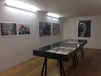
Interesting exhibition at the ICA looking at the life and music of the calypso singer Mighty Sparrow. The show consisted of good timeline of Sparrow’s life and a display case tracing his career relating it to political events in his home country of Trinidad and the US. I hadn’t realised that calypso was a competitive art form. The shows small display was complimented by an installation by Carmel Buckley and Mark Harris of 180 ceramic tiles, the size of an LP record, showing the front and back of all Sparrow’s albums. They looked just like real album covers and created a wonderful display over two walls. Can I get my Springsteen albums done please? Closes on 5 February 2017

Bloomberg New Contemporaries 2016

Image
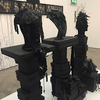
Ugly exhibition at the ICA showing casing the work of new and recent fine art graduates. There was very little which was attractive about this show. There were a lot of strange badly produced paintings and installation/sculptures which looked more like piles of rubbish. In its defence a lot of the work was conceptual but the labels were minimal. Unless it’s obvious I think conceptual art needs some explanation to help the audience appreciate the thinking and process behind it. If a work is produced (and I’m making this up) by adding one empty tin can to a pile for every time the BBC mentioned Brexit then it has some meaning if you don’t know that it’s a pile of dirty old tin cans. So rant about conceptual art over, there were some things I liked, but not many! I liked “The King” by Jamie Fitzpatrick, a large wax figure on a plinth of a fallen king. I’m not sure what all the extra heads were about but I loved the one on the back with a mechanic jaw which clicked away every

Detroit: Techno City

Image
Dense exhibition at the ICA looking at the Detroit Techno music scene. OK I admit I went thinking this would be about Motown but it turns out there was a later electronic music explosion in the city which completely passed me by! It did reflect a similar period to the other two shows which were on at the gallery at the same time. The show has a classy display using old recording equipment to play the music on earphones. There was a lot of commentary but it quite small print and just too much to read. It was probably a good show for fans of this music but it didn’t really give a narrative which would pull you in to find out more. Closes on 4 September 2016.

Artistic Differences

Image
Interesting exhibition at the ICA of contemporary art work to present the work of Judy Blame, accessories designer to whom their other exhibition is dedicated, into context. It looks at connections between the art, music and design worlds in the 1980s and 1990s. There were some strange works in this show including Linder’s photo collage of a women with an iron for a head and mouths as nipples. There was also the Chapman Brothers “Disasters of War 4” including the reworking of Goya etchings. A nice link to another exhibition I’ll cover soon was a copy of the James Reid “Never Mind the Buzzcocks” poster for the Sex Pistols. Closes on 4 September 2016.  

Judy Blame: Never Again

Image
Strange exhibition at the ICA by accessories designer, art director and fashion stylist Judy Blame. I hadn’t heard of Blame however as I went round I realised he was one of the major designers for early 80s London Club Scene so his accessories were worn by Boy George, Nenah Cherry, Massive Attack and Bjork. He also worked for various design houses such as John Galliano, Louis Vitton and Marc Jacobs. The exhibition was presented as a series of montages of clothes, accessories and eclectic objects. One included a manhole cover with cigarette ends! He specialised in using found objects to make his pieces which includes necklaces made of keys and fob watches.   It also featured the work he’d done as an art director on fashion magazines. The show gave an interesting impression of a varied career in the fashion industry and made you think about the cross over between fashion and contemporary art. Closes on 4 September 2016.

Martine Syms: Fact and Trouble

Image
Strange exhibition at ICA of recent work by Martine Syms who is interested in how language and gesture is used in the US media as expressions of identity. I’m afraid this is another show where I didn’t really understand what the artist was trying to say even though some of the work was interesting. I liked a video series called “Lessons” which was a series of very short 30 second TV clips to give the idea of the verses of a poem. I also liked the way the gallery was set out with even the entrance being an art work. Closed on 19 June 2016  

Guan Xiao: Flattened Metel

Image
Confusing exhibition at the ICA of work by Chinese artist Guan Xiao. The commentary says that Guan explores how ways of seeing are influenced by the digital age but I must admit I wasn’t getting it! However I did like some of the work such as a video installation called “Action” which was a triptych screen showing image of classical sculpture alongside modern faces. Very relaxing and contemplative. However I’ve just looked as the press release and I think there might have been more than I saw! Can I make my plea again for short videos in art shows! I loved the huge foot in a sandal with the screaming Beatles fan but I have no idea what it meant! Closed on 19 June 2016  

Radical Disco: Architecture and Nightlife in Italy, 1965-1975

Image
Small exhibition at the ICA looking at the relationship between architecture, design and night life in post war Italy. OK I admit it I didn’t understand this! There were lots of descriptions but I never really understood why any of this was important! I suppose it said something about architect interior work but little sense of what the themes were or how it changed things. I did like some pictures of molded chairs round a table and there was a fun looking cocktail bar but I think that is the extent of what I gleaned from this show! Closing on 10 January 2015

Bloomberg New Contemporaries 2015

Image
Bemusing exhibition at the ICA of work by artists emerging from UK art schools. The show could do with a bit more commentary on the works. I found few of them aesthetically pleasing but I was willing to read a bit more about them to try to engage but there was little more than titles. Just give me clue! I quite liked Scott Lyman’s “Folly/Monument” which looked like a mini triumphal arch in pale pink but I have no idea why a video of the “Swimming Pool Library” was being shown inside it. I also liked Conor Rogers beautiful miniatures on unusual objects such as a dog looking out from under a gate on the back of a cigarette box. Most noticeable was reference to some strange materials being used! I give you testosterone powder on one work. Any ideas? Also one work described as “heat manipulated crocheted yarn and concrete”, yes please let’s have more of that! Closes on 24 January 2016. Review Evening Standard

Isa Genzken: Basic Research Paintings

Image
Intriguing exhibition at ICA of a set of paintings by Isa Genzken who is mainly known for her sculpture and installations. The monotone abstract pictures had a sense of being urban scenes or aliens landscapes. Your eye made logical patterns from the texture and started to build stories and yet listening to the attendant in the room talking to someone, they were made by rag rolling over a textured surface on the floor. There was no logic in them yet your eye found it.

Everything is Architecture: Bau Magazine from the 60s and 70s

Image
Dense exhibition at the ICA on this radical architectural magazine. This show was very wordy and basically consisted of copies of the magazine in displays round the edge of the room with poster versions of some of the covers round the walls. I could see that it was a beautifully designed magazine but that it had taken an innovative approach however with the magazines to read and the long commentaries it was just too much!

Eloise Hawser: Lives on Wire

Image
Site-specific installation at the ICA by Eloise Hawser based on the life span of a cinema organ. I’ll be honest. I’m not sure I understood this, but there were some interesting element which I found rather calming. The centre piece a very slow moving mechanism called the Burbey Wurlitzer which had various cogs and chains moving so slowly it took a while to realise they were. This was somehow linked to the fact that the ceiling was changing colour creating different atmospheres in the lower gallery. The best things though was that I learned a new word “skeuomorphism” the process of making new stuff out of old stuff or as the leaflet describes it “the potential for obsolete objects to be appropriated and transformed for contemporary use”.

Fig-2 35/50: Amy Stephens

Image
Small exhibition at the ICA of recent work by Amy Stephens. I have come late to this party! The ICA are running a different show each work for a year exploring different “modes of artistic conduct”. It sees itself as a statement on visual culture and contemporary practice. It just takes up one room a week. I must try to get there more often. The blurb on this his week’s artist Amy Stephens artist said she looks at the relationship between 2D and 3D surfaces and organic forms. I’m not too sure I understood why there were stones with sticky tape on them but I loved a role of blue metallic wrapping paper representing a water fall.  

FB55

Image
Confused exhibition at the ICA to mark 60 years since they hosted Francis Bacon’s first solo show. This show was a great idea and I can imagine the excitement of the meeting that thought of it. Then they went to the archives to put it together and found they only had an invite and a programme from it. Instead of then opting not to do it, someone then wondered what they could tie it to and decided that as there had been the ambiguous picture “Two figures in the grass” in the show that they’d link it to the fight to legalise homosexuality. Basically the Bacon bits were not much and padded out by catalogues of other shows. The material on the lead up to the Sexual Offences Act 1967 and the partial decriminalization of homosexuality was fascinating. There were law cases and books which I’d not come across. It was laid out well and told an interesting story. Hopefully in two years’ time when it’s the 50th anniversary someone will pit on a show taking an intense look at this.

From her wooden sleep …..

Image
Magical installation at the ICA by Ydessa Hendeles. This was an installation in their theatre space consisting of 150 artists’ mannequins in what she described as a “tableau vivant” with Debussy’s Golliwog Cakewalk playing in the background. The mannequins varied in size but the majority were either sitting on children’s school benches or sat in a circle around a central figure at one end.   Some were very lifelike. One the walls were fairground distortion mirrors so as you walked round you saw strange versions of yourself. I found the whole thing both magical and a thing of nightmares! The effect was added to by the fact I was alone in the space except for about 5 guards who didn’t move. They sort of morphed into the art work! I’d deliberately not read too much before I went in but when I read the blurb later I realised it was both installation and an exhibition of the artists collection of mannequins which she had carefully catalogued in an excellent free booklet. I

Looks

Image
Mixed exhibition at the ICA of work by five contemporary artists which looks at “how mass digital culture informs how identity is constructed, performed and challenged”. No I’m not too sure I understand either! I liked the spooky sculptures in the first room by Sewart Uoo made of metal and looking very real and slightly decaying. These sat with a carpet by him based on a Cosmopolitan style website. Which I thought was rather fun. I also liked Juliette Bonneviot’s pictures which were plain painted canvases but made from materials containing molecules or compounds that act like xenohormones. The materials used all come from everyday life such as linen and food colouring. Each picture had a commentary which described the colour and compounds used. They looked rather Rothko like but with an added environmental element. They worked rally well together. My favourite was a video installation (yes I am saying my favour was a video!) by Wu Tsang consisting of a video called “A