Posts

Showing posts with the label maps

Imaginary Cities

Image
Strange exhibition at the British Library of works by contemporary artist Michael Takeo Magrunder transforming the British Libraries digital map collection into fictional landscapes for the information age. I’m afraid the most interest thing in the show were the original maps that had been used to create the four works and the information about the British Library project to digitise 19th century books and to extract the maps, Illustrations and photographs into a database.   I loved his description that an archive was not just a repository but “a storehouse of creative potential that engenders new avenues or culture”. My only problem was that I didn’t really understand the art works he had produced. This wasn’t helped by the fact the virtual reality one wasn’t working when I was there. The Paris works were large square, kaleidoscope like images but I couldn’t understand the explanation of how these related to the maps. I did like the London triptych which gradually cha...
Maps and the 20th century: Drawing the Line

Image
Fascinating exhibition at the British Library looking at the history of the 20th century through maps. The show had nice clear themes of mapping a new world, war, peace, the market and movement. I loved the colour palette used for the display and the idea of putting maps of different styles on the floor to gently guide you round. I liked the idea of putting two maps together as a contrast, often one from early in the century and one from later; however it was annoying that, as the labels were always on the right that this meant the label was therefore a long way from the first item you looked at. I would like to have seen a bit more about how the maps were made but I liked the fact they didn’t just talk about geographical maps but also about how maps can be used to show data about economic and social issues. They also looked at maps as art works and how they are often used to communicate an idea. There were some wonderful maps and objects in the show. I loved the Haig...

Mapping the City

Image
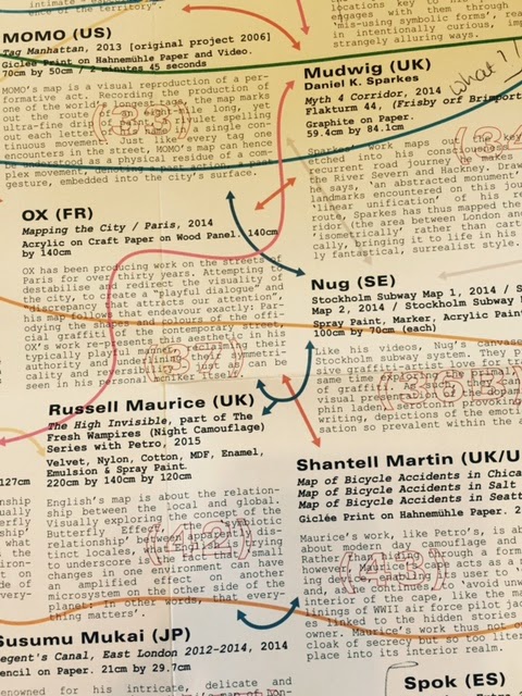
Confusing exhibition at Somerset House of work by street and graffiti artists supposed on a theme of maps. I say confusing because I wasn’t too sure that all the works fitted the theme. One seemed to say it had stared with the idea of painting a map but it had ended up as woman! Things were not helped by the fact that your only guide round the show was a very confusing leaflet which I have pictured. It was a large format and as the works weren’t in order you were constantly having to open it and refold it to find what you were looking for. Added to that the numbers of the items were printed over the text and arrows, also over the text, joining up works in similar mediums. I’d also say I got lost finding the gallery so I was grumpy before I even got there! I did however love a pyramid of coloured cement castles by 3TT Man. I think it had something to so with combing contradictory beliefs but I just thought it looked pretty. Also Will Sweeney’s take on Cabott Square in Canar...

Beautiful Science : Picturing data, inspiring insight

Image
Interesting exhibition at the British Library looking at how scientists turn numbers into pictures both to explain their findings and to develop ideas.   There was a lovely section looking at how the idea of the tree of life had been used both as a metaphor and a scientific diagram linking it to the idea of the Great Chain of Being. It also made me think of the idea of family trees and the Jesse tree. I was fascinated by the section on health matters including the use of rose diagrams by Florence Nightingale to demonstrate how most soldiers in the Crimean War were dying from preventable diseases.   I loved the juxtaposition of the maps used to chart outbreak of cholera which lead to the discovery of its cause and a modern interactive world map showing how an epidemic would react under difference circumstances. The final section was on weather charting and it was a neat link to have had Darwin as an example of the tree of life in the first section and charts...

Magnificent Maps: Power, Propaganda and Art

Nice exhibition at the British Library looking at the history of maps concentrating on how they were used and displayed. I liked that fact they were displayed as they would have been categorizing the display areas as the rooms in which they would have been shown and that it looked at them as objects rather than concentrating on how they had been made. It was also good to see the old and new mixed and I spent ages looking and laughing with the Grayson Perry Mappa Mundi. My favorite piece was a tapestry from the 17th century which was one of a series made for a landowner. I was intrigued to find that the tapestry on show was of Oxfordshire, where I was born and brought up. I loved the small depictions of the local towns and villages. Reviews Times Daily Telegraph