Posts

Showing posts from June, 2014

Purpose and process: British and French printmaking 1600-1900
Image
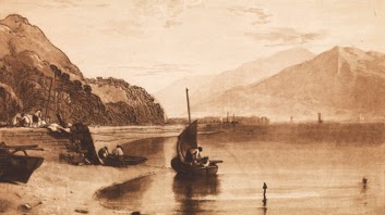
A small exhibition at the Courtauld Gallery showing some of their print collections from France and Britain in the 17th, 18th and 19th centuries. There were some nice works but I found the works did not hang together as a group very well. It was used as an opportunity to talk about prints being a way of producing multiple images and new developments such as lithographs which made it easier to put pictures in books. I was interested to see a Turner print for his Liber Studiorum which he had etched himself as I had recently done a morning course on Turner. There was also a nice satirical print by Sandy on the subject of Hogarth’s artistic theories. My favourite was a delightful print by Jacques Stella of a vendor of tripe for cats! It shows the salesman cutting off sections of the tripe, happy cats running off with pieces and a jealous dog looking on.

Impress : print making expanded in contemporary art

Image
Intriguing exhibition at the Courtauld Gallery looking at how contemporary artists have used print techniques.   The show was curated by the students on the MA is curating course at the Courtauld Institute. The show began be redefining what a print was and described it as now the exertion of pressure to create an image and there were some fascinating examples. I loved Mona Hatoum’s “+ and -” which was a tray of sand over which an arm with one serrated edge and one flat one rotated. This meant that in turn half the sand was ridged and half flat but this was constantly changing. I also liked Richard Long’s “A Line Made by Walking” which was a photo of the ‘print’ his footsteps had made by repeatedly walking across a field. However my favourite had to be Tim Mara’s “Cane Chair”. On one piece of paper was a picture of a chair, a picture of how a cane seat was made, an imprint of a cane chair seat and a photo of a bottom which had been sitting on the chair and the imprint w...

Brueghel to Freud

Image
Interesting exhibition at the Courtauld showing highlights from their print collection. The commentaries looked at how each work was produced and why. Pre-photography prints were used to educate and to disseminate the work of an artist. Post—photography you can see prints becoming works of art in their own right and another medium for artists to use. In the early section I was fascinated to see which artists did their own etching. The show included a copy of the only print Brueghel the Elder made himself however Parmigianino was known for producing his own etchings. I loved a scene of a mock battle which was staged every year in Florence by Jacques Callot. It was made in a limited edition of 1000 in the shape of a fan. 500 of these were made up into fans to give away on the day. It was commissioned in 1619 by Cosimo II. The later prints took on a more stylized form. There was a wonderful Bonnard of a woman with children and dogs which was made up of expressive bl...

Making colour

Image
Fascinating exhibition at the National Gallery looking at the history of colour and pigments. The first room looked at the science of colour, what the primary colours are and how they are used and the colour wheel. I would have liked a bit more on this as I am fascinated by how colours work together and had hoped this would fill that gap in my knowledge a bit better. However the rest of the show was brilliant as it took a color in turn blue, red, yellow, purple, green and gold and silver and looked at the different pigments which have been used over the centuries to create that colour. There were examples of the minerals etc which had been used and a good video on how pigments were mixed with oil or egg to create paint. It also discussed how some of the colours had changed over time and why they may appear differently to us now. All aspects of the show were illustrated by pictures from the collection. The whole thing was really interesting and also a chance to see som...

Summer exhibition

Image
This year’s annual exhibition at the Royal Academy, the world’s largest open contemporary art exhibition in the world. I think this year’s show was one of the better ones! There was lots of work I’d have happily taken home with me but sadly I didn’t. As ever I loved the rooms of small pictures but this year these seemed to be a better blend of work by academicians and the public. Highlights from those rooms included Stephen Farthing’s two pictures of a collie dog in a flat cap, that is the picture was of the underside of a flat cap with a picture of the dog in the middle of it not a dog in a hat, which would also have been good! I also liked Ben Madgwick’s “Aspirin” which was a picture of an old fashioned Aspirin bottle on the edge of a canvas with a very glossy finish. Of the bigger works I liked Joe Tilson’s pictures of Venice of which there were a few scattered about the show. These had a think decorative geometric border with a picture of a Venetian church in the middl...

Building the picture: study morning

Image
Excellent study morning at the National Gallery exploring the themes of their current exhibition “Building the picture” which looks at architecture in Renaissance painting. The first half of the morning the two curators of the show Caroline Campbell from the National Gallery and Amanda Lillie from the University of York talked about the themes of the show and discussed why they had picked particular pictures. Then Martha Fiennes, the film maker, discussed her work “Nativity” which uses SLOimage to   randomly generate a set of backgrounds, architectural features and people to build up an ever changing image. She likened it to a visual iTunes shuffle. There is a short film about the work showing at the exhibition and from 30 June for a week the Gallery with be showing the complete work in the Lecture Hall. I found this work fascinating and will certainly try to go and see it. It was great to get a contemporary artists take on the idea of architecture in pictures. Fi...

Antipode

Image
Small exhibition at the Ronchini Gallery of new work by Dutch artist Berndnaut Smilde. I loved the pictures of his Nimbus series where he creates a cloud for a fleeting moment in an empty room and photographs it. They are very peaceful and somehow make you look at the architecture of the room in a different way. I was however left with the felling that I’d rather see the cloud in action than via a photograph. It left me wanting more. I didn’t quite understand some of the other works. A projection of a castle with an upside down rainbow projected onto it was rather still and beautiful but I wasn’t sure what it meant. I didn’t get al all the post cards with blocks of miniature tiles on them. I guess it’s saying something about landscape but not sure what!

SEEN

Image
Colourful exhibition at the Opera Gallery of work by SEEN, a Graffiti artist. I thought this was a fun colourful show when I walked in. Not quite my seen, pardon the pun, but still interesting. I assumed it was the work of a young up and coming artist then I looked at the price list, £93,000, and realised I wasn’t really understanding what I was looking at. A bit of Googling later and a useful article in the Independent and I found out SEEN is described as the “Godfather of Graffiti” so I was actually looking at new work by a man who had formed the origins of an art phenomenon. A bit of explanation on the hand out might have helped, but I guess for most people if they were there they knew and the gallery wasn’t expecting stray middle aged ladies to come in off the street! Review Independent

Improbably landscapes

Image
Exhibition of work by Santiago Montoya at Halcyon Gallery as part of their Halcyon New Contemporaries series. The show comprised a selection of types of works. Some were large tapestries which shows pictures and symbols from banknotes which plays on the idea that tapestries used to denote wealth as they were both expensive and portable. I also liked the pictures made of bank notes, rolled over and used to create patterns such as a $ sign in red on blue. My favourite bit was in the installation in the middle of the room called “Forgive me Father for I have painted” which set paint brushes and paint tubes in resin as a comment on the contemporary art world’s relationship to painting.

The John Scott Collection

Image
Fascinating exhibition at the Fine Art Society of items from the collection of John Scott who specialised in objects from 1830-1930 a period which saw the rise of the professional designer. In all there will be seven exhibitions and this show comprised three of them modern English design from the 1860s and 1870s, Powell & Sons Whitefriars glass and British art pottery. The modern English design section was a wonderful mix of furniture, pictures, ceramics and metal work. I had not come across the metalworker Thomas Jeckyll before and loved his work. The Glass section was beautiful but there was almost too much of it to look at! A lot of the wine glasses had quite a modern feel to them and I would buy them now. I think my favourite section was the art pottery. There were designers I knew already such as De Morgan and the Martin Brothers but also one’s I had not come across like a wall of Majolica dished by Della Robbia Pottery.    

Richard Jackson: new paintings

Image
Fun exhibition at Hauser & Wirth of new work by Richard Jackson who uses paint as a liquid in installations. I liked the fact these were called paintings even though they were more installation/sculpture works but they all involved paint and many of them created further work by pumping out or spraying paint. I liked the way a couple of them set up a dialogue with other artists even though that might have been unintentional. “Pain-t” was a line of 5 sculptures of small boys firing paint at a wall via their bottoms. Each represented a different colour. This reminded me of a vulgar version of the Anish Kapoor work which fired paint from a canon. “Who painted my horse yellow?” was a full sized horse suspended upside down and, you’ve guessed it, painted yellow. This cried out Stubbs and the work he did dissecting horses. This was a show which made me laugh out loud and, on a day rather packed with modern abstraction, it was much needed. It would have even better if som...

Chillida on Miró

Image
Interesting small exhibition at Ordovas looking at the friendship of two of Spain’s most important modern artists Joan Miro and Eduardo Chillida. There was a mix of pictures and sculpture by both artists and it was interesting to draw comparisons. I must admit I am not a big Miro fan, I do keep trying but he leaves me a bit cold so I wasn’t intrigued by this friendship however it was a nicely set out show. This gallery is good and taking just a few objects and building a story with them. Review Telegraph  

Gregory Peck: Style archive of an icon

Image
Fabulous exhibition at Huntmans’, the Saville Row tailor, of clothes they had made for Gregory Peck. This is a most unexpected exhibition. To start with the window is great and it took me a while to work out there was more inside. All the staff were really welcoming and were happy to talk about the clothes and to show me how the volume worked on the hand sets. The clothes were on tailors’ dummies with an ipad where the head would be with a rolling series of portraits of Peck. Next to each was a video telling you what the outfit was and if there was film of it being worn they showed that. It was amazing to see the film of him getting his Oscar, next to the jacket he wore and the Oscar itself. All the clothes were so timeless and elegant. I was also lovely to see them in the shop which had an old fashion yet vibrant feeling. I think the best word to describe it would be classy. Just to add to the experience while chatting to one of the assistants he told me that th...

Golems

Fascinating exhibition at Pace London of work by the Romanian artist Adrien Ghenie on the theme of Charles Darwin. The first room was paintings of Darwin including portraits of him at various ages and a self-portrait of the artist as Darwin. These had distorted almost erased faces. They reminded me slightly of the Tonks pictures of shrapnel damaged First World War soldiers.   I liked a large one called “Charles Darwin at the aged of 75” which showed him in an autumnal garden, wrapped in a blanket and sitting on a modern white plastic chair. However the best thing was an installation which was a room inspired by his life. It was very dark and the gallery attendant shows you in with a torch. You then look at a room made of old panels and furnished with Victorian furniture. There are pieces coming off the ceiling and the leg of a table appears to have broken through. It takes its inspiration from Rembrandt’s “Philosopher in Mediation” which I wish I had seen before I saw ...

Richard Smith: Works on paper

Image
Exhibition at Flowers Gallery of works on paper by Richard Smith from throughout his 40 years as an artist. Upstairs were some collage works with layers painted papers with shapes cut out and folder back. There were also work with pieces of wood of a 60 degree v shape, often added in threes. Downstairs were abstract paintings again often with three items on a back ground. The website says he is influenced by American billboards but I must admit that was lost on me. These were interesting works but I must admit I’d already done quite a lot of abstract art that day and he didn’t impinge as much as some of the others.

Paul Jenkins on canvas and paper 1989-2009

Image
Exhibition at the Redfern Gallery of work by the American abstract expressionist Paul Jenkins. He was inspired by Pollock and Tobey and developed a style of pouring paint to create pictures although there was work in various media in the show. As you know I’m not a great abstract fan but I liked a long picture called “Phenomena Sight Saturn Lodestone” which had an amazing texture. Also great for texture was a round picture in an open square frame called “Phenomena Compass Window” which was a great swirl of colour with a big thick lob of paint in the middle. I had thought the light was good in the gallery which has a lovely room like by natural light from the ceiling but when the assistant put the lights on the pictures sprang to life.

Bridget Riley, the Stripe Paintings 1961 - 2014

Image
Interesting exhibition at the David Zwirner Gallery of stripe pictures by Bridget Riley from all periods of her career. These works were beautifully displayed over three floors but I have to confess I find them very hard to look at. The press release said they are “at time triggering optical sensations of vibration and movement” and that is certainly so for me. I don’t find the blue ones too bad but the orange ones seem to jump off the wall and wiggle around! As for the white one with red and blues strips I had to leave the room! I do actually like the pictures and find the fact that they have this effect fascinating. There was one sketch where a very precise measurement was being worked out and the plan was that the lines weren’t evenly spread they were varying by a millimeter in an uneven pattern. I did wonder how many of the others used this technique but didn’t feel I could get close enough up to measure them! Review Guardian  

Traces of war: landscapes of the Western Front

Image
Lovely exhibition at the Fleming Collection of photographs by Peter Catterell of how World War I battlefields look now. These started with a visit to the Somme in 1996 to mark 90 years since the battle and to see where is Great Uncle the water-colourist William Wyatt Bagshawe died. From there he went back to old Western Front battle fields and took beautiful peaceful pictures of the sites now. Many of the pictures show how the fields still show the scars on the fighting with the line of trenches and bomb explosions showing as undulations in the ground. I loved one of a harvested crop with the lines of stubble mirroring an arm on the march or the lines of gravestones. He also took close up still lives of items left from the fighting like pieces of barbed wire and shot bullets. These were almost abstract photographs but strangely moving to see a mangled bullet close up. Alongside this work were picture taken by George P. Lewis of women working during World War I which C...

Bernard Frize: Colour Divides

Image
Colorful exhibition at the Simon Lee Gallery of new work by Bernard Frize. These works were big colourful swirls which on first glance looked like they had been digitally produced but on closer inspection you realized they were very carefully painted. They are created by a sequence of colours on a wide brush which is then used to apply the paint in joined up swirls. It looks like a new sequence of colours is then added round the edge. There seemed to be a feathering effect in places like the effect you often see in cake decoration but I couldn’t work out how that was done. Although the works looks very free flowing you can tell from one picture which splits the pattern on a vertical line that they could be very laborious to produce. The works in the show were in pairs some of them with the paint being applied in reverse colour order on one picture. Others are painted twice with one pattern over another giving a slightly ghostly look. I loved the sense of vibrancy and ...

Rain, Steam and Speed: a longer look

Image
Excellent morning at the National Gallery looking at Turner’s “Rain, Steam and Speed” led by Matthew Morgan. This was in their “A Longer Look” series. The talk looked at where the picture sat in Turner’s career having been painted in 1844 when he was 77. We also discussed the elements of the picture, where it was, what the significance of that was, what the status of the railway was at the time and how it was viewed and what other pictures that it was displayed with at the Royal Academy were like. We then looked at how other artists at the time and later the Impressionists treated trains. Then finally after some time looking at the picture itself we came back to discuss how it fitted into the idea of the sublime landscape. I am only just really starting to look at Turner’s having found them rather a mass of grey and brown till now. This talk was really helpful in showing me how to look more carefully at the work and think of it in the context of its own time not ours....

Time Machines: Daniel Weil and the Art of Design

Image
Retrospective at the Design Museum of the work of Daniel Weil and his new designs for clocks. This was a nicely laid out show with his older work along one wall which includes lovely cutlery for United Airlines and an opaque orange CD cover for the Pet Shop Boys. Then down the middle were a large collection of his sketch books over a case of items he had collected as inspiration from washers, a chess set made of everyday objects and a pie ventilator. The new clocks were fascinating. I particularly liked the one running down the middle of the room where the face, hand, and numbers of the clock were hung about a foot apart but when you viewed them from the end they made a visual whole. Review Evening Standard  

Designs of the Year 2014

Image
Fascinating exhibition at the Design Museum of international design projects across seven categories, architecture, product, fashion, furniture, graphics, digital and transport. The show was very eclectic including designs for clothes, buildings, apps are more. However as well as looking at design in the decorative sense it also looked at practical design of things such as a syringe which turns red when exposed to the air to show whether it was sterile.   There were lots of items about branding the most interesting being how the Whitney Museum used a W in different ways on different sized publications. My favourite was a screw top bottle cap which doubled as a building block that works with Lego to encourage people to use and play with them rather than throwing them away. I bought four in the shop and can’t stop playing with them although I haven’t tried them on a bottle yet! It was also great to see the new chair design for the Bodleian Library. Review Evening...

Inside the White Cube

Image
The second exhibition in this series at White Cube Bermondsey which highlights work by three artists Alex Da Corte, Jack Greer and Augustus Thompson. I wasn’t convinced by the work of Thompson which mainly consisted of large black and white canvases with big circles and roses. There were decorative but no idea what they meant. I did like the four works by Da Corte built into an installation with a black, white and mirrored floor with large balls and shampoo bottles with different coloured contents. My favourite though was Greer who had collected scraps and off-cuts from artists with whom he shares a studio and put them together in collages. He also carved or painted on cacti with words representing his family history.

Andreas Gursky

Image
Interesting exhibition at White Cube Bermondsey of large scale photographs by Andreas Gursky. Many of the pictures were expressed like a stage set with small figures to give an idea of scale. Some of them have a feel of being a photo collage with various elements brought together to make one image.   I loved the ones of a new Museum in Germany, Lehmbruck, with a big glass cube in the centre of a gallery with iconic artefacts in and around it and lone onlookers. It gave you a sense that someone was looking at you in a gallery looking at them in a gallery.    I also loved one of a cathedral where the stained glass windows were huge and shown in black and white while the floor was damaged and a small camera crew looked on. There was also a set with super hero figures in including one of a glass brick building with a men stuck in a display window looking out at Spiderman. I have no idea what they meant but I liked them!

Made in Mexico: the rebozo in art, culture and fashion

Image
Colourful exhibition at the Fashion and Textile Museum looking at the Mexican scarf, the rebozo, which has become an emblem of Mexican identity. It looked at how they are made and the influence they have had. The design of the show was lovely with scarves shown on nice manikins of an older Mexican lady, alongside photos and paintings and whole outfits. There was a mocked up shrine in the middle of the room and lots of cacti. The scarves themselves were beautiful but a little dull in colour and actually all quite similar. I don’t think I really got the subtle differences between them. I was more interested in how Mexican culture has used the image of the scarf and how modern designers had incorporated it. I loved portrait of weaver as a memorial to him with a loom set into the picture. I enjoyed the show and came out informed but it didn’t make me care.

Under the Influence: John Deakin and the Lure of Soho

Image
Interesting exhibition at the Photographers’ Gallery of photographs taken of Soho in the 1950s and 1960s by John Deakin. Deakin had been a photographer for Vogue but in his spare time photographers the people around him in Soho many of whom became his friends. These included many of the leading artists of the day including Lucian Freud, Francis Bacon and Frank Auerbach. The pictures had an air of louche glamour. I loved one picture of the artists in a restaurant in which Bacon was looking cheerful! Also one of Bacon posing with 2 sides of a dead pig ie Bacon with bacon but also now has overtones of Damien Hirst! There were also nice ones of the people who worked in pubs, clubs and restaurants at the time. Review Evening Standard  

Deutsche Börse Photography Prize 2014

Image
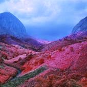
Exhibition at the Photographers’ Gallery for this annual photography prize rewards a living photographer, of any nationality, for a specific body of work in an exhibition or publication which has contributed to photography in Europe. There were four artists represented. My favourite was Richard Mosse who had done photographs of war affected areas of the Democratic Republic of Congo where he had used old military surveillance film which turned green colours pink. Hence there were pictures of mountains covered in pink foliage and soldiers in pink uniforms. I found the work of Jochen Lempert interesting in his juxtaposition of pairs but a little dull. I liked Lorna Simpsons work using anonymous 1950s images of a man and woman with her own photos recreating the poses. Although the originals had a sense of love as they had been taken by another person whereas her, which were self portraits, seemed a little lonely. Albert Garcia-Alix had done rather explicit and egotistical...

CPA auction 2014

Image
Exhibition of pieces of contemporary ceramics in the CPA Auction displayed at the Contemporary Ceramics Centre. There were some lovely pieces in this show and I envy the lucky highest bidders. I loved Mary Rich’s lustre bowl in gold and blue, Matthew Chambers sculptural works of concentric circles and Svend Bayer’s functional cooking pots.  

The Other Side of the Medal

Image
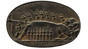
Surprisingly interesting exhibition at the British Museum looking at commutative medals made in Germany in World War I. Yes it sounds dull doesn’t it but I found a fantastic collection of early German expressionist art! Whereas in England the anger at the war seemed to come out through the poetry in German they made medals. There was a heavy use of death images and whole section at the end talking about the history of the German use of the Dance of Death and how it was picked up in the war. There was Death selling tickets to the passengers on the Lusitania, Death manipulating Zeppelins, despondent soldiers being led to death, Death pumping blood from a battle field etc.In some of the images Death was a metaphor for the allied armies but in other it was just death! My favourite piece was a medal showing Zeppelin’s over Tower Bridge. This never happened but evidently it was rumoured to have done in Germany. Reviews Telegraph  

Ancient Lives, New Discoveries

Image
Fabulous exhibition at the British Museum looking at the lives of eight people who lived along the Nile from 3500 BC to 700 AD by examining a CT scan of their mummified bodies. The scans were amazing and a good way of finding out what’s inside a mummy without unwrapping it and disturbing the remains and artefacts. One of the mummies had extensive amulets on their body and as the commentary said if you had unwrapped it these would have moved and you wouldn’t know exactly where they had been. However the scan showed them in situ including a lovely eagle on her throat. In the case next to the scan they display 3D printed version of the amulets; the first time I have seen 3D printing in an exhibition. I found it most moving when you knew the name of the person eg Padiamenet, the temple door keeper, whose scan was shown upright so it appears as if he is standing in our space. There were also some really touching artefacts such as a wooden toy horse and a wig dating from 135...

Artistic exchanges: Corot, Costa, Leighton

Image
Small but sweet exhibition at the National Gallery looking at how the northern painters Corot and Leighton who travelled in an painted the countryside around Rome influence the Roman artist Costa and how he in turn influence them. This seemed to be another in the National Gallery series which could be entitled “What can we do with the acres of 19th century landscapes we own?” but I rather enjoyed them although they do get a bit similar. I had not realised before the Lord Leighton was such a good landscape painter and I loved his very clear style such as in his picture of Venetian roofs. I was also interested in the fact he not only knew and worked with Corot but owned the first Corot to be brought to England which was on show in the adjacent gallery. I wasn’t quite sure why there were two Thomas Jones’s at the end from the previous century but they are so lovely I didn’t mind and it’s always nice to see them!

Building the Picture: Architecture in Italian Renaissance Painting

Image
Lovely exhibition at the National Gallery looking at how architecture was used in Renaissance paintings and how those pictures themselves fitted the architecture.  This was partly a chance to a see picture you knew well in a new context but also introduced me to new ideas on the symbolism of architecture. It talked about the difference between using real and imagined architecture. Sometimes an artist wanted to put an event in a real space such as two of St Zenobius placing him in the actual streets in Florence in which his miracles had been reported. At other times artists had to create a space they didn’t know such at the Temple of Solomon which no longer existed. I loved the first section which recreated the space where a virgin and child by Veneziano used to hang. It also talked about how architecture was used in a picture to draw the viewer into the scene for example threw an arch or an open door. Reviews Guardian Telegraph

Take one picture

Image
This years Take One Picture exhibition at the National Gallery which choses a picture, this year Seurat’s “The Bathers” and asked schools to respond to it. Each school looked at a different aspects   of the picture landscape, leisure, work, clothes etc. One school had used what they had seen on the way to the gallery and did a picture map of the Thames with bridges across the river and people walking and sitting at either side. Some children from Barnsley had made a miner banner incorporating their town and images from the picture. One school had made sheep fleece felt hats like the boy in the water is wearing. However best of all was the wicket version of the dog made the Ysgol Griffith Jones School in Carmarthen. This show is always really interesting because as well as seeing how children have viewed a work it makes you look at it differently and see new things in it.