Posts

Showing posts from March, 2014

Hockney : print maker

Image
Interesting exhibition at Dulwich Picture Gallery looking at David Hockney’s work in prints throughout his career. I liked the way it split the show into etchings and lithographs and explained both techniques which made you focus on how he worked differently in each style rather than just thinking about how his general style changed over time. Also liked the way it showed sets of prints such as the Rakes Progress from 1963.    My favourite set was as illustrations to poems by C. P. Cavafy which were basically prints of men in bed together which may or may not have been done as a gay rights statement. Either way they are lovely gentle rather sweet pictures. There were some great still lives and I liked the wall of lithographs of flowers in vases from various stages in his career. Reviews Telegraph Independent Evening Standard    
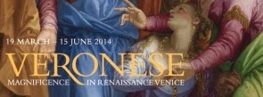
Veronese: Magnificence in Renaissance Venice

Image
Fabulous exhibition at the National Gallery looking at the work of Veronese. I was so looking forward to this show and I was not disappointed! It was a good old fashioned show and I see that as a good thing. It concentrates on one artist and their career in chronological order. It mentions the other artists of the time but does not take up space with their work. Because of it being at the National Gallery if you want to make the comparison with Titian or Tintoretto you just have to head to the next gallery when you’ve finished. I loved the fact that the commentary on the works was in the small leaflets so people did not queue up to read a label or bunch around them. I’d also recommend the tape tour which added a lot more particularly the comments by an opera designer and costume historian. Veronese came across as an artist who really understands the human condition partially the happier aspects of it. He shows the happiness of people dressing up in their best clothes ...

Past the Future

Image
Small exhibition at Tate Britain curated by artist John Noble to launch the new gallery dedicated to the archive collection at the Tate which brings together works which symbolise the history of the Millbank area. It has works which reflect its origins as a swampy area such as Robert Morris’s black felt work which looks like running water. It also looks at the idea of the prison which stood on the site in works such as Anthony Caro’s “Witness” a large weeping figure behind bars. To represent the early Tate there was a bust of GF Watts but placed on the floor to make you looks at it differently. I liked the fact this display let you draw your own conclusions.  

Sketches for Spaces: History Painting and Architecture 1630–1730

Image
Small exhibition at Tate Britain looking at the 17th and 18th century fashion for decorating interiors with murals and paintings from the ceiling of the Banqueting House to the Painted Hall at Greenwich. The show looked at royal ceilings, domes, staircases and other ceilings. I loved seeing a number of different possible designs for the inside of the Dome of St Paul’s. I was interested to learn how great mural designs were popular as prints and to see a whole section on the designs of the staircase at Marlborough House including a life size photo of it sent in the corner of the room   and print and painted versions. My favourite item was Carwitham’s “Fantasy of Flight” which may have been a mural design or a book illustration. I so hope it was a mural design! It would have rivalled the Michelangelo Last Judgement with great naked figures tumbling down the picture.

Ruin Lust

Image
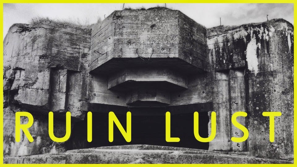
Thought provoking exhibition at Tate Britain which looks at how artists have been inspired by ruins both real and imagined seeing them as either nostalgic or a warning of the future. I particularly loved the second and third rooms which just seemed to be full of some of my favourite artists and places as well as having some wonderful new discoveries. The pieces chosen were clever such as picking a number of unfinished Turner sketches which were in themselves also in themselves like ruins. There were some lovely group hangings such as five pictures of Llanthony Priory from different dates and a Piper and a Coltman next to each other both showing a Romanesque arch. There were also interesting ideas about how people have viewed ruins such as the lovely picture of early 19th century people going round a ruin at night lit by flares. Another room looked at how depicting ruins after a war can help people understand or come to terms with the destruction giving a modern twist ...

Richard Deacon

Image
Interesting exhibition at Tate Britain of works by sculptor Richard Deacon. I loved the sparseness of this show. The works were very big so there were only two or three to a room so you got the chance to look at them closely, see how they worked in a space and look at them without anything else in the way. I liked works made of laminated wood particularly the rougher ones where the glue was seeping out. There was also a room of smaller pieces designed for domestic spaces and to sit with other objects in a home in which I particularly liked a sinuous ceramic piece. Reviews Guardian Independent Evening Standard  

The Sunflowers: Why? How? When?

Image
Fascinating discussion at the National Gallery about the current Sunflowers exhibition with   Christopher Riopelle, one of the curators of the exhibition, Ashock Roy,   Head of Collections at the National Gallery and formerly head of its scientific unit and Ella Hendriks,   Head of Conservation at Van Gogh Museum. They not only looked at why the pictures were made but also showed recent analysis of the composition and pigments. I was fascinated by the section on pigments as you could easily think the works were just yellow with a few other bits but the variety of yellow was fascinating as well as thinking about how different colours work together. A really interesting evening listening to three experts.

Family stories of the Great War

Late night opening at the Greenwich Heritage Centre to launch their World War I War Memorials project. There was a stall about the project which hopes to find out more about soldiers named on local memorials and see if they still have family in the area. I have volunteered to help with this. There were also stalls from the Firepower, the Royal Artillery museum next door, a group from the Progress Estate in Eltham, built to house munitions workers, which celebrates its centenary next year and a group looking to preserve the Blue Cross animal cemetery on Shooter’s Hill. I also went to an interesting talk by a lady from the War Memorials Trust about their work and had a good chat to a man on the Firepower stall about how I might find out more about my Grandfather who fought in World War I. On his advice I am going to contact the archivist at the Museum. However, almost best of all, was the Hop Stuff stall selling beer brewed on the Royal Arsenal site, about 200 yards awa...

Premiums: Interim projects

Image
Interesting exhibition at the Royal Academy of work by the RA Schools postgraduate fine art students half way through their studies. It was a bit of a mixed bag of work and I suspect as I go to see so much, that a lot of it looked derivative of other things, although often those things were works I’d seen very recently so maybe it’s more about the current zeitgeist! I won’t go on about bad contemporary painting but there were some examples! However I did like Sean Steadman’s big surrealist work as it was well done particularly the giant damaged finger nail. In the same room I liked Sophie Alsbo’s work “Comeback”, four screens showing film of a waterfall, with real sections, pixilated and out of focus ones., which was rather relaxing. My favourite pieces were Laurence Owen’s ceramics with interesting titles such as “Daddy’s Girl” and “Limp Bisque”! I was also fascinated by Max Prus’s flat free standing figures which were eerily 3D and really seemed to inhabit the space...

Norman Stevens: selected prints

Image
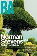
Small exhibition at the Royal Academy of prints by Norman Stevens RA. These ranged from his lovely detailed etchings of the early 1970s through to the bolder screen prints and coloured etchings of the 1980s. I particularly liked a series of etching of parts of buildings a plants such as one of   a house shutter and lilies, they gave an unusual view of a property but somehow implied the life that was going on inside it. I loved the colours in the later works and the series he did looking at the effects of the Great Storm of 1987 especially “Black Walnut Tree 21 October   1987” which was a lovely study of texture with lime and lemon leaves.

Sensing Spaces: Architecture reimagined

Image
Interesting exhibition at the Royal Academy which aimed to recreate the power of architecture in a gallery environment. How can we get an idea of inhabiting space rather than just reading about it or seeing it from the outside as in a traditional architecture exhibition? It was a fascinating show but some of the rooms worked better than others. I loved the tower by Pezo von Ellrickshausen in the first room I went into. It was a big box on four columns which were spiral staircases taking you to the almost ceiling level. It was worth taking the ramp up instead as this gave wonderful views of the gold ceiling angels. I wasn’t so sure of Eduardo Souto de Moura’s recasting of the entrance arches to rooms. I liked them as objects and the way they sat with the originals but I didn’t’ feel they said enough to fill a room. My favourite section was the maze like interior created by Li Xiaodong which took you into a forest like interior space winding round to find rooms and ending up...

Inverted House

Image
Installation in the Project Space at Tate Modern by Tina Gverovic and Siniša Ilic following a two week residency at the Museum. OK I have to admit I didn’t get it! There were as series of small pictures, an arrangement of chairs and oddly painted walls. According to the blurb on the website it “considers key questions of museum function, social interaction and the potential of collaborative conversation” but I am none the wiser. I assumed the idea was to create a confused space around you but compared to the Sensing Spaces show at the Royal Academy which I saw the next day it didn’t really do that.   The pictures were interesting but I didn’t really see how they worked together or really see what they were saying.   It looked more inviting from outside so maybe it should have been left as a sort of shop window!

Richard Hamilton

Image
Interesting retrospective at Tate Modern of work by Richard Hamilton, often seen as the inventor of Pop Art. I found this show fascinating as I keep coming across iconic works by Hamilton such as “Just what is it that makes today’s homes so modern, so appealing?” and the Rolling Stone screen prints but I had no idea how they fit into the body of his work. The show was arranged chronologically but also drew comparisons across his work. He seemed to strike an interesting balance between political comment and humor. I liked the way the show used reconstructions of iconic exhibitions such as his work for the “This is Tomorrow” exhibition at the Whitechapel Gallery and I look forward to popping to the ICA which is currently showing two more of these reconstructions in the space for which they were devised. My favourite works were the three Northern Ireland diptychs showing a dirty protestor, a soldier and an Orangeman. I was also interested to see how often he reused the on...

Vikings: life and legend

Image
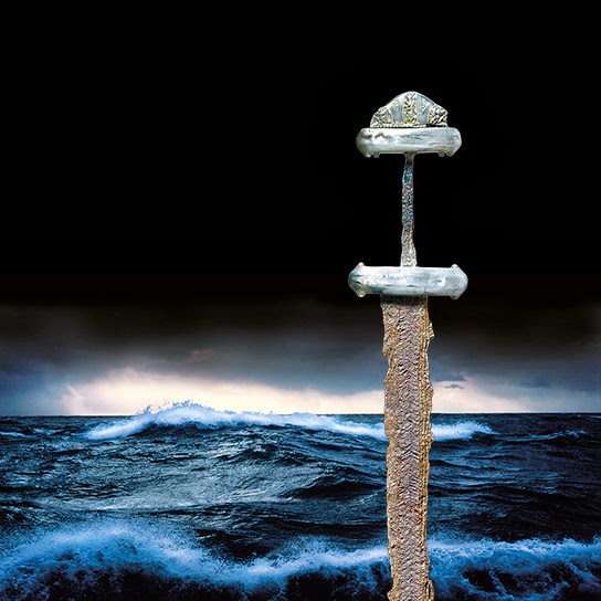
Frustrating exhibition at the British Museum looking at Viking culture and how it influenced and was influenced by the rest of Europe. I say frustrating because it was very busy and the first room is quite cramped so it involved a lot of queuing. Thanks to the attendant who tried to alleviate this by telling people to move on round where there was more space but if you did that you’d miss out about 4 displays! Also because it was cramped you either queued to look at things or read the commentary, you couldn’t do both! Because of that I seemed to miss the narrative for the first couple of rooms so wasn’t too sure what they were trying to say as the artefacts didn’t seem to be Viking but to be from lands they invaded. Oh and while I’m moaning can I mention not puttying the description of objects so low down where they get covered up by people and where most of your middle aged audience have to bend down to read them due to their varifocals! The general message seemed to be t...

Saatchi Gallery/Deutsche Bank Art Prize for Schools

Image
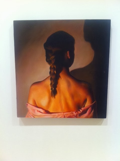
A surprisingly good exhibition at Saatchi Gallery of work by the 20 shortlisted entries for this prize for school children. Usually my heart sinks at the works “school art exhibition” but there was some stunning work in this show, in fact some of the best I’ve seen at this gallery. I loved the painting of a piece of bacon which was done by pouring paint from a watering can, cleverly split in two for artistic effect, by Kanisha Thorne. I also loved “Rock and Roll Frog” by Poppy Bar aged 7, which was a super green frog playing a pink guitar! Witney Khan’s “Coming up for Air” was worthy of being in the BP Portrait Award. However my favourite was Rosie Rendle’s   “The Babysitter” a beautiful back view of a woman with a plait. It had a Flemish quality.

New Order II : British Art now

Image
Interesting exhibition at the Saatchi Gallery of thirteen contemporary British artists. There was some nice work in this show and I would pick out Martine Poppe’s Analogical Change series, a group of oil painting on polyester restoration fabric giving a misty out of focus effect to the large works. I also like George Little’s “The Moveable Set” a picture of an interior made up of a 3D effect table and a garden outside. My favourite though were the eerie sculptures by Virgile Ittah of life like, slightly decaying figures, made of wax, marble powder and fabric. However I do have a gripe! There are some artist I didn’t get to see as the room they were in had been given over to another show. Much as I enjoyed this show, it was very annoying not to see the whole of this show! This has happened to me before at the Saatchi Gallery and it took me three visits once to see the whole of a show. Please stop doing it or at least advertise the fact on your website. Review E...

Heads : selected portraits c1550-2010

Image
Interesting selling exhibition at Abbot and Holder of portraits and figurative studies from the mid 16th to the present day. There were some lovely pieces including a portrait of W.B. Yeats by Augustus John, a nice George Du Maurier and a William Strang of Arthur Clifton. My favourite however was an Eric Kennington of an East Prussian Prisoner. Now if only there had been room for more like that in the National Portrait Gallery World War I exhibition!

Figures and helmets : New work by Mo Jupp

Image
Exhibition at the Contemporary Ceramics Centre of new work by clay sculptor Mo Jupp. Most of the show was of small expressive female figures of just torsos and legs. These were standing and sitting and he captured the stance of woman beautifully. They reminded me in an odd way of Mondrian pictures. The other pieces were helmets of a cylindrical design. I was made a note that they were Ned Kelly like and later spotted that in the commentary. I found these less interesting and rather cold.

From temple to home: celebrating Ganesha

Image
Small display at the British Museum looking at the elephant headed Hindu god Ganesha, who is seen as the creator and remover of obstacles.   It went through the iconography of the image of the God and the legends behind why he is shown the way he is. It looked at modern images of the God such as Ganesha as a cricketer. There was also a recreation of a home shrine to the God and a section on the revitalised Ganeshchaturthi festival in India.  

Foreign bodies, common ground

Image
Unusual exhibition at the Wellcome Collection following the work of artists commission by them to work in health research facilities around the world. This was a mixed bag of work with some artists working with the communities they were in to produce the work and other just taking inspiration from the place. A fun idea was by Miriam Syowia Kyambin and James Muriuhu working in Kenya. They set up a photo studio made to look like    doctor’s office and filled it with props. They then asked local people to come and pose in it in white coats decorated in American fabric choosing the props they most feel influence research. During the run of the show on certain days there is a photographer present so you can join in and be part of the project. My favourite piece was a necklace of fossils by Kater Paterson who was based in Cambridge. She took her inspiration from DNA research and each bead in the necklace was fashioned form a fossil and they are threaded in an evolutiona...

Beautiful Science : Picturing data, inspiring insight

Image
Interesting exhibition at the British Library looking at how scientists turn numbers into pictures both to explain their findings and to develop ideas.   There was a lovely section looking at how the idea of the tree of life had been used both as a metaphor and a scientific diagram linking it to the idea of the Great Chain of Being. It also made me think of the idea of family trees and the Jesse tree. I was fascinated by the section on health matters including the use of rose diagrams by Florence Nightingale to demonstrate how most soldiers in the Crimean War were dying from preventable diseases.   I loved the juxtaposition of the maps used to chart outbreak of cholera which lead to the discovery of its cause and a modern interactive world map showing how an epidemic would react under difference circumstances. The final section was on weather charting and it was a neat link to have had Darwin as an example of the tree of life in the first section and charts...

Georgians Revealed: Life, Style and the Making of Modern Britain

Image
Excellent exhibition at the British Library to mark 3000 years since George I came to the throne looking at how life in England had changed by the time the last Hanoverian king died. I had been lucky enough to have a curator tour of this exhibition before Christmas but was pleased to come back and look in more detail at the exhibits. The curator had been fascinating on how the show was arranged and what they had chosen to put in and leave out. I thought the detail of this show was fantastic from looking up at the period marble payer backs of the cartoons and newspaper articles outlining the history of the period in the entrance section to the light dialogue between sections such as the Jane Austen references without a Jane Austen section. I loved the section on shopping and the growth of consumerism and so wanted to go to the ceramics shop which also sold chandeliers! I liked the way the growth of interior design at this period from whole Adams interiors to people buy...

The Sunflowers

Image
Lovely display at the National Gallery bringing together their version of Van Gogh’s Sunflowers and the Amsterdam version which is a copy by Van Gogh. It was wonderful to see these works together and compare them. I had done a super workshop at the National Gallery a couple of weeks ago looking at how and why they were painted and I did find that brought much more understand to the show. It is a small show and likely to get busy so the information boards had been kept to a minimum but what there was was good and it was clever to bring you out into the room with the other Van Gogh’s in rather than trying to group them together in one space. I thought the London version had a more luminous quality with the paler background and the use of the blue paint to edge the table and the vase. It had a feel of work being thought through whereas the Amsterdam version was slightly looser in style. Don’t be put off by the queuing, I only waited about 20 minutes, but I’m glad I wait...

The Great War in portraits

Image
Disappointing exhibition at the National Portrait Gallery of portraits from World War I. I only say disappointing because this exhibition should have been so much bigger! What there was was well thought out and created some interesting dialogues between works but why give it only 4 small rooms. This is a national event and to me one of the most interesting aspects is the art it inspired and how it changed art. There is no way any curator could have done the subject full justice in four rooms. Why did the David Bailey get the whole of the rest of the floor? Yes I know economics as it’s a popular blockbuster and I guess it pays for this free show. As I say what was there was fantastic. I liked the room of generals and ordinary solders with them taking opposing walls. I loved the fact they had some of the Tonks pictures of disfigured soldiers and that these were shown with some of the photos from the Sidcup hospital. I liked the idea of having a display of postcards and that ...

Tales of Paradise: Gaugin

Image
Tiny gem of an exhibition at Ordovas looking at the primitive in Gaugin’s work both in Tahiti and Brittany. This was quite a large stark white space with four jewel like Gaugin’s in it! My favourite was a stunning portrait of a young Tahitian boy.   I am not a great Gaugin fan but this had a slightly Renaissance quality. It was also good to see a sculpture included as I find his Tahitian sculpture more interesting that the painting. There was also a fascinating film on Gaugin in his own words playing. However it was slightly long and was being shown in a elegant office space. I must admit I felt odd standing next to three people who were working while watching it but I was pleased to see it’s on the website so I will watch it in full there.

Hans Arp : Chance – form – language (and a FRANZWESTigation)

Image
Baffling exhibition at Hauser & Wirth of sculptures by Hans Arp. I must admit I just didn’t get this show! It was my 5th one of the day so maybe I was tired but it seemed very stark and uninformative! Since reading the press release I have realized Arp’s work was being shown with work by Franz West including what I assumed was a rather old sofa in the corner! I also wasn’t sure who the poetry on the walls and being read out was by and why it was there. I do think a show, whether you like it or not, should be fairly self-evident and this wasn’t! Maybe a few more labels would have helped! As you know I don’t always   respond well to abstract work and this was one of those occasions, sorry! Review Evening Standard  

Dale Chihuly: Beyond the Object

Image
Stunning exhibition at the Halcyon Gallery of glass by Dale Chihuly. There was an interesting mix of work including pieces which were almost architectural installations of blown glass such as the central piece with a sea bed of glass shapes above your head. I loved the glass water lily shapes mounted on the wall an beautifully lit to thrown the colours against the wall. There were also smaller sculptures which you could imagine having in a home, often shell like in shape and examples of chandeliers like the one at the V&A, cascading from the ceiling and throwing off different shapes alight. A visually stunning show and a privilege to be so close to such lovely fragile work. Review Telegraph  

Brian Rice : Early works 1959-1980

Image
Exhibition of contrasts at the Redfern Gallery looking at the early work of Brian Rice. This was a mix of slightly sludgy brown abstract landscapes and bright sharp geometric abstracts. Of the landscapes I liked one of a pollarded tree with cubist shaping although I was not as fond of the rather mushy pictures by the door. In contrast the bright geometric pictures were like pop art posters. I liked the circular pictures with a repeated design in each segment giving a kaleidoscope effect. Oddly these pictures sat well together and you did have a sense of one hand painting them.

James Turrell

Image
Luminous exhibition at Pace London in Burlington Gardens of light installations by James Turrell. These consisted of space with a frosted glass surface animated by LED lights in specially constructed white rooms. There were two landscape ones from the Wide Glass series and three portrait ones from the Tall Glass series. As you stood with the works you realized they were slowly and subtlety changing colour. It was fascinating to feel the different effects that the different colours have on you. The green was the most calming but I found the cerise pink difficult to be with, which was odd as I do like pink! You found yourself going back to the rooms you had already been in to see how they had changed with the different colour. Review Evening Standard