Posts

Showing posts from 2016

Design Museum

Image
Newly opened Design Museum on High Street Kensington which has moved from the banks of the Thames in Bermondsey. The new building is a reworking and a refurbishment of the old Commonwealth Institute which I remember visiting as a child and the architect John Pawson has retained the iconic curved concrete roof which dominated the internal space as well as being beautiful from the outside. I loved the big space in the middle of the museum and the lovely inclusion of benches on the main staircase giving people a place to sit plus hopefully a space for talks and discussions. The pale wood used throughout is beautiful. The two spaces for special exhibitions are lovely. I liked the way the one on the ground floor wraps round the back of that floor and the one in the basement has lovely tall ceilings and I look forward to the imaginative way in which it could be used. However it is a shame that the permanent collections feels quite cramped on just one side of the top floor. ...
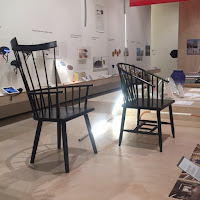
Beazley Designs of the Year

Image
Fascinating exhibition at the Design Museum of their annual survey of 70 projects from across the design world that they consider to ne the best this year. I always enjoy this show for its range of items from ones which you have seen already in the shops such as Muji’s range of simple white kitchen gadgets to ones which are still aspirational. I like the inclusion of graphic design and architecture in the show but it tends to be the objects which catch your eye an imagination. I was fascinated by the space cups designed so that astronauts can drink coffee in space which uses the shape an passive capillary forces to love coffee into the mouth. I loved a bicycle navigation tool but more for the smart clip on design it used than the technology involved. The products designed for Third World Countries and disaster areas are fascinating. I loved a flat pack house, partly designed by the Ikea Foundation, for use in disaster conditions which comes in two packs including tool...

Fear & Love: Reactions to a Complex World

Image
Interesting exhibition at the Design Museum looking at how design is moving away from objects to becoming a way of understanding the world and changing it. Eleven design practices from around the world had created installations to explore an issue. I think if I’d seen them in a different context I would have called them art installations rather than design works but they just shows how genres are blurring. I had seen two of the installations at the Architectural Biennale in Venice earlier in the year so I felt a bit cheated but very smug! That was one of Mongolian structures for nomads moving into the cities and one by a Chinese fashion design who works with women from the mountain regions of China with the clothes displayed on earth. The stand out display for me was Intimate Strangers by Andrew Jacque, displayed as two large screens and a series of ipads on stands which looked at the history of the gay dating site Grindr and some of the unlikely uses that had develop...

Art of Make Believe: Staging stories for children

Image
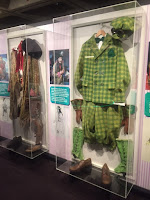
Lovely little exhibition at the National Theatre looking at the children’s shows they have done over the years. The display was aimed at children and went through the different processes in producing a show with interactive displays. I liked the way it came back to the same shows to give a continuity to the narrative. I loved a film about movement in The Wind in the Willows and a nice display of costumes including Toads motoring suit. It was interesting to note that the actor Arthur Darvill had lent the Long John Silver coat which he’d worn in Treasure Island last year and presumably bought after the show was finished. I also liked a mock-up of the set of Treasure Island which let you play with lighting effects. It brought back happy memories of sitting under the stage at school with a lighting board!

Simon Fujiwara : Joanne

Image
Interesting video installation at the Photographers’ Gallery of a work by Simon Fujiwara. As some of you may hay realised I don’t have much patience for video art but I did like this one. I like the way it was introduced in a white room by large light boxes with stunning photographs of the subject of the film, Joanne. The video itself was then on a screen facing the back wall at an angle. The film was about the artist’s old art teacher from when he was at Harrow School. It looked at how women define themselves and how others define them. It felt a bit like a film about a person as a brand. Fujiwara had met her again 15 years after they had been at the school and they worked together on this film. It became clear that she had left her job at the school when topless pictures of her had appeared and the film discussed how she doesn’t want to be defined by that. Closes on 29 January 2017

Feminist avant-garde of the 1970s: works from the Verbund collection

Image
Humourless exhibition at the Photographers Gallery looking at feminist photography from the 1970s. This was very old school, humourless feminism which felt a bit bludgeoning after a while but you had to take a step back and think about the context and what it was trying to do. I did like Mary Beth Adelson’s “Some Living American Women Artists” based on Leonardo’s Last Supper with Georgie O’Keefe in the place of Christ. It seems appropriate after the wonderful show of her work this year at Tate Modern. I was interested to see two artists take the approach of a series of pictures of themselves with their faces pressed up against glass. I also liked Helena Almeida’s picture of women’s hands through bars in the windows and fences. I would have liked to see a bit more commentary on the works but I guess I needed to buy the small book which went with the show which I wasn’t including to do! Closes on 29 January 2017  

The Classical World and Classical Revivals

Image
Fabulous ten week course at the Victoria and Albert Museum on classicism looking both at its roots in the ancient world and how later generations used and developed it. I have been meaning to do a V&A course for ages but, as they are quite long, I don’t get a chance as usually one holiday or another breaks into them. However this Autumn I was grounded after Italy in the summer so I took the opportunity to do this and it was great! While in Rome I’d become fascinated by the ancients remains there and what different artists would have seen at various periods of art history so this was just the course I was looking for. We had some excellent speakers. I’d heard David Bellingham before at the National Gallery and he is a very engaging speaker. I was impressed by the range of dates he could talk about doing talks on Roman emperors and how they showed their power, how Renaissance artists used classical sculpture, a detailed look at Botticelli’s Venus and Mars and then reappe...

The Camera Exposed

Image
Interesting exhibition at the Victoria and Albert Museum of photographs which feature cameras. It shows that cameras often appear in self-portraits of photographers but can also be included to draw attention to the voyeuristic nature of photography. There seemed to be a lot of pictures by or of Weeggee, the New York photographer named after a Ouji board due to his ability to get to a crime scene before the police. I was amused though that the first picture of him was when he visited Camera Week at Owen Owen in Coventry! I’d not come across him before but I’ll look out for his work now. I liked Isle Bing’s self-portrait, set up like a Flemish portrait, where the only bit of the camera you can see is the shutter release cable. It felt like an artist painting themselves with a brush. I also liked Nicholas Nixon’s series “The Brown Sisters” of his wife and her sisters taken every year. Many of them like the one shown include his shadow with the camera. There were also a n...

The Winton Mathematics Gallery

Image
Newly designed gallery at the Science Museum designed by Zaha Hadid. This is a striking space with a wonderful installation in the middle based on the air displacement of the plane which hangs in the centre of it. The structure is a beautiful flowing shape made of a stretched canvas with a thick metal edge. The whole thing is lit in a purple light. It leaves two spaces one of which has the plane in it and a video about the new design. The other is currently empty with benches round it which I hope will be used for gallery talks. I loved the fact the shapes also played out on the design on the floor and in the ceiling lights throughout the gallery. The display space in the rest of the gallery is also good with nice themed displays on the role of the maths in society linking the old and new within each section. These link well to the installation and weave around it.   Reviews Times Telegraph Evening Standard  

Wounded: Conflict, casualties and care

Image
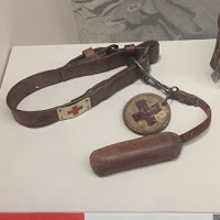
Fascinating exhibition at the Science Museum looking at how the wounded were treated in the First World War and the innovations that were driven by the lessons learnt. I thought I had a good knowledge of the First World War but I learned so much from this exhibition. The first section looked at the chain of evacuation of the injured from the battlefield with displays on each stage from treatment on the front line, though dressing and clearing stations to hospitals and the journey home. There was a wonderful model of a hospital train and I found the front line stretcher moving. I also loved the Red Cross dogs collar. I hadn’t realised the dogs went out onto the battle field and sniffed   to find men who were still alive. They then pulled a piece of clothing off the wounded and took it back as a sign of life. The next section looked at the technological breakthroughs including Marie Curie bringing   x-rays to the front line, a new splint which was developed as ...

Feeding the 400

Image
Poignant exhibition at the Foundling Museum looking at how the institution fed the children in its care. This was a beautifully displayed exhibition and became a history of food in general as well as at the Foundling Hospital. There was good use of art works to illustrate points as well as great archive material. It looked at the social side of food with the idea of what and how the foundling ate emphasising their place in society. There were also interesting displays on feeding infants and the research the hospital did. Originally they had fed babies on bread soaked in milk but they realised there was a high death rate so they switched to using paid wet nurses. I did find it heart-breaking though that a baby would we with a wet nurse until about he age of 3 or 4 by which time the child and nurse must have bonded. How hard it must have been for both of them when the child returned to the hospital and institutional life. I learned some things I’d never thought about, l...

The Fantastic Barbican World

Image
Nice little exhibition at the Barbican looking at the design of the flats in the Barbican Centre. I was astonished to learn that more than half the population of the City of London lives in the Barbican. The architects Chamberlain, Powell and Bon recognised the need for different forms of living and there are more than 100 different types of flats in three towers and 17 designs of terraces houses. One of the aims of the project had been to get people back to living in the City after the war. The display included floor plans of the different types of flat alongside photographs of how people had adapted them. There were also models of the various types on internal and external staircases. Since 2001 any changes need to get listed building consent so it has become harder to adapt the space. I particularly fell for a flat with upside down arched windows! Closes on 16 April 2017

Bedwyr Williams : The Gulch

Image
Strange installation in the Curve Gallery at the Barbican Centre by Bedwyr Williams. I’m afraid I just didn’t understand what this work was trying to say. I read the explanation a couple of times but didn’t really understand that either! There were things in it I liked like a stuffed goat and singing running shoes but I’m not sure what they meant or how they related to the other items. Closes on 8 January 2017  

The Vulgar: Fashion Redefined

Image
Vibrant but slightly confused exhibition at the Barbican looking at the concept of the vulgar in fashion. I say confused as I’m not sure it ever got to a good definition of what Vulgar is. The main conclusion seemed to be that vulgar meant lower class often with the implication of people trying to act and dress outside their class. This seemed quite patronising and didn’t sit well with the designer clothes which made up the majority of the show. I did like the fact that show was curated by both a fashion curator and a psychoanalyst however that may have been what added to the confusion. It did give you good ideas to go away and think about. However the show was visually stunning! I liked the fact the show included a lot of historical ideas and them also looked at how those ideas are used by modern designers. There was a lovely display in the middle which could be viewed from both levels of 18th century clothing and modern designer versions. There were some great outfits an...

Adapt or Die: Adaptations at the National Theatre

Image
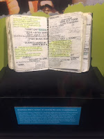
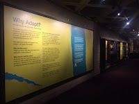
Nice exhibition at the National Theatre looking at why and how the theatre adapts works for the stage which have started in another format or language. This was the first exhibition I’d been to which used code and Blippr to deliver further information. You pointed your phone with the Blippr app on it at the code and were shown a video or extra text. Sadly I couldn’t get the one where Idris Elba appeared from his Everyman costume. I loved the fact the show looked at some of my favourite shows there. It began by looking at two adaptations of medieval plays, The Mysteries and Everyman, and talked about how to bring them to a modern audience. It also looked at Carousel and the controversy of casting a black actor as Mr Snow, a touch I’d thought was brilliant at the time. I also loved seeing the actors annotated script for the Waves which was a wonderful complex adaptations of the Virginia Woolf novel in which six actors swapped roles and played the different characters.

National Theatre Archives visit

Image
Inspiring visit to the National Theatre Archive arranged by the Association of Pall Mall Libraries. I am such a fan of the National Theatre so found it magical to get a chance to visit their archive. The archivist, Erin Lee, was very welcoming and talked with such enthusiasm about the archive and her role there. She talked us through the various collections and how they promote and use them. From the amount of projects she mentioned I assumed she had a large staff but it turned out to be her and a couple of trainees and project related people. I was so impressed by her energy. We had a look in the basement at how the archive was organised and she opened a few of the production boxes to show us programmes, notes and sketches. She had open a prompt book and there was a set model on show. She then took us over to the theatre itself to show us her current exhibition (which I’ll review next) and talked about how she calls on other departments at the theatre to help her put thes...

The Radical Eye: Modernist Photography from the Sir Elton John Collection

Image
Wonderful exhibition at Tate Modern looking at modernist photography in the first half of the 20th century. The show was fascination as it gave a good overview of photography in this period when artists were transforming how photography could be used. It picked good clear themes to look at such as portraits, the start of documentary photography and abstraction. There were some amazing pictures such as a wall of portraits by Irving Penn taken in a wedge shaped set which gave a sense of confinement. I loved the one of Duke Ellington. A very art deco photo by Rudolf Koppitz of three women in long black outfits with a naked woman in front creating a wonderful contrast against the black. I liked the section on how taking a different view on a real object can create an abstract image such as Emmanuel Sougez picture of half a cabbage and Aleksandr Rodchenko’s picture up a transmission tower. As interesting as the individual works was to look at the pictures as a collect...

Bedlam: the asylum and beyond

Image
Fascinating exhibition at the Wellcome Collection looking at the history of the Bedlam asylum and the treatment of mental health. This show was a good mix of good historical displays and contemporary art installations to help illuminate some of the ideas. It looked at how in ancient times the asylum was a space, often a religious place where individuals could seek refuge. I was fascinated in the sections on the town of Geel in Flanders which became a place of pilgrimage, as it housed the shrine of St Dymphna, the patron saint of the ‘mentally distracted’ in medieval times. In modern times the town still offers a system of ‘family care’ where ‘Boarders’ live with families and are part of the town’s life. The sections on Bedlam itself were really well presented and much helped by the slide show put together by Rev Edward Geoffrey O’Donoghue, chaplain from 1892 to 1930, compiled to illustrate the regular lectures he gave as part of a programme of entertainments for staff and ...

In Conversation: Picasso and Sylvette David

Image
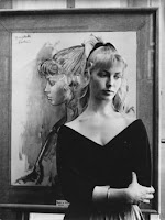
Magical interview at the National Portrait Gallery with Lydia Corbett, also called Sylvette, who modelled for Picasso in the 1950s. She was the model with the pony tail. She was interviewed brilliantly by the curator of the current Picasso Portraits exhibition, Elizabeth Corbett. Sylvette was delightful but slightly whimsical and the interviewer managed to gently bring her back on track whist also enjoying all the stories which emerged. She talked about how she met Picasso with her fiancé, Toby, when he delivered a chair he had made to Picasso and went on to model for him for a number of sittings over a short period of time. She also talked about how Toby helped Picasso make the sculpture of her which is in the show. The most interesting bit was when she talked about the fame which came after the sittings. She had been due to be on the cover of Paris Match but Collette died and got the slot instead!

Taylor Wessing Photography Prize 16

Image
Varied exhibition at the National Portrait Gallery of the shortlisted entries in this year’s Taylor Wessing Photography prize. Early on in the show I loved two portraits by Fabio Boni of Italian Red Cross volunteers. Photographer against red back grounds in their uniforms emphasising their wonderful older faces. Also on the subject of age I loved Karsten Thormaehlen’s picture of the last living American to be born in the 19th century, Susannah Mushatt Jones, whose grandparents had been slaves. I liked Dexter McLean’s picture of his sister with her mobile phone camera over her eye, a comment on how relationships are becoming filtered through smartphones and social media. There was a striking portrait of Simon Callow by Andy Lo Po, a reflective and detailed picture. Closes on 28 February 2016  

John Gibson RA: A British Sculptor in Rome

Image
Delightful exhibition at the Royal Academy looking at the work of John Gibson, a Victorian sculptor who settled in Rome. I had come across Gibson before as he trained in Liverpool and there is some of his work in the Walker Art Gallery. His patrons in Liverpool paid for his to travel to Rome to train for three years but he never returned. He initially worked in Canova’s studio but soon set up his own studio which became one of the largest in Rome. It was interesting to see a change in his output following the French Revolution. Up to that point most of his work had been on commission but after that he began making plaster models of his ideas which he work in marble or bronze once purchased. I loved the inclusion in the show of some of his account books which listed his assistants who were also know to work for other artists. The show was also good at showing method and liked the sketch and worked up sculpture of the meeting of Hero and Leander. I loved his touching me...

Intrigue: James Ensor by Luc Tuymans

Image
Weird but fascinating exhibition at the Royal Academy of the work of the James Ensor curated by the contemporary artist Luc Tuymans. I liked the opening section which looked at his early life in Ostend and how this affected his later work. Some of his family ran a curio shop selling seaside souvenirs and carnival objects such as masks. He also witnessed the disinterment of mass graves from the Siege of Ostend in the early 17th century to make way for building work so he would have been used to the site of skeletons. All of this helped to explain his strange later art focusing on masks and skeletons which seemed to come from nowhere. Some of the early work reminded me of Sickert as it was a bit muddy brown in colour and atmosphere. I liked his visceral still lives such as “The Skate” from 1892. I also liked the mix of the ordinary and weird in his work. In one beautiful picture on an interior, possibly a studio, you suddenly reason the figure on the chair is a skeleton look...

Abstract Expressionism

Image
Interesting show at Royal Academy looking at the work of the American Expressionist artists. I’ll come clean straight away, as you’ll know if you read these mutterings, I don’t like abstract art and I found some of this particularly difficult. I went to the show, apart from the fact I try to get to everything, to learn more about the form and maybe start to appreciate it more but I’m afraid it didn’t work! I liked the way the show was roughly arranged by artists or groups of artists with some of them getting early and late rooms so it gave you a distinct view of all of them. I still love Rothko and I’m not sure why! I remember the wonderful Tate show a few years ago which explained the work well and I really warmed to it. However the rest left me quite cold. I get that the work is about the artist expressing their emotions but given how many of them seemed to end up committing suicide I’m not sure that expressing them helped! I like art to uplift me and enlighten me n...

Money and Power

Image
Nice exhibition at the Guildhall Art Gallery of photos commissioned from the London Gay Photographers’ Network on the gallery’s collecting themes of money, power and politics. Sometimes the work lacked subtly and seemed to be an excuse to take nude photographs. I liked Graham Martin’s pictures of a naked business man and got that we were meant to contemplate what lead this man to be naked on a beach with his brief case and the FT but it felt a little strained. Other pictures worked better and I liked Carl Doghouse’s self-portrait with his face covered in money, with the idea than money can mask personality. I loved Soken Higgwe’s picture of Canary Wharf rising from the mist. Also some of the pictures which addressed lack of wealth such as one by Georgios Tampas of a girl sitting on the street next to a Mercedes. Closed on 6 December 2016  

Victorians decoded: Art and Telegraphy

Image
Strange exhibition at the Guildhall Art Gallery looking at the effect on art of the coming of the Telegraph and the changes that made on Victorian art. It marked the 150th anniversary of the first telegraph cable to be maid across the Atlantic and I rather enjoyed the section looking at this. I hadn’t realised the cable was made in Greenwich, near where I live. As the cable was laid across the ocean it was tested all the way. I was also fascinated by the company code books as telegrams could be read by strangers at various stages so firms moved into sending coded messages for confidentiality. I had assumed the show would be full of art showing people reading telegrams or pictures of cabling work however instead it looked at how people thought in a different way with sections on distance, transmission, coding and resistance. There were lots lovely pictures of beaches, ocean and rocks which were meant to show how people were looking across the seas and how the world was beco...

Woolwich Contemporary Print Fair

Image
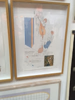
Interesting art fair at Royal Arsenal Riverside focusing on work by print artists organised by Brocket Gallery and Berkeley Homes. There were some really nice work and I liked the way it was displayed with an artist’s work being scattered round the show so that you started to recognise their style. I particularly liked Claire Hynds work deconstruction areas of the South Bank into broken up architectural details. My favourite though was Jenny Weiner’s reinterpretations of well-known art works, again deconstruction them to their basic colours and shapes and sometimes rotating the scene. They made you think about the original works in a new light. Closed on 20 November 2016