Posts

Showing posts from April, 2014

Beatrix Potter: the Land, the Seasons and the War

Image
Display at the V&A of work by Beatrix Potter from the years of the First World War. I must admit I thought this was stretching First World War shows a bit far! It was an interesting display and I guess said a bit about the home front but I did feel it was a connection getting pulled too far! I did like the section on how she got political just before the war and campaigned against the requisition of land horses producing a pamphlet about it with lovely illustrations. Her family described this a “The year Bea went into politics”. The rest was a bit marginal with some reference in letters to changes in the land such as women working on farms and some wistful pictures of the countryside, although as some of those were pre-war I wasn’t sure how they fitted in.
Memoirs of an Infantry Officer: Paul Hogarth Illustrates Siegfried Sassoon

Image
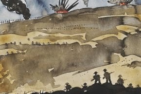
Small display at the V&A of illustrations by Paul Hogarth from 1981 for a Limited Editions Club edition of Siegfried Sassoon’s World War I Memoir. The illustrations related to specific passages of the book and drew on contemporary art of the time. One picture called “The Raid” had a Nevinson like feel to it with a big angular explosion at the top. Many of the pictures has long foregrounds which I liked. Others were small black and white sketches such as one of a rat and tin cans. My favourite was one of a hospital ship, a portrait shaped picture with ¾ of the space being taken up by sea with the ship with red crosses on pushed to the top of the picture. It reminded me of the book I have just read about World War I nurses in a ship Wreck, Thomas Keneally’s “Daughters of Mars”.

Selling Dreams: One Hundred Years of Fashion Photography

Image
Interesting exhibition at the V&A giving an overview of the last hundred years of fashion photograph. The title comes from a quote by Vogue photographer Irving Penn that photographers are “Selling dreams not clothes” and that quite sets up a tension throughout the show between photographers and those who are commissioning them. At least two Vogue editors are reported as asking photographer to concentrate on the clothes more. I love the quote from editor Carmel Snow “You are not here to make art, you are here to show the buttons and bows”! I think I am with the editors! I think the art of fashion photography is showing off the clothes and I dislike pictures where you can barely see what a model is wearing. They are still good photographs just not fashion photographs. This show was a bit of a quick romp through the genre from Edward Steichen’s 1911 pictures of dressed by Poiret seen as the first fashion photographs though to the images from the 1980s more interested

William Kent: Designing Georgian Britain

Image
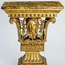
Opulent exhibition at the V&A looking at the life and career of the Georgian designer William Kent. This was a beautifully displayed show with the falls in dark Georgian colours but the section dividers in white glass etched with sketches by Kent though which there was a lovely vista to a chandelier. Kent began as a painter but also became an architect and designer for the stage and of gardens as well as being the first British designer to tackle a whole interior. There was a lot about the work which came out of his friendship with Richard Bogle, 3rd Earl of Burlingotn and his friends Alexander Pope, Handel and John Gay which gave a wonderful picture of society and life at the time. I loved the section on the work he did for the Royal family including a barge for Prince Frederick and a Palace which wasn’t built for Richmond. I also didn’t know he designed much of Horse Guards Parade so I can’t wait to go and have another look at it.     The section on garden

The Glamour of Italian Fashion, 1945-2014

Image
Elegant exhibition at the V&A looking at the growth of the Italian fashion industry and what makes it different. The first section of the show was chronological starting with the post war industry based on artisan craftsmen where fashion was used to boost the economy, through the growth launch of the Sala Blanca fashion shows at the Pitti Palace in Florence and the role of the Hollywood films made in Rome. The second section began with the role of the stilista in Milan, who aimed to create the perfect style. It then looked at different materials and ended with a wonderful room of brand designers seen as modern taste makers. There was a lovely section on the role of local dressmakers with a great collection of clothes owned by Margaret Abegg and made by Maria Grimaldi which discussed the relationship between women and their dress makers. This was lvoely because Margaret was not a standard model shape and it was nice to see how the clothes would work on more normal

Empire Builders 1750-1950

Image
Interesting exhibtion  at the V&A looking at the work of British architects working aboard up until the end of the Second World War. There is a sister exhibition at the RIBA bringing this up to date which I hope to make it to this week. It was themed by type of building but might have been better themed chronologically or by country. I found theming my type of building made is a little bitty and lost a sense of story and progression. I also found the commentaries quite wordy and dense. There were some fascinating things though. I loved Gibbs book of designs including St Martin’s in the Field led to the reproduction of those buildings all over the world alongside pictures of some of those buildings. I responded most to the designs for housing from bungalows to blocks of flats. There was a lovely Lutyens design for a house on the Hudson River which was never built.

The Craze for Pastel

Image
Nice exhibition at Tate Britain looking at the 18th century fashion for using pastel as an alternative to oil paint. The show marks the new acquisition of Ozias Humprehy’s “Baron Nagell’s Running Slave” a beautiful portrait of a black servant in exotic livery. It was interesting to see how well known artists had used the medium with works by Constable, Gainsborough and Turner,   who used it for a lovely rapid sketch of the Belvedere Apollo.   My favourite though was the lovely portrait probably by Wright of Derby of a man with flowing hair. It was also interesting to see how the genre grew with using pastel to imitate oil paint but then moved round for oil to try start to imitate the effect of pastel. The fashion partly died out due to the growth in neo-classicism which called for a more austere and defined style.

Source

Image
Thought provoking exhibition at Tate Britain which compares the old salon style hanging of pictures to the modern fashion for social media to show a large number of images in a single location. There was a wall of closely hung modern pictures on one wall facing another wall of the same images held online being put into different orders and displays. The closely hung wall was fascinating as you did gradually see recurrent themes and works by the same artist whereas at first you just saw muddle. With the social media wall your eye just got used to one format and it changed. I am not sure the parallel was completely correct as I view social media images as lots of images but one at a time, not as a page of images however it does show the same idea of images fighting to get your attention and hold your eye. I wasn’t sure where the sound boxes fitted in as they weren’t working when I was there!

Forgotten Faces

Image
Interesting display at Tate Britain of portraits from their collection which have been stars of gallery in the early 20th century but have since fallen from fashion with the popularity of Modernism. I must be an old fashioned girl because I thought there were some lovely pictures. I already knew the beautiful Edwardian lady walking her dogs “Diana of the Uplands” by Charles Wellington Firse well from a National Portrait Gallery exhibition but I can’t for the life of me remember which one. I just remember that the woman in the portrait, his wife, went on to be head of the Wrens and girl guides! I think my favourites were the two by Ralph Peacock one of his wife’s sister Ethel and one of his wife and Ethel together. They are both lovely pensive pictures of Edwardian girls. I loved the commentary on one picture by Gerard Kelly which said he was “as famous in his day as he is forgotten now.” The show was a good example of why you shouldn’t just show the fashionable in gal

Dock 2014

Image
Huge installation at Tate Britain by Phyllida Barlow. I loved the way it filled the space of the Duveen Gallery. Your instinct looking from one end is that it’s big but as you walk down you realize there are more pieces filling the space behind the first one. I liked the sense of weight the first piece had yet when you look closely the large hanging metal looking boxes are made of foam and polystyrene. When I was there people were enjoying having their photo taken with it pretending to be lifting up some of the blocks.   I wasn’t so sure about the big cardboard pillar with coloured tape round it! I must admit I have no idea what it was trying to say and I could hear a particularly tidy friends voice in my head saying ‘messy’ at the pile of wood in one corner but generally I liked it! Reviews Times Telegraph Evening Standard    

Boro

Image
Fascinating exhibition at Somerset House of this Japanese textile work made up of patches and layers of cotton made as bed covers dating from the 17th century to the 20th. Think of a sort of patchwork made from worn out biker jackets! Although they came from a need of poverty they had a certain gentle artistry with a limited colour palate of brown, blue, grey and black as those were the colours commoners were restricted to wearing. The cloth was traded by merchants as disused documents almost like shoddy. Not many have survived as the Japanese establishment were embarrassed at the poverty from which they came. Some of them have a wonderful feeling of depth as the material has been layered complete with its holes. Some of the top layers are little more than threads. This makes you look at them really carefully and speculate on the lives of those who made them. It’s odd but your eye makes modernist art out of them although there is no evidence that the modernists saw the

From Vera to Veruschka: The Unseen Photographs by Johnny Moncada

Image
Exhibition at Somerset House of fashion photographs by Johnny Moncada of Veruschka before she became a supermodel. I have to admit I’d not heard of Veruschka, and I thought I was into fashion and fashion photography! For those like me she was the first sixties supermodel pre dating Twiggy. This show was therefore a bit lost on me. I did come back and Google as I realised I was missing something! They were nice pictures and I particularly like one of her in a swimming customer lying half in and half out of a rock pool. But I just didn’t get I was supposed to be wondering at the person not the clothes or the photographs. It was not helped that the gallery was full of an art class having a chat and not really looking at the work. Definitely a case where I should have done some homework first or maybe a bit more commentary might have helped me!

Burnt Generation

Image
Interesting exhibition at Somerset House of work by eight Iranian photographers on the theme of dissolution, loneliness and the dissolution of youth. The works were shown in a lovely large format but I would suggest using anti-reflective glass as on a nice sunny day it was difficult to see some of the pictures without a lovely image of yourself in the middle of it! A number of the pictures reminded me of the art historic idea of the history painting such as Azden Akhlaghi’s recreation of events from eye witness accounts and Gohar Dushti’s created scenes in a barren landscape. I particularly liked one of those of 11 women in black on a very long sofa. Babek Kazemi’s pictures of house numbers super imposed with pictures of local people were quite moving giving an idea of the life which might have gone on in the houses before the population was displaced.

Janey Morris: Pre-Raphaelite Muse

Image
Small exhibition at the National Portrait Gallery of pictures of Jane Morris, the wife of William Morris, model and embroiderer. I thought I had a good knowledge of Jane Morris but I learnt a lot from this small display. I hadn’t know she had an epileptic daughter who she nursed and that not only did she probably have an affair with Rossetti but also with Wilfred Scawen Blunt, a poet and Irish and Egyptian nationalist. I got a real sense of her having a lot of female friends in her circle and I loved a picture of her on holiday in Sienna with two daughters of an MP and one of their husbands, taken against a photo study backdrop of the city with the man lounged at the women’s feet. One of the women went on to become the first women on the London County Council. I also liked the four pictures of her as an older lady only one of which was printed at the time and the plates of which were found in a skip!

Benjamin Britten: a life in pictures

Image
Interesting display at the National Portrait Gallery of photographs of Benjamin Britten and his circle to mark his centenary. I loved the pictures of him as a child particularly one of him aged 6 with his mother in a production of The Water Babies. You can’t help but compare it with the later one of him with the children in his opera’s such as a lovely rehearsal picture of Noyes Fludde including a child with a squirrel on its head! A lot of the pictures were of people he worked with and made up a wonderful study of the musical and artistic world in post war Britain. I loved the photo of Tippet by Bill Brandt with his set off centre against an abstract looking background. Also the informality of a snap of Britten, Peter Pears and John and Myfanwy Piper in Venice. I must admit to a certain delight at spotting John Shirley Quirk on one picture as he was at university with my parents!

Hans Holbein Re-made

Image
Neat little exhibition at the National Portrait Gallery looking at how the increased demand was met for works by Holbein after his death. It is interesting to see a show focusing on what many might consider to be fakes. It shows a change in emphasis to the modern approach of not only holding up great works but looking at the use of art and market for it. These were pictures bought by people knowing they were not by the great man either because they wanted a high quality image of the person shown or because they wanted to buy into the Holbein style. I loved a small framed sketch they has which was an studio pattern of Fisher showing the holes and pounces used to reproduce copies. It was also interesting to see the evidence that the picture of Sir Thomas Moore had been produced on the continent, the wood and primer used, which showed that this reproduction of work was not confined to Britain. Review Telegraph

Stubbs “Whistlejacket”: A longer look

Image
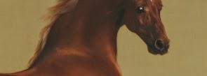
Interesting morning at the National Gallery looking in detail at Whistlejacket by Stubbs led by Nicholas Pace. I know very little about Stubbs so found this session fascinating. I love the picture but knew very little about it other than the slightly random fact of where it was painted for. The talk took us through the amazing anatomical studies Stubbs made of horses and how he went about them, grizzly but interesting. We then went to look at the picture and he talked more about why it may look the way it does and whether it was ever meant to have a background or even a rider. Back in the seminar room we looked at his later work particularly of more exotic animals and of fighting horses and lions which he hoped would boost his reputation with the Academy. What fascinated me most though was seeing Stubbs as an artist of the Enlightenment (forget any hideous time frames which might place him as Rocco!) and very much part of his time working for the rich young gentry and

Who was Veronese?

Image
Delightful seminar looking at the current Veronese exhibition at the National Gallery given by Colin Wiggins, a curator of special exhibitions at the gallery. This was a fascinating mix of the life of Veronese and a look in detail at some of the works in the show. There were some great close ups of details of pictures and much talk of how Veronese loved the ‘stuff’ of painting, the paint, the colour, the canvas etc and however much of illusion he created he never let you forgot it was done with pain. Colin gave lovely descriptions of the work but had to stop himself using the word gorgeous yet again at one point! He also shared my love of Veronese’s dogs! Colin was also fascinating as he puts on shows by contemporary artists at the gallery and talked a lot about how Veronese influenced contemporary art. I would never have seen this for myself but he had some good examples of very abstract Bridget Riley which followed a Veronese colour pallet and pattern form. He also talke

Renaissance Impressions: Chiaroscuro Woodcuts from the Collections of Georg Baselitz and the Albertina, Vienna

Image
Fascinating exhibition at the Royal Academy of a particular type of print made using multiple woodblocks. I must admit this is probably one for the Renaissance geeks but I loved it. It was so interesting to see the development of such as specific art form and how it developed. It is well worth watching the film. I find reading about a print technique quite difficult as things seem to get complicated quickly but seeing a current RA producing a picture gave such a good idea of what was involved and helped you appreciate the fine work. There were also some good examples where multiple versions of works had different base tones which showed what a difference it made to the final imagine.   I was interested in the fact that many of the works were form the collection of George Baselitz as his own print work is included in a show at The British Museum at the moment. I loved the originality of the early German artists although a lot of the work was heavily influence by Durer.

Excavations

Image
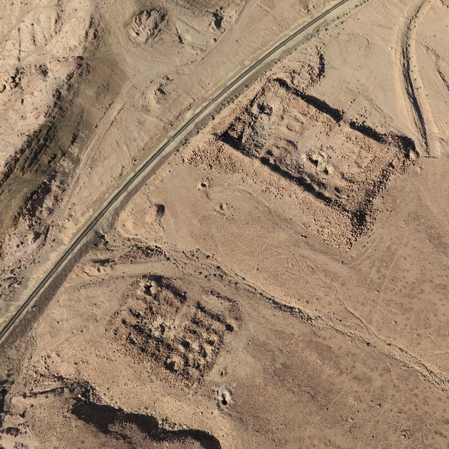
Interesting small exhibition in the Hayward Gallery Project Space of work using aerial photography by Jananne Al-Ani. These works are part of an ongoing project “The Aesthetics of disappearance: a land without people” and it examines what happens to the evidence of atrocities and how it affects the landscape. Reflecting the use of aerial photography she shows recently occupied by now deserted spaces which are now defined by their lack of people. These were haunting images and I liked the way similar images were given a variety which made you look more closely by showing them in different ways, in a light setting and a dark one, as projected film and as a small film to look down on.    

Martin Creed: What’s the Point of It?

Image
Surprisingly good retrospective of work by Martin Creed at the Hayward Gallery. This was definitely a show I went to on the grounds I go to everything I can. The reviews in the papers had been dire and I hated his Turner Prize winning room with the light going on and off but in for a penny (or in this case £11)! However I loved it! Just walking into the first room to be greeted by the huge rotating neon sign saying “Mother” made me smile, particularly when it speeded up and I felt like I was being chased! The aforementioned lights were in a room with other works and I liked it better in that context as it meant things, in the case a wall of broccoli prints and a video with two dogs on, appeared and disappeared or blended into the gloom. I found the whole exhibition an element of ‘the take it or leave it’. If there was something you did find nonsense, I didn’t get the pile of cardboard boxes and never found the Blu-Tack, just walk on and you’ll find something else to m

Two sets of Picasso linocuts: Recent acquisitions

Image
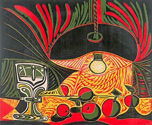
Really interesting display at the British Museum of two sets of recently acquired linocuts by Picasso. They were fascinating because they had not only the finished work but also the progressive proofs showing a version of each stage of the process. The commentary explained the process really well and I was fascinated to see how the work built up from the palest colour to the darkest. You really appreciated the skill needed to build an image up by cutting back the detail at each stage rather than adding to it and how he created detail from colour not just line. I preferred the colourful “Still life under a lamp” but it was a lovely contrast to the black and white “Jacqueline Reading” where some the detail had been created by scratching the surface of the lino with a metal comb. All a long way from my old junior school efforts!

Germany Divided: Baselitz and his generation

Image
Exhibition of prints at the British Museum of six artists from post War Germany from the Duerckheim collection. All six artists Georg Baselitz, Markus Lupertz, Blinky Palermo, A.R. Penck, Sigmar Polke and Gerard Richter, had loved in East Germany but migrated to West Germany either in the 196os or early 1980s and the exhibition highlighted how this was reflected in their work. I have to admit I didn’t find much of the work particularly attractive but I was interested in how they had been influenced by earlier work such as Baselitz’s reaction to seeing Mannerist paintings in Florence.   I liked the fact the works were shown with earlier prints to place them in the tradition of German print making but felt the early works did show up the crude nature of the later work. Most modern prints hung alongside a Durer are going to come out of it badly! Review Telegraph

Court and craft: a masterpiece from Northern Iraq

Image
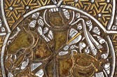
Nice exhibition at the Courtauld Gallery focusing on a wonderful 14th century bag made in Mosul in Northern Iraq. The bag itself is beautiful. It is in brass with silver and gold inlay and has a hinged lid. It would be a really useful, practical bag shape even today. The show looks at what the bag might have been for and how it fits in stylistically with other work from that place and time. The show also uses it to illustrate court life as the motif on the top is a court scene and I particularly like the display where they had an enlarged picture of the scene with example of objects in it in front and highlighted in the picture. They also showed other works which had been made for that court such as a beautiful copy of the Qur’an.

Photo Noir: the art of Cornel Lucas

Image
Interesting exhibition at the National Theatre of portraits by Cornel Lucas, the only stills photographer to be awarded a Bafta. Most of the works in the show came from the time he worked at Pinewood Studios from 1950-1959 and included wonderful shots of the stars of the day such as Katharine Hepburn and Bridget Bardot. I loved a study of Gregory Peck which showed every pore and hair follicle and reminded you how handsome he was. There were some later works such as a fashion shoot on scaffolding and a young brooding Cliff Richards. Also a lovely shot of Penelope Wilton as a big eyed 1960s girl. Review Telegraph  

Introduction to art history

Image
Brilliant four day course at the Courtauld Institute led by Anne Puetz and Clare Richardson which did what it said on the tin, provided an introduction to the study of art history. Day 1 looked at what the different periods and isms were and how their styles distinguished them. It also looked at why it can be dangerous to try to shoehorn art into a definition. In the afternoon we went into the gallery and split into two groups to discuss the issues raised in the morning in front of the pictures. Day 2 looked at artistic techniques and how paintings were made and the materials used also at the different genres of painting. In the afternoon again we split into two groups spending time in the conservation studio and the print and drawings room. I am always fascinated to see conservation work in action. I’d also never been to the Courtauld print room before and it was good to see new things and discuss the different uses of drawings and prints. Day 3 was the most stimu

Crivelli's 'Annunciation with Saint Emidius' : A longer look

Image
Excellent morning’s workshop at the National Gallery led by Dr Richard Stemp looking in detail at the gallery’s Annunciation by Crivelli. We began by talking about who Crivelli was and where he was working then spent a nice long time at the picture looking at it in detail and talking about its meaning as we spotted things in it. The session had a feeling of discovery about it rather than following a set lecture type pattern. I was fascinated with why certain anachronistic items such as the gourd and apple seemed to come out of the painting towards you. It was also interesting to hear why the painting was produced and what it celebrated. I have always been fond of this picture with its odd mix of a real scene and city but with a mystical event happening in the middle of it. The morning made me look at it afresh and with the added knowledge to inform my viewing.