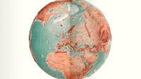
Maps and the 20th century: Drawing the Line
Fascinating exhibition at the British Library looking at the history of the 20th century
through maps.
The show had nice
clear themes of mapping a new world, war, peace, the market and movement. I
loved the colour palette used for the display and the idea of putting maps of
different styles on the floor to gently guide you round. I liked the idea of
putting two maps together as a contrast, often one from early in the century
and one from later; however it was annoying that, as the labels were always on
the right that this meant the label was therefore a long way from the first
item you looked at.
I would like to
have seen a bit more about how the maps were made but I liked the fact they
didn’t just talk about geographical maps but also about how maps can be used to
show data about economic and social issues. They also looked at maps as art
works and how they are often used to communicate an idea.
There were some
wonderful maps and objects in the show. I loved the Haig map from the First
World War, a 3D map pf the Western Front made by cutting up a map and sticking
it on built up wood to create the contours of the land. Also a Belfast rifle
map, used by the British Army during the troubles which colour coded the
Catholic and Protestant areas and was shaped to be stuck on the handle of a
rifle for easy access.
I found two items
very personal. The 1948 London A-Z was open on the page where I live while it
was still a munitions factory and there was a German Blitz map for Liverpool,
where my parents were as children at that time.
It was lovely to
see John Benjamin’s Ordnance Survey maps with wonderful doodles on them such as
tracery windows on the map of Nottingham. Also Tolkien’s original map of Middle
Earth drawn on graph paper so he could work out realistic travel times.
Closes on 1 March
2017
Review
Telegraph


Comments