Posts

Showing posts from 2018

Rachel Maclean: The Lion and The Unicorn

Image
Funny video installation at the National Gallery by Rachel Maclean looking at the relationship between England and Scotland. I loved the way the room was set up like a grand theatre with red and blue drapes and comfortable pouffes. The film lasted about 15 minutes so it was easy to wait for the beginning and watch it in full. You know my usual moans about long video art! The film featured real recordings of the Queen being mimed by Maclean in a wonderful, lavish comic costume. It was odd to see this strange figure speaking with such a familiar voice. The two countries were then represented by the lion and unicorn of the title, based on an interview of Alex Salmon (Unicorn) by Jeremy Paxman (a very suave lion). Again there were lovely lavish costumes and the comedy figures emphasised the difference in the two characters. It’s rare that a video installation makes me laugh but I did laugh out loud at this one and yet it was also making very valid and interesting points. ...
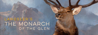
Landseer’s The Monarch of the Glen

Image
Small but full exhibition at the National Gallery to mark the loan of Landseer’s “Monarch of the Glen” from the Scottish National Gallery. It’s rather fun as you walk towards the gallery to see this wonderful clique shining out from the wall. Like many art cliques it’ a much better picture than the endless shortbread tins and whiskey bottles convey. I loved the white highlights on the horns and on his nose which give it a sense of space and scale. The show put this picture in context including some Stubb’s anatomical pictures which Landseer copied and pointing out that Whistlejacket is a precursor for this picture. It also hung it with other pictures of staffs by Landseer including a copy of a now lost mural by him by Queen Victoria. The show discussed Landseer’s religious views and hinted that the stag is actually an allegory for the risen Christ. Antlers, which fall off an regrow, have often been taken a symbol of Christ and the stance of the stag putting itself in a...

Playing with Scale: How Designers Use Scale Models

Image
Interesting exhibition at the National Theatre looking at how scale models are used for set design. It showed how models had been used in theatre since Ancient Greece and how the standard scale is now 1:25 as it is difficult to incorporate detail in anything smaller. I loved a big display of pencils of different sizes to illustrate what scale means. It then went on to look at six productions in the Olivier starting with the 1977 production of “The Plough and the Stars” to show how scale models had been used in practice. It featured a lot of work by Jocelyn Herbert and included a recreation of her studio with an interview with her from the archive playing on a telephone. Each show featured the scale model used and archive material to describe the design process. It was nice to see show’s I’d seen features such as the recent “Anthony and Cleopatra” and the “Comedy of Errors” from 2011.   The display also discussed how the models are used from being in the room dur...

I Am Ashurbanipal, King of the World, King of Assyria

Image
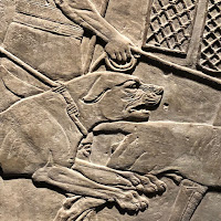
Fabulous exhibition at the British Museum looking at the Assyrian king Ashurbanipal. I love Assyrian art and this show makes you realise how much of what we see is from this period. This is partly because the British Museum led the excavations at Nineveh. The show gave a picture of an absolute ruler but a much more subtle man than we see from biblical texts. The first section looked at the palace at Nineveh and court life. It cleverly used the reliefs to tell this story including sections on banquets and gardens and of course the already mentioned lion hunts. It was also lovely to see other objects from the site such as chair ornaments. I loved the section which discussed the library he created which contained over 100,000 works mostly newly copied in the finest clay. Each piece has his name on it. There was a lovely display of these tablets in a floor to ceiling glass case to give an idea of the enormity and coverage of this reference library. Before looking at th...

Dying for Eternity in the Lion Hunts of Ashurbanipal

Image
Fascinating lecture at the British Museum examining the lion reliefs from Nineveh some of which are included in the current I am Ashurbanipal. The lecture was given by Paul Collins from the Ashmolean Museum. He started by describing the two palaces at Nineveh and looking at where these reliefs were situated. He then went on to describe them in detail with excellent slides and then to try to unpick what they might mean. He compared the very formal looking king with the naturalist lions and pointed out that the hunt was taking place in a formal space not in the wild. He related this to the Assyrian creation myths where the gods overcome chaos and bring peace and stability. The king is therefore showing himself as overcoming the chaos of wild life and building a stable empire. I was lovely to be able to leave the lecture and go to see the reliefs which were left in the normal museum galleries and then to do the exhibition. The lecture certainly shed light on the exhibition wh...

No Man’s Land

Image
Small exhibition   at the British Museum looking at the history of boundaries in the Middle East. The main part of the show looked at the moment when natural boundaries changed to man made one which often led to conflict. The term “No Man’s Land” for disputed territory goes back to the Assyrians. There were some fascinating artefacts from this time including a newly identified border pillar which have shown a white in the landscape. There was also a plaque, shown here,   showing a border ceremony. It was nice to show these items with photographs from the 1980s by Ursula Schulz of the Ur and Uruk landscape which has since been destroyed but war and the Picot agreement which divided up the area following the collapse of the Ottoman Empire. Closes on 27 January 2019 Review Times

Yakov Chernikhov 1889-1951: The Soviet Piranesi

Image
Colourful exhibition at Alon Zakaim Fine Art of work by the Soviet artist, Yakov Chernikhov. Chernikhov was an architect and a theorist on the art of drawing who organised his own Research and Experimental Laboratory of Architectural Forms and Methods where he taught drawing. This show was mainly his geometric abstract works in gouche and ink. Many of those had a structural 3D effect and were in bright colours. They are very precise works and I liked one like a brick plus his lively colour combinations. There were also some architectural works. I wasn’t sure if they were real designs or fantasy works. But I liked the shadowy backgrounds. Closes 21 January 2019

The Gentileschi Effect

Image
Interesting exhibition at Robilant and Voena looking at the art of Artemisia Gentileschi and its influence. This was a small show of two rooms which sadly didn’t include much by Gentileschi in fact there was only one and that was a new attribution. It was a full length portrait of a man in black, Antoine de Ville, and identified as a Gentileschi by her initials in the silver trinkets around his neck. It was a striking picture but I found the head a little small and not quite in keeping with the body. There was also a picture by Gentileschi’s daughter, Prudenzia, “Allegory of Rhetoric” possibly after a picture by her mother. It was a nice touch to hang it with a modern take on the work by Francesco Vezzoli. Other interesting works in a similar style included a Guido Cagnacci and a Luca Giordano. I also loved a nice Pompeo Batoni. Closes on 18 January 2019

Hooked

Image
Thought provoking exhibition at the new Science Gallery at King’s College London looking at addiction. The show uses both scientific discoveries and contemporary art to look at when habit becomes an addiction and when pleasures become darker. I was fascinated by the section which looked at phone and digital addiction which got me a bit worried about the amount I use my phone.   The commentary pointed out how addictive behaviour increased activity in the brain’s reward centre which creates dopamine and discusses how recovery processes deal with that loss of dopamine. Works I enjoyed included “No Change” a slot machine by Kyros which just shot your money back out at you and the broken sugar table pictures here. Also a screen which just says “Please don’t like this” with a Like button, needless to say 274 people had pressed it when I was there and I must say it was very tempting and “The Curtain of Broken Dreams”, made by Natasha Caruan made of found gold rings. Close...

Christine Ay Tjoe: Black, kcalB, Black, kcalB

Image
Dull exhibition at White Cube Bermondsey of new work by Christine Ay Tjoe. These works were black and white abstracts which could also be called a splodgy mess. They made me think of ink blot pictures used by comedy psychiatrists and hence my eye was trying to make out pictures in them which I don’t think were there! The one I attach looked like an exploding vase of flowers. I will say though that there were very painterly splodgy messes. Closes on 20 January 2019

Darren Almond: Time Will Tell

Image
Fun exhibition at White Cube Bermondsey of new work by Darren Almond. These pictures were broken numbers in grids which reminded me of those puzzles you get in Christmas crackers that are muddled up sliding blocks in a frame that you have to rearrange to make a picture. I can never do them! The idea is that numbers are the only true common language and the font used is one used in the urban landscape at stations etc. In each one there is an unbroken zero. I liked the fact they all looked similar but were made in different materials. The show was accompanied by a sound track of a recording of the three working 18th century timepieces by Harrison in the National Maritime Museum which made you look at the works as if they are digital time pieces as well as making you walk in time with the ticking! Closes on 20 January 2019

Night and Day: 1930s Fashion and Photographs

Image
Glamourous exhibition at the Fashion and Textile Museum looking at the fashion of the 1930s. This is one of my favourite periods in fashion history so I wanted a lot from this show and found it a bit thin. The main themes were covered well with good tableau but I’d have liked to see a bit more on who had designed the clothes. There was good booklet with all the information in to save on labels messing up the displays. It described the clothes and added snippets and quotes about the period however it was a bit large to use as you went round the show. There was some fascinating information in the show such as the fact that this period saw improved sizing which made the selling of clothes in department stores easier. It also looked at the growth of women’s magazines. I’d have liked to see more use of photographs given they are billed in the title but there was a nice room of Cecil Beaton pictures. My favourite tableau was the one shown here representing the Coronation...

Portraits and Biography

Image
Packed two day conference at the National Portrait Gallery on the relationship between portraits and the lives of their artists organised by the Paul Mellon Centre. This was an academic conference made up of a series of papers under broad subject headings as well as an excellent keynote paper by Ludmilla Jordanova on what portraits of a profession can tell us using the Royal College of Physician’s collection as an example. We also had a talk by the curator of the current exhibition at the gallery on Gainsborough’s family portraits. Interesting topics which came up included whether anatomical pictures can be considered to be portraits, what an Elizabethan portrait of a family can tell us about the lady of the house and how this is supported by writings about her, Portraits Histoiries in 17th century France, images of Royal mistresses in England in the same period and Harriet Hosmer’s cast of the hands of Robert and Elizabeth Barrett Browning. These two days gave me lots ...

Gainsborough’s Family Album

Image
Charming exhibition at the National Portrait Gallery of portrait’s by Gainsborough of his own family. It was so lovely in this show to see the circle of people around an artist brought back together again. From an early traditional picture of his brother, a non-conformist minister, though numerous pictures of his wife and daughters and even a picture of his dogs you get a sense of an extended family of the time and how it operated. However I have a sneaking feeling this wasn’t just about sentiment but also about practicality. If you want to try out a new idea you can’t really use a commissioned work to do it so much better to turn to your family as a subject to try out in innovative idea. Also what a great selling point to come to the studio, to be welcomed by Mrs Gainsborough and to immediately see a portrait of her as an advert for the artist’s work. Despite practicalities I think the show does include some of the best of Gainsborough’s pictures as we get a real sense...

Renaissance Faces: Lotto’s Portraits

Image
Fascinating workshop at the National Gallery looking at the portraits of Lorenzo Lotto . This day, led by Caroline Brooke, was a good compliment to the current exhibition. She began by looking at what we know about Lotto’s life. She looked at why he traveled so much and how he picked up the styles of the cities he worked in. She also looked at some of his altarpieces as it was these commissions which brought him to the cities and it was while there that he then picked up the portrait work. She also pointed out that he wouldn’t have had a workshop because of his travels and would have to have found new artists in each city to work with him. We then put Lotto’s work in the context of other Renaissance portrait work. We talked about the importance of portraiture in Venice, where he trained, and the influence of Flemish art on his work. We also spent time in the exhibition with a list of questions to consider when looking at the pictures and were encouraged to discuss ...

Annie Albers

Image
Interesting exhibition at Tate Modern looking at the life and work of Anni Albers. It was great to see textile work being given equal status to paint in this show but I did find it elegant but cold. I loved the way the space had been divided by gauze walls making the gallery feel quite different and interesting to find later on that this was a technique Albers had used herself. I was most interested in the early section on the Bauhaus looking at how the school brought together different art forms with equal standing. I was fascinated by Paul Klee’s colour workshop and it was nice to include a picture by him in the show. This was where her ideas of using a grid as the heart of abstraction started. I loved some jewelry she made using everyday objects such as hairpins. I also liked seeing textiles in different colour ways including Eclat J which is still in production. I also loved six hangings in black and gold she made for a synagogue which people sit in front of en...

Christian Marclay: The Clock

Image
Mesmerising video installation at Tate Modern by Christian Marclay. This work lasts 24 hours and puts together clips from films which show clocks and time so that they appear at the correct time of the real day. You can drift in and out, don’t worry you don’t have to watch 24 hours! The room is huge and set out like a cinema but with sofas but it’s a bit hard to find your way onto one in the dark. I dropped in for about half an hour. Watching it seems to make time slow down as you wait for the next minute to tick over and you try to spot the clock and the time in the clip. You also play a game with yourself to try to name the film. I was delighted to spot Big Ben and the Liver Building in the section I saw. I also got a bit of James Bond, a few Westerns and lots of trains, which of course are a rich sauce of time references. I want to try to go back at a different time to watch a bit more and see if the work feels different it you are watching different times of day. ...

Tania Bruguera: Hyundai Commission

Image
Strange installation at Tate Modern by Tania Bruguera. I say strange because it relies on people to make it work and if people aren’t playing then there is nothing there except a black floor. I’d read the reviews and did suspect this might be the case. Evidently if people lie on one side of the Turbine Hall their warmth makes a face appear in the floor of the other side. Hence if no-one lies down nothing happens plus if you are lying down to make it work you can’t see what’s produced so there is no incentive to join in. It does come with a strange low frequency sound which is unsettling as you sort of don’t notice it until it gets into your head. I think the whole thing is meant to be a take on migration and immigration but this doesn’t really come across. It’s such a shame as you can do quite dramatic things in this space but this just left it looking at same as usual but with an unexplained shiny black floor. Closes on 24 February 2019 Reviews Times Guardian ...

Shrouds of the Somme

Image
Beautiful installation at Queen Elizabeth Olympic Park to commemorate the 72,396 British and Commonwealth soldiers who died on the Somme and have no known grave. This work by Rob Heard consisted of a small figure to represent each soldier which he bound in a small hand stitched shroud. These were then laid out in a geometric pattern and filled a section of the park. You could walk around the edge as well as going onto a raised platform to look over the work. It was a nice touch to also have the names of the all the soldiers being read out but the sound system was poor so I only realised when I was standing next to the person doing this. I found this work very moving. Each figure is in a bent shape in their shroud and do not feel at peace.   It’s also astonishing to look at them and realise that even more men died in the Battle, these are just the 72,396 with no known grave. It transformed the incomprehensible number into a visual representation which gave you a sense o...

Mantegna and Bellini: Painting the Renaissance

Image
Excellent course   at the National Gallery looking at the work of and relationship between Mantegna and Bellini. This was led by Caroline Brooke over two afternoons and took the form of a series of lectures. She has a lovely dry style which I enjoy. She sets the work in the context of the time but also has a way of seeing things through modern eyes to share practical ideas. In the first week she looked at the history of the two artists and how their family ties linked them but also why they might have been a reason for Mantegna to move to Mantua to find a market he didn’t have to share with his brother in law. She then looked at the importance of place in their work from the university city of Padua to Venice and Mantua. Finally we looked at their patrons and the difference between being an independent artist in a city and a court painter. Week two led us to look what inspired both artists but also how they were innovative. This covered not only the classical tradit...

Taylor Wessing Photographic Portrait Prize 2018

Image
Interesting exhibition at the National Portrait Gallery of the shortlisted pictures in this year’s Taylor Wessing Photographic Portrait Prize. I didn’t feel there were any of the themes which naturally seem to occur in this show some years but there were some nice works. I liked Toby Carlson’s picture of performance artist Joan Jonas with a see though mask which gave the picture a feeling of having an underdrawing also Daniel 7 by Richard Ansell, one of five children who survived the Grenfell fire, a beautifully lit face against a black background. My favourite work was Sam Wright’s photograph of a defeated boxer which was a touching picture of unhappiness. The winner was Alice Mann with her pictures of drum majorette’s in South Africa whose colourful costumes contrasted with the run down stadium they are pictured in. Closes on 27 January 2019 Reviews Times Guardian

Art in the Aftermath

Image
Touching exhibition at La Galleria of work by soldiers who have found help coping with traumatic events through art as well as the work of Style for Solders who organised the show. This was a case of finding a fascinating world that you hadn’t known existed before. It was an odd mix but all interesting. The art work was excellent particularly the portraits by Stewart Hill who was in the gallery when I went in and came over to say hello. As you can tell from this blog I spend a lot of time in galleries and it is rare for someone to come over and welcome you and engage about the work. I also liked the wall of poems by Karl Tearney which were a wonderful mix of moving and witty pieces. I loved one about suffering from PTSD in the middle of Tescos, a wonderful description of what it feels like and what others can do. The other aspect of the show was looking at the work of Style for Soldiers, an initiative set up by designer Emma Willis to go to Headley Court, the rehabilita...

Fields of Battle: Lands of Peace 1914-18

Image
Interesting outdoor exhibition in St James Park to mark the centenary of the end of the First World War. This used lovely photographs by Michael St Maur Sheil of the landscape affected by the war to talk about issues raised by the conflict. It was beautifully arranged so that as you looked along the displays you saw a line of the pictures but each was accompanied by excellent explanations of each of the areas of the war and common themes it raised. I thought I knew a lot about the First World War but even I learnt new things from this such as the fact that the plastic surgeon Sir Harold Giles who worked at Sidcup to rebuilt men’s faces was a cousin of Sir Archibald McIndoe who did similar work in the Second World War with pilots injured by fire. Also that the Save the Children Fund was founded in 1919 to raise money for children in Central Europe and the Indian government lent Britain money to fund the war. This was the last in a series of touring exhibitions. I rememb...

Beyond the Deepening Shadow

Image
Moving installation at the Tower of London to mark the century of the end of the First World War. Created by Designer Tom Piper and sound artist Mira Calix it filled the moat of the Tower with flames which were started by one flame being lit by a Yeoman of the Guard and this being spread gradually throughout the space. This was a beautiful spectacle but was very popular so the space was very crowded. I was meeting friends there and we just watched from the rim of the moat, once we had found each other! It’s strange to be directed in the opposite direction in which you want to go for crowd control reasons. I never worked out what people were queuing up for. I know before the event you could get tickets to go into the moat but not sure this is what people were queuing for as there didn’t seem to be many people down there. I got a good view from near the entrance to the Tower by standing in tip toe and peering over people’s heads but a much better one from the road to Tow...

Francis Upritchard - Wetwang Slack

Image
Strange exhibition in the Curve gallery at the Barbican of new work by Francis Upritchard.  The website calls it a “site-specific installation which draws from figurative sculpture, ceramics, glassblowing and more”. I’m afraid I found it a bit of hotch potch of work. I liked some of it but wasn’t sure how it hung together as a cohesive statement. I did think it had been displayed well in this strange space as different groups of work appeared as you walked round the curve. I liked the weird figures which welcomed you to the space and the set of ceramic pots with strange faces on them which reminded me of the Roman funeral urns I’d seen a few weeks in an exhibition of Roman Londoners. There was also an interesting take on the Parthenon Frieze at the end. Closes on 6 January 2019 Reviews Evening Standard

Borrowed Light

Image
Colourful installation in the foyer of the Barbican Centre by Troika, a collaborative contemporary art group. The work consists of a scroll of slowly moving multi-coloured wide film running from top to bottom of the building via the light well so it can be seen on every level of the building. The colours blend into each other changing gradually like a sunset. It has the effect of slowly changing the look of the brutalist space around it and bringing in some much needed colour. Closes in May 2019

Modern Couples: Art, Intimacy and the Avant-garde

Image
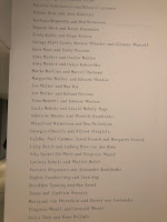
Fantastic exhibition at the Barbican Art Gallery looking at huge range of couples who influenced the avant-garde art world in the early 20th century. There was almost too much in this show and too many stories to follow up. From the first list of couples at the entrance that listed them in alphabetical order of the women I was hooked. The premise of the show was that modern art was about collaboration and mutual influence and to give all those involved an equal status. Throughout the show I loved the mix of art works and archive material. Where ever possible there were letters between the couples which gave them a chance to speak for themselves. There were also great explanations and commentaries. I really don’t know where to start! My beloved Bloomsbury Group were well represented with Virginia Woolf being linked to Vita Sackville-West on the fascinating lesbian section on the ground floor and Leonard on the second floor to look at the work of the Hogarth Press. Vanessa Be...

Lorenzo Lotto: Portraits

Image
Fabulous exhibition at the National Gallery of portraits by Lorenzo Lotto. The show took you through Lotto’s life and travels around Italy and put him in the context of the time. I got the impression of a good artist who realised that he couldn’t compete with Titian in Venice so spread his net further to the outlying cities and carved out a steady career. You often come across his pictures in Renaissance shows and are always impressed by them but he is even more impressive when the work is seen together. I liked the way the portraits were shown with some of the types of objects the figures are holding which emphasised the symbolism of the work. I loved seeing a contemporary dress shown with one of the pictures so you understood how the clothing worked. Also to see a statue that may be the actual one in one of the pictures. It was fascinating to see a portrait with its cover as well as a frame which would have taken a cover. We often forgot that some of these pictures we...

Grayson Perry: Them & Us

Image
Fun and thought provoking night at the London Palladium watching Grayson Perry. Not quite sure how to define this event but decided to include it because of who it was. Part of me wants to call it a stand-up comedy show but it had deeper resonance than that. Basically it was Perry setting the audience questions which we answered via small voting pads. He began by taking a profile of the audience and we had to say if we thought we were urban or rural and various other facets eventually fitting us into two main categories represented by flags. His premise was how we think about others, ie Them and Us. In the second half he went on to link this to the Brexit vote with clever twists which I won’t give away in case you go to see him on his tour. My favourite bit was the build up to the end of the first half when we voted to keep or reject art works for the Royal Academy Summer Exhibition, as Perry had done this year. Of course he gentle led us to reject a picture by Churchill a...

Mimesis: African Soldier

Image
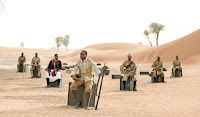
Wonderful video installation at the Imperial War Museum by John Akomfrah representing the Africans who fought and took part in the First World War. Shown over three screens it mixed archive material and a newly shot narrative featuring a variety of the soldiers often show against a desert like backdrop surrounded by the flags of the nations involved. It memorialised both soldiers and porters. I’m going to have my usual video moan in that this work was 75 minutes long! A bit longer than you want to spend on one piece in an exhibition. However as this was so lovely I would like to go back and watch the whole thing. It would really help to advertise the start times so you could watch it properly from beginning to end rather than dipping in in the middle which I found a bit confusing, Closes on 31 March 2018

Moments of Silence

Image
Innovative installation at the Imperial War Museum looking at remembrance rituals. Created by 59 Productions you walked through the three parts of this installation. You start in a video installation with the illusionistic effect of sands running out of a timer and an idea of the Hall of Remembrance that was planned but never completed. You then walk along a corridor and look into a very dark space where various minutes silence were played. I thought this was such a good idea. Each one included the preamble or end of the silence and of course none of them were actually silent. I loved the one from a football match which ended with a huge cheer.   The final room was white with the words from various memorials on the wall. All in all a very thoughtful piece. Closes on 31 March 2019

I was There: Room of Voices

Image
Moving installation at the Imperial War Museum of recordings of people’s memories of Armistice Day. These were played in a darkened room with pillars in the middle and neon strips on the walls. The light levels rose gradually during the sequence of recordings. The voices came from different speakers around the room and were in a wonderful variety of accents. The sound coming from around the room gave the whole thing a sense of life and movement. The stories were poignant and moving. I loved the chap who said he’d been marching to the front when they were met my other soldiers coming towards them announcing the war was over. In a very matter of fact voice he said “so we came back and buried our dead.” Also the nurse who saw five of her charges die on 11 November 1918 and couldn’t view it as a happy day. At the end there was a chap who’d lost a leg and was given an artificial one and told he could go now. He set off on a mile’s walk to a bus with his back pack and a poorly fi...