Posts

Showing posts from July, 2014

Noda Tetsuya’s ‘Diary’ series

Image
Interesting exhibition at the British Museum of prints by Noda Tetsuya. Since the later 1960s Tetsuya has been making prints showing his family, the landscapes he has experience on his travels and objects from everyday life. These are often based on a silk screen photographs with additions. Each picture in the show has a date and place and a description by him. I loved a portrait of his son overlaid with a drawing his son did on the material his father was using. Also a picture of his wife reading the Tokyo Times where the she is pictures low down in the frame with the just the top of her head appearing above the paper. His still lives or pictures of everyday object were lovely such as peaches on a pillow or the first nail his son drove into a piece of wood. I love the idea of recording your life in pictures. It gave a real sense of the man and his family.

Gems of Chinese painting: a voyage along the Yangzi River

Image
Exhibition at the British Museum focusing on art from the area of the Yanzi River in China. I know very little about Chinese art but the more I see of it the more intriguing and beautiful I find it. I come at it with a fresh and open eye as the work has no strict time table in my head. I am often struck at how early an amazingly fresh and new looking piece of work is. The earliest I spotted was by an artist active between 1131 and 1162 and we know their name, Ma Hezhi. How many names of Western artists of that date do we know? I loved a picture of a pig and piglets by Wang Su and also a bustling picture of an Imperial Inspection of the region which was full of life and crowds. I loved the humanity of the work in this display and I want to see more and learn more.

Hamilton’s Odyssey into Ulysses

Image
Lovely exhibition at the British Museum of drawings by Richard Hamilton drawn with the idea of producing an illustrated version of James Joyce’s Ulysses. The book didn’t happen but the drawings were lovely. Hamilton said he was aiming “to make the pictorial equivalent of Joyce’s stylistic leaps” and each section did have a different artistic technique. I loved a picture for the section where the hero of the book Leopald Bloom takes a bath. The picture was a wonderful picture of him in his bath with the bath vertical in the picture with Bloom’s head in the foreground. It perfectly showed which bits of the body were above or below the water. It really reminded me of the wonderful scene of Daniel Craig in the bath in “Love is the Devil”, the film about Francis Bacon. I also liked the pictures for “In Hornes House” which were a drinking scene but each figure was drawn in a different art historical way so there was an icon, a take on a Rembrandt self-portrait, a Cezanne like fi

Dressed to impress: netsuke and Japanese men’s fashion

Image
Fascinating little exhibition at the British Museum looking a Japanese men’s fashion and particularly the role played by netsuke. Although I had seen netsuke on the Antiques Roadshow I hadn’t really thought about how they were used so it was really interesting to see a man’s costume and how the netsuke acted as a break to shop the hanging personal objects from falling down. I loved the idea that you chose the netsuke you wore by your mood, the season or depending on who you were meeting. The commentary likened this to the was a modern western man might choose his tie and cufflinks. There were some nice examples particularly a nice ceramic netsuke of a boy holding a lion masque.

Shakespeare: Greatest living playwright

Image
Magical small exhibition at the Victoria and Albert Museum looking at how Shakespeare’s plays have been performed down the ages. The star of the show was a video installation in a pagoda in the middle of the room with a fascinating film of modern actors, directors and designers talking about how they approach the plays. While you watched you realised that set into one side of the pagoda was a copy of the First Folio and around you were things like Henry Irvin’s shoes in which he played Richard III, tickets issue by Garrick to an anniversary show, Ellen Terry’s Desdemona handkerchief and much more. There weren’t a lot of things in this show but what there these were the right things. Adding the voices of contemporary actors was the best way of showing the power that Shakespeare still has.

M F Husain: Master of modern Indian painting

Image
Colourful exhibition at the Victoria and Albert Museum of eight triptych paintings by Indian artist M.F. Husain. These were beautifully displayed in a long room and shown at an angle so that as you looked down the room you got an amazing sense of colour and activity. Each picture shows an aspect of the rich history and life of India. Husain described the pictures as “a museum without walls”. The plan had been to produce 96 pictures but he died after only eight of them. I loved these works and found them so vibrant. My favourite was   “Indian Households” in which each section as given to the family of a different religion, Muslim, Hindu and Sikh. Each household blended into each other and included modern as well as traditional references with people using sewing machines and reading contemporary newspapers.

Wedding dresses 1775-2014

Image
Beautiful exhibition at the Victoria and Albert Museum looking at the history of wedding dresses. What was lovely about this show was that often it was known who the dress was worn by and therefore exactly when it was worn. For the later years there was also a photograph of it being worn. All the dresses were given slightly romantic titles such as “An October Wedding”. The display case had line drawing of churches at the back and often this was of a church where one of the dresses had been worn. In the early cases I loved a dress worn by Mary Northcliffe   in York in 1807. I was a very Jane Austen empire line white muslin with asymmetric embroidery, also in white, to give it the feel of a toga. There was also an amazing dress form the late 1800’s with fringes of pearl down the front. One whole case was given over to Margaret Whigham’s dress from 1933, designed by Norman Hartnell and worn for a big society wedding. It was shown with a film of the event. Upstairs c

Dear Cathy and Claire: an Exhibition of Letters to Jackie Magazine’s Famous Agony Aunts

Image
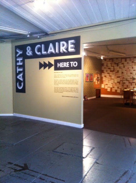
Nostalgic exhibition on the South Bank as part of their Festival of Love season which marks the 50th anniversary of Jackie magazine and looks in particular at the agony aunts, Cathy and Claire. I loved the montage of covers on the walls and kept spotting ones I remembered. You could pick up phones and listen to members of the editorial team and readers. There was also a wall of replies to the letters and a board where you could write down what you wished you’d known at 15 of which my favourite was “Don’t grow up it’s a trap!”    

Museum of Broken Relationships

Image
Interesting exhibition at the South Bank as part of their Festival of Love season which a collection, brought together by artists and ex-lovers Olinka Vistica and Drazen Grubisi, of donated objects which reflect people’s split ups and divorces. It is strangely moving look at the ordinary items which have been given and to read the explanation which say where they were and how long the relationship lasted. There was a cabinet of tickets, concerts and travel, one of teddy bears and one of hats! I picked up on the man who had given his vegetarian girlfriend a leather handbag! Also the ‘her’ towel from a ‘His and Her’ set where he’d take the ‘him’ towel with him! Review Times  

The Human Factor

Image
Excellent exhibition at the Hayward Gallery using the work of 25 artists to look at how contemporary artists have looked at the human form. The body has been one of the oldest subjects in art history and many of the artists revisited old themes or techniques. I have a bit a phobia of wax works after being chased by one once (don’t ask) so I found a few of the works a bit difficult as they were so real but oddly not the most real one Paul McCarthy’s “That Girl” three super life casts of a naked girl. However I couldn’t stand with the Maurizio Callelan figure of JFK in his coffin. I loved Ryan Gander’s take on the Degas ballerina showing her as escaped and peering out of the window or slipped off her plinth to have a cigarette! Also his spooky marble sculpture which turned out to be of his four year old daughter playing ghosts with a sheet. My favourite was Ugo Rondinone’s “Nudes 4 Dancers” which were four life sized figures on each side of a large white room. From a di

Virginia Woolf: Art, Life and Vision

Image
Fabulous exhibition at the National Portrait Gallery looking at the life and work of Virginian Woolf. I admit from the outset of this review that I am a huge fan of Virginian Woolf and the Bloomsbury Group so I was either going to love this show or be super critical! Luckily I loved it! I was unsure at first why it started with the bombing of Tavistock Square but when you got to the end you realized that the pictures taken in that house were a great overview of Virginia’s life and style and it meant the whole show came full circle. You felt you could have gone round again in a continuation of the story. Even though I have seen a lot of Bloomsbury material there was a lot in the show I’d never seen before even as book illustrations such as a Carte de Viste of Virginian in mourning in 1895. It was interesting to read who had loaned material and many items where you stood thinking “how did they get that” you realised the item had been lent by Mrs Quentin Bell, daughter in law

Armed Forces Art Society Annual Exhibition

Image
Interesting exhibition at the Mall Galleries of work by the Armed Forces Art Society. I went in expecting quite militaristic pictures but I was quite wrong. There were a lot of land and townscapes showing signs of foreign travel but also portraits, still lives and everything you’d find at any societies art show. There were two works by their patron Prince Charles. It was a well hung show setting up nice sections on different subjects but also with a good eye for colour and setting a rhythm for the show. I loved Ken Head’s very distinct sharp watercolours also Peter French’s great pictures of the Bermondsey waterfront and the Shard. My favourites though   were Sue Fawthrop’s wonderful bold brightly coloured landscapes. They pulled to across the room to have a look .

Tove Jansson: Tales from the Nordic Archipelago

Image
Small exhibition at the ICA on the life and work of the author of the  Moomin books for children, Tove Jansson. The show features copies of the books in a number of languages as well as photographs of her life on her private island in the archipelago of Finland where she regularly spent the summer months. Her house looked amazing and full of books, statues and empty frames. I particularly like the picture of her with her pet seagull!

Journal

Image
Interesting exhibition at the ICA bringing together international contemporary artists who explore historical events and gradual social changes. There were five artists represented. I liked Paulo Nazareth’s worked which is an on Going one based on a walk he is doing through Brazil then up the African continent from Cape Town. Along the way he is collecting objects he uses such as the caps and labels from water bottles.   I also liked the idea of Koki Tanaka’s work “#8 Going Home” which filmed people affected by the travel changes following the 7/7 bombings to retrace their walk home that day. I didn’t have the patience to watch the video installation by Cyprien Galliard partly because the room was so hot.   Review Evening Standard  

GENERATION: 25 Years of Contemporary Art in Scotland.

Image
Fascinating exhibition over a number of galleries in Scotland giving an overview of 25 years of contemporary art in Scotland. I saw the works at the Scottish National Portrait Gallery, Scottish National Gallery and the Scottish National Gallery of Modern Art. As with all contemporary art overview there was good stuff and not so good stuff but I think I only said ‘silly’ and moved on rapidly about twice! On the bad side, I am not sure videos always work in a gallery space. Much as I found Henry Coombes film about Landseer amusing it didn’t have the same feeling as viewing an art work. Similarly Rosalind Nashashibi’s films were interesting but just demanded too much of your time. I was interested in Callum Innes large geometric pictures which were made my painting square then using turpentine to remove one square. It’s hard to describe but a good effect and an interesting technique. Who could fail to be amused by Ross Sinclair’s “Real Life Rocky Mountain” which put a hill in

First Sight: Recent Acquisitions of Prints and Drawings

Image
A slightly random exhibition at the Scottish National Gallery of recently acquired prints and drawings although it did include some lovely works. I loved a Sir Joseph Noel Paton, head of Robert the Bruce, particularly as his father’s collection included some of the bones of the Bruce and his mother claimed to be descended from him. The picture itself was a wonderful big head of a Victorian Medieval Knight. There was a nice view of Rom by Turner on his first trip there in 1819-20 but with slightly odd foreground figures. Plus a nice view of Harlech Castle by Paul Sandby, who I seem to being followed by at the moment!

Titian and the Golden Age of Venetian art

Image
Nice exhibition at the Scottish National Gallery bringing together three of the Titian Metamorphosis pictures and showing them with other Venetian pictures from this time from their collection.   Pictures around it included a good Bassano “Adoration of the Kings” which included a very good bottom, a “Christ carried to the tomb” by Tintoretto, which had a surprising amount of colour in it for him and a portrait of an archer which might be a Giorgione. The commentary was also fascinating. I had realised that Venetians were good at colour because they had such great access to pigments through the trade routes but I had never realised they liked using canvas as it was the same material used for the sails of the ships! I had also never thought about the great use of landscape in Venetian art, when they don’t really have any! There was also a good room of prints and drawings the best being a woodcut by Titian, which is thought he drew on the block and then someone else carv

John Byrne: Sitting Ducks

Image
Interesting exhibition at the Scottish National Portrait Gallery of portraits by John Byrne which he had helped to pick. Many of these pictures were quite quirky with a slight cartoon quality, such as that of Billy Connolly but there were also some very formal commissions. There were a lot of self-portraits and it was interesting to see him change over the years both in style and look. I liked a picture of Gerry Rafferty done on a guitar. However my favourite was a stunning picture of Tilda Swinton. She was place low in the frame against a white background with great horizontal lines making up her picture. A very painterly work.

Minette: The Life and Letters of a Stuart Princess

Image
Small exhibition at the Scottish National Portrait Gallery looking at the life of Princess Henrietta Anne, the youngest daughter of Charles I and a great ally of her brother Charles II. She was smuggled out of England during the Civil War and raised at the French court, marrying Louis XIV’s younger brother, the gay Earl of Orleans. Sadly she died aged just 26 but did use her political position to help Charles II. The main picture in the show was by Jean Nocret of her in a stunning blue dress. There were also examples of the letters between herself and her brother full of court life and gossip. This was a fascinating look at a forgotten, short life which was very significant at the time.

Ruskin : Artist and observer

Image
Lovely exhibition at the Scottish National Portrait Gallery focusing on drawings and watercolours by Ruskin. The works set up a nice contrast between the very detailed architectural studies, often focusing in on a particular detail, and pictures of vast mountains and scenery.   I was also interested to see him copying the work of other artists such as Carpaccio’s “Dream of St Ursula” and that he also collected, and later took, photographs. There was one picture of a Blenheim Orange Apple which you felt you could have just picked up the fruit and eaten it.

Reception, Rupture and Return: The Model and the Life Room

Fascinating exhibition at Tate Britain in their archive room looking at the role of the artist model and the life room. I particularly liked the displays in the middle of the room which looked at the lives of models such as Eileen Mayo who worked for Dod Proctor and Laura Knight. The display included Christmas cards to her from Knight and Duncan Grant. Round the edge of the room was the story of how life drawing shaped art teaching and how   modern artists have used and reacted to it. There were wonderful works by Gaudia Brzeska, Hilda and Sydney Carline, Keith Vaughan and many more. It was interesting to compare styles by seeing many artists working on one subject.  

Chris Killip

Image
Small exhibition at Tate Britain of photographs by Chris Killip of life in 1980s Britain. He work looked at the political and social issues of working class communities, living and working within them. They had quite a nostalgic feel about them which felt strange as I remember the times well and they are not nostalgic in my head! I liked a picture of a group from a care home sitting in a shelter on a seaside day out.   There was a also a great Warhol like display of baked beans in a supermarket. Best though was a picture of a youth on a wall from 1976. He was curled up in disappear and it was an image which could have come from any age.

British Folk Art

Image
Quirky exhibition at Tate Britain looking at folk or naïve art from around Britain. My only argument with the show would be that some of the work shown was not produced as art but as trade signs, notices etc therefore to judge them in artistic terms seems strange. However they are beautiful objects with a social interest. I did however love the display of trade signs as you came in against a bright yellow background. I also like the way the show featured three artists, George Smart, a tailor who produced numerous textile pictures which he sold in Tunbridge Wells, Alfred Wallis, the St Ives artist much feted by the artists who settled in the town, and Mary Linwood who produced copies of the old master in needlepoint which were amazingly successful in their day.   Favourite pieces included the quilt made by a couple in the year before they married in which each of them showed things that meant a lot to them. It was like a conversation in textile. I also liked the pictur

Kenneth Clark: Looking for civilisation

Image
Stunning exhibition at Tate Britain looking at the life, work and collecting of Kenneth Clark. I may just be saying stunning as it included so many things that I love that it was like walking round my own head! Renaissance, Bloomsbury Group, early 20th art, the National Gallery on the Second World War and throughout the whole a real sense of friendship and a desire to support artists. The show was beautifully arranged. I loved the way it set up the artists in a New Romantics gallery who were going to come to the fore during the war before the wonderful room of the war art. It gave you a real sense of why Clark picked particular artists for different types of picture. I will admit to shedding a tear in that room! The mix of fantastic art, the tableaux at the far end almost reproducing one of the first photographs you’d seen in the show, realising the music represented the Myra Hess concerts in the National Gallery and one mention of Raviolious was enough to send me over the

BP Portrait Award

Image
Excellent exhibition at the National Portrait Gallery to mark this year’s BP Portrait Award. There were no silly works in this year’s show such as abstract portraits. Apart from one picture, I think you would have recognized any of the people if they had walked past you in the street, which is surely one point of a portrait. Looking at the notes I made as I went round they are copious so it’s really hard to pick out pictures I particularly liked as I noted down so many. I thought Edward Sutcliffe and Li Wu Da’s picture of an art forger was clever, combining a straight portrait by Sutcliffe with a 90 degree elongated mirror image by Da. A nice play on the idea of copying and transforming images. I liked “Andrea and Myrtle” by Simon Davis but no-one is painting me on the toilet! There seemed to be a number of works in egg tempera such as “Profile of Emily” by Anthony Williams which had a very real effect but was made up an lots of tiny lines in different colours, almost

Nativity

Image
Showing of the fabulous “Nativity” at the National Gallery, Martha Fiennes's film which was featured in the video for the recent exhibition about architecture in Renaissance paintings. I could have watched this for hours. The background, architecture, figures and sound all self-generate themselves continuously so the film has no set length and no specific narrative. However your head starts to make up narratives. I found these were often set by the music and in my case at one point the sky went dark, the architecture changed and “Silent Night” played and I found it so moving, and yet it wasn’t meant. The work had the same effect on my as Anthony Gormley’s “Field” works which have hundreds of small figures   in a defined space. I found both works hard to walk away from because of the strong sense them build up that the work will still exist when you are not there and you feel a bit like you are deserting it! I want to see more using this SLOimage technology it was r

Perspectives

Image
Annual summer arts exhibition of Westminster Adult Education Service, featuring 2D and 3D creative art from students of Westminster’s specialist adult college held at the Mall Gallery. There was some fascinating work in the show which seemed particularly rich in still lives. I liked Patsy Whiting’s bringing together of odd items such as a rose and wrench and a oil can. I also liked Marjorie Collins witty picture of a red and a green tin mug called “Stop and Go”. There were a lot of pictures either painted on paper which had already been written on or incorporating collage such as Sera Knight’s London scenes, which made me think there had might have been a class in this technique. It was very effective.  

Pangaea: New Art from Africa and Latin America

Image
Interesting exhibition at the Saatchi Gallery looking at contemporary art form Africa and Latin America. Who can resist a room being taken over by giants ants! I’ll admit it found it hard to stay in the room and the effect was creepy but close up the ants by Rafael Gomezbarros were quite sweet! I also liked a ball of bricks by Fredy Alzate. I wasn’t convinced by Oscar Murillo’s piles of rubbish with no titles. I found them just a bit lazy, give them a title and give me a clue what they are about! Similarly liked Dillon Marsh’s photographs of bushes on telegraph poles, but tell me more. Are they a natural phenomenon or has he made them? Reviews Independent Evening Standard    

Abstract America Today

Image
Bland exhibition at the Saatchi Gallery looking at contemporary art from the USA. Nothing really moved me in this show. There seemed to be a lot of big canvases which were more about using paint and its effect than creating an image. I did quite like Lisa Anne Auerbach’s knitted wall hangings of mind maps with notes to self like “Learn better techniques for screaming”. I also liked a big embroidered canvas giving an out of focus effect but it had lost it’s label so I have no idea who it was by! Review Evening Standard    

War and Memory

Image
Wonderful exhibition at the National Maritime Museum of work by Rozanne Hawksley looking at the nature and meaning of commemoration of war. The whole thing has a very young contemporary art felling to it then you see a photo of the artist as an evacuee and realised she is an older lady. A number of works came from a show she did called “Seamstress of the Sea” about her eternal grandmother who sewed sailor collars during the two world wars. Works sowed the work of seamstresses but also linked this to the idea of sewing wounds and also had a burial at sea should. Another room looked at how we commemorate the dead and included a wreath made of white gloves, white feathers and bone. There were also modern versions of sweethearts pin cushions. Everything was well displayed in dark, rather sinister feeling rooms. I would love to see more work by this artist.

A Chronicle of Interventions

Strange exhibition in the Project Space at Tate Modern. The leaflet said it “presents a response to the history of economic, political, military and foreign interventions in Central America” but I found there wasn’t enough explanation and it just left me confused and a little depressed. I did like film of the body builder by Humberto Velez but wasn’t sure how it fitted in. I loved a film of men dressed as building dancing to xylophone music but again had no idea what it meant. It was jolly but I am sure the unending xylophone music must have been driving the gallery assistant mad!

Return of the Rudeboy

Image
Exhibition at Somerset House about the cultural heritage of the Rudeboy phenomenon born in Jamaica and revived with 2 Tone. The main point of the show were some amazing portraits photos by Dean Chalkley of modern Rudeboys displayed in large format round the walls and in the first room within the lids of old suitcases. In the second room there were outfits up the middle of the room and a set of objects by Kitty Farrow presenting grooming accessories. In the final room there was a working barbers shop! I found this all fascinating but was not sure by the end I actually knew what a Rudeboy was. The definition given by the show was “Visual commentators expressing attitude, individuality and integrity through personal style and mind set”. I’m not sure that helps. However it was visually stunning so who cares!

Museum of Water

Image
Fascinating installation at Somerset House or as described on the entrance a live artwork by Amy Sharrocks. I am not sure what I made of it! It was very inviting and intriguing being set in the old Light Wells and Dead House which it used really well. As you walked round the light well there was the sound of dripping water from some of the closed off rooms. Other rooms were open with water related objects spilling out, hence the umbrellas in the attached picture. Once in the main area of the Dead House which had a rather dark, sinister entrance, there were shelves of bottles of water which people had collected and donated. Some of these were very touching such as water from a cats bowl, pond water from a garden, bath water, seawater from various places. There seemed to be a section on different holy waters. I think the idea was to highlight water both as a scarce resource as well as its importance to us both physically and emotionally. However I came out thinking what