Posts

Showing posts from June, 2013

Vermeer : the art of love and leisure

Image
Extremely clever exhibition at the National Gallery looking at the role of music in art and society in the Dutch Golden Age focusing on Vermeer. This exhibition was beautifully arranged to gradually introduce you to ideas about music at this time before hitting you with the star pictures. The pictures were displayed alongside instruments and music books. It was also a good way to highlight the galleries pictures from the Dutch Golden Age. It looked at the meaning of music in art, the social function of music, the role of duets and solo playing. The duets room had a slightly Carry On double entendre feel about it which was fun! Then what can you say about the Vermeers? Much as I love early 20th century art I think Vermeer may be my favourite artist. This was a great chance to see five pictures about music making which will probably never been seen together again. The two National Gallery pictures were shown with the Kenwood guitar player in between and they made a love

On solid ground

Image
Small outdoor exhibition behind St Martin in the Fields from an organisation called On Solid Ground telling stories of people starting afresh in new cities after fleeing conflict or disaster. I found it interesting to see what people had managed to bring with them and when they had to start again from scratch. I also loved one quite “A lion in her own country becomes a cat when she’s far from home.” I like the idea of bringing art and ideas into outdoor public spaces.

BP Portrait Award

Image
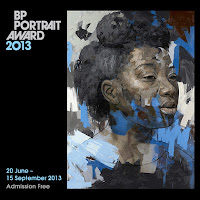
Good exhibition at the National Gallery for this annual portrait award. I always enjoy this exhibition and there is usually a theme which develops and this year was self portraits. My favourite was “Portrait sketch of Charles” by HK Park which showed a portrait sketch on an easel next to a full picture of the subject so putting the sketch and the person in one space. A really clever idea! Also on my wish list a slightly Bloomsbury picture by Fred Clark of his brother in law, painted to get to know him better, a picture by Eric De Vere of his son as he went into the army and Ewan McClure Rembrandt like self-portrait. Oddest picture was “The Shadow of Life” by Lucy Jones, an interesting expressionist work but a portrait, I’m not sure! Review Times Independent Evening Standard    

Take one picture

Image
Interesting exhibition at the National Gallery of childrens’ reactions to a work in the gallery a still life by Willem Kalf. I don’t usually like this sort of exhibition but this one was really good. It included work from a number of schools and concentrated on 3D transformations of the work. My favourites were a school in Folkestone who had done a lobster hunt around the town because of the lobster in the picture! Also the school in Hertfordshire which did table settings with each child making cutlery and a goblet for a guild. It did leave me wanting to see the picture but I’d run out to time!

Michael Sandy : Saints Alive

Image
Stunning exhibition at the National Gallery of kinetic sculptures by Michael Sandy based on paintings of the saints in the gallery. The only proviso I need to make from the start is that it would be better if more worked! On the day I went of the 7 pieces only 2 were working and one of those was the rather unbreakable looking Catherine wheel. However I thought it was so good I’ll keep going back in the hope of seeing them all in action! On the day I went the multiple saint and St Thomas were working. I found a great delight in seeing pictures I know so well in 3d form and moving albeit in a slightly shaky way. The multiple saint had legs from a St Michael stamping on a devil. I think it should have had the head of St Peter Martyr but that seemed to have gone missing. I so wanted to see the St Jerome beating himself with a stone and I can’t guess what the headless St Francis would do! Reviews Times Telegraph Evening Standard    

Metropolis: reflections on the modern city

Image
Thought provoking exhibition at Birmingham Museum and Art Gallery looking at views of city life by contemporary artists. It gave a rather bleak view of cities, as an urbanite, I would like to have seen a bit more about the attractive side of city living not just the bleak inner city side. I did however like the film of derelict house with it’s windows being smashed by Jochem Hendricks which reminded me of a game of Wackamole as you were waiting to spot which window would get broken next. Also the film footage of Las Vegas by Nicholas Provost which showed an image and it’s mirror image moving like a slow kaleidoscope.

Regeneration: Rajesh Gogna, Cathy Miles & Miranda Sharpe

Image
Nice exhibition of contemporary jewellery at the Museum of the Jewellery Quarter in Birmingham. The works were from three jewellers, Rojesh Gogna, Cathy Miles and Miranda Sharpe, and looked at how they had been influenced by the past. I liked Miranda’s pink bowl based on microbiology and Cathy’s metal wire tea pot. I was not so convince by Rojesh’s wall hangings which looked slightly like urinals!

More than a game : How Scotland shaped world football

Image
Surprisingly interesting exhibition at the Kelvingrove Art Gallery and Museum looking at story of football in Scotland. Surprisingly because I’m not Scottish and not that keen on football! The real star of the show was the Scottish Football Museum which had lent lots of items and seems to have made a concerted effort to save pieces of memorabilia from grounds which were being updated particularly after the changes to grounds following Hillsborough. There were some lovely items such as a child jersey from about 1890, a grammar book from1691 which mentioned pupils playing Pila Pedalus or football. There were lots of things for children to do without making the whole thing patronising including an electronic game about the offside rule and a virtual football pitch on the floor on which you could like a virtual ball. I didn’t see a child use it but I did see one of the security guards slip in for a kick around!  

Joan Eardley’s Glasgow children

Image
Spotlight display at the Hunterian Art Gallery in Glasgow looking a portrait of David Samson by Joan Eardley and other pictures she painted of his family and the area in which he lived. She captures a community in the 1950s at the point at which it is going to disappear with tower block replacing the tenements. The picture of David shows him in a grey coat which is much too big for him and held together by a belt. I loved “Girl with Baby in Blue” which showed the real tenderness between a child and the brother or sister she was looking after.

Hagar and the angel

Image
Small exhibition looking at a recently acquired small picture “Hagar and the Angel” by John Runciman at the Hunterian Art Gallery in Glasgow. This picture, done in 1766, was an early example of a Scottish religious work and was shown alongside etchings by John and his brother Alexander and of the subject of Abraham, Hagar and Sarah by other artists. It also followed the brothers through to a trip to Italy where John died but Alexander continued to work and became a leading Scottish artist on his return. A lovely example of an exhibition that puts a picture in context.

This Unrivalled Collection: The Hunterian's first catalogue

Image
Quirky exhibition at the Hunterian Art Gallery in Glasgow looking at the first guide to the Hunterian Museum by Captain John Laskey in 1813. It took the opportunity to display objects from the original collection alongside their descriptions from the catalogue. In doing so it gave a snapshot of the world as understood by the Enlightenment and gave a wonderful view of what one of the oldest public museums in the world was like in its early days. It included objects from Captain Cook, a very dead three toed sloth, anatomical items and a copy of the Rosetta stone. It was interesting to see mistakes which were made at the time such as a shield which was identified as Roman but in fact had been made in the Renaissance for Ludivico Sfzora.

Everyday

Image
Interesting exhibition at the Museum of Modern Art in Glasgow of contemporary Scottish sculpture bringing together works by 6 Glasgow based artists. It worked well in the very elegant main gallery of the Museum with the colour of many of the works mirroring the colour of the gallery. I liked the white objects on white table which looked very tactile but I resisted! Also the blackboard with giant piece of chalk coming out of it.    

Tales of the City : Art Fund International and the GoMa collection

Image
Small exhibition at the Museum of Modern Art Glasgow part of a series highlighting recent purchases of international art hanging them alongside items from the UK to show shared influences. This exhibition looks at playful approaches to object making such as David Hockney’s photograph of real sunflowers next to a drawing of sunflowers. I must admit there were more UK works than international so I felt the exhibition slightly missed the point.

Nikki de Saint Phalle : The Eric and Jean Cass Gift

Image
Interesting exhibition at the Museum of Modern Art in Glasgow of work by this sculptor who made the Stravinsky Fountain at the Pompidou Centre. Eric and Jean Cass had donated 14 works by Nikki de Saint Phalle to the museum following a recent decision to disperse their collection to museums in the UK. They gave these works as the museum already had works by the artist. On the surface these were very jolly coloured sculptures although from reading the labels I realised they were inspired by abuse.   I liked a rather depressed little patchwork frog! A centrepiece was ”Altar of a Dead Cat” a triptych like house door with religious objects and dead animals attached as well as cans of compressed paint which she had then shot at to burst over the objects. It was really rather sinister but impressive. There was an interesting film with it about its conservation.

Anita Klien: New paintings

Image
Nice exhibition of new work by Anita Klein at the Eames Fine Art Gallery in Bermondsey Street. These were lovely big, bold, colourful pictures of contented women. They couldn’t fail to make you feel happy! I particularly liked one of three women sitting drinking coffee which really reminded me of happy times sitting with friends and chewing over life!  

Kaffe Fassett – A Life in Colour

Image
Colourful exhibition at the Fashion and Textile Museum of the work of Kaffe Fassett. You could not fail to be hit by the colour in this beautifully displayed exhibition which mixed patchwork quilts, needlepoint, knitting and paintings culminating in “The Orangery” a physical still life mixing all aspects of his work into a modern country house interior. The film was very interesting and well worth a watch to add depth to the objects. I was fascinating to hear him say that he felt he’d not really understood colour as a painter he only really discovered how colours worked together when he started working in yarn. He described pattern as “colours moving around”. It did leave you thinking of him as an artist rather than a designer. The real discovery was his paintings which were still lives of lots of similar objects either in contrasting or complementary colours. Of course I particularly liked the blue and white section!

Editions: Contemporary Rugs for Collectors

Image
Small display at Somerset House from a project dedicated to producing limited edition tufted rugs of art works. The rugs are produced by Christopher Farr and they are beautiful objects. I particularly liked the Terry Frost rug and William Scott’s “Permutation 2”. However I was unconvinced by the quote “Editions of prints, sculpture and video have long been an important aspect of an artist’s oeuvre and now we can add to these the limited edition rug.” I think this can be true if the artist designs the rug but not if a rug design is based on their work. Sorry but it smacks slightly of trying to create a new form of art for investment.

Nicholas Hawksmoor: Methodical Imaginings

Image
Delightful exhibition looking at Somerset House looking at the London churches of Hawksmoor through photographs taken by Helene Binet. The first section just presented the photographs alongside lovely small resin models of the churches suspended from the ceiling. Very classy! Many of the photographs were of unusual angles of the building such as foundation slabs and down flights of stairs. They really made you want to go and hunt out the churches to see them for yourself. The second section was shorter but looked at the history of the churches with a board on each of the 7 remaining churches.

Blumenfeld Studio: New York, 1941–1960

Image
Exhibition of photographs by Erwin Blumenfeld at Somerset House. Blumenfeld went to America in 1941 and brought his European eye and Dadaist techniques to US photography. He worked for most of the major fashion magazines. This exhibition was quite sparsely hung which gave the pictures room to breathe and really be looked at a individual objects. The images were very simple and clean. I particularly liked the war time images and found it fascinating to see the original shot and then how it was cut to be a magazine cover. Also the section which showed how he took a series of pictures for a shoot and changed and adapted the pose until it was right. It was also amusing to see the very elegant and sophisticated cigarette adverts which would be banned now! Reviews Evening Standard  

Patrick Caulfield

Image
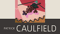
Retrospective exhibition at Tate Britain of the work of Patrick Caulfield shown as a partner exhibition to the Gary Hume. I loved these Pop artesque pictures with their bold outlines but also subtle detail in the finish. Somehow although the effect was very flat they also had a 3d quality. I loved “Office desk against a blue window” for the wonderful silhouettes but also for the fact he included the pen holder and detail of the items on the desk. I had seen his work before but never realized the when he adds very detailed sections, such as roses, that these are painted on. In my ignorance I had assumed they were collage! I loved this contrast of the bold and the detailed. I was also amused at the way he depicted wallpaper and interior patterns, he is almost a Vuillard of pop art! Reviews Telegraph    

Gary Hume

Image
Retrospective exhibition at Tate Britain of the work of Gary Hume. These were wonderfully shiny paintings which really benefit from being seen in the flesh rather than reproduced as some of the detail is in the texture not the colour. For example there was a large picture called “The Red Barn Door” which in reproduction doesn’t look a lot better than a red square but in the flesh has the texture of a barn door and all the details drawn out within the paint. Very clever. I loved a picture called “Tulips” which as an almost cloisonné effect as the edges of the paint were raised.    Reviews Telegraph

Old Mistresses

Image
Fascinating study day at the National Gallery chaired by Griselda Pollock, Professor of Social and Critical Histories of Art, University of Leeds , looking at how art history and the viewing of art had changed since the publication of her ground breaking book “Old Mistresses” in 1981. The day began with Griselda outlining the reasons for writing the book and how she and her co-author had gone about it. This was followed by Margareta Gynning,   Senior Curator of the Natoionalmuseum Sweden, talking about how she works with other genres when curating exhibitions to tease out the meaning of the art and invite people to view an interpret it in their own ways. Next were two talks looking at how female painters and female subject are represented in art. First was Jo Rhymer, Public Programmes Manager at Sotheby's Institute of Art, talking about Rosa Bonheur's "The Horse Fair” and how it it has been viewed differently over the years, from being acclaimed when it was fi

Polish Art Now

Image
Interesting exhibition at the Saatchi presented by Abbey House to spotlight contemporary art coming out of Poland. I particularly liked small rapid paint sketches by Stanislaw Mtodozeniec called Fast Brush which included a wonderful picture of the Guggenheim spiral in New York and an orchestra almost done as a negative. I also like the big finger prints presented as portraits by Marek Niemirski. The flashing duvet was an good focus for the gallery although I am still not too sure what it was!

The Independent Group: Parallel of Art & Life

Image
Very small exhibition at the ICA on this collective to mark the 60th anniversary of its ground-breaking exhibition Parallel of Art and Life. I just wanted more from the exhibition. It assumed a knowledge which I didn’t have so I’d have liked more explanation, although maybe if I’d read the small hand-out while I was there it might have helped. It turns out this group are known as the “Fathers of Pop” so actually fit in nicely with other exhibitions which have been on in London this year such as the Lichtenstein and now the Caulfield. However none of this was clear in the room. An exhibition whose blurb in the hand-out promised much “evoking the ICA’s original home in Dover Street in the 1950s” but delivered little.

Bernadette Corporation: 2000 Wasted Years

Image
Confusing exhibition at the ICA looking at the work of this collaborative art group. OK I confess I didn’t really understand this! It seems to be a group which started by organising parties in New York in the 1980s but over time, as people joined and left, they became a fashion label, a magazine and even published a novel. There was a useful timeline in one room of what they’d done when and who was involved but I do admit I rather struggle with this conceptual art idea. There were some interesting clothes on models   but   I never understood the glass box with TV screens in it which made an annoying noise but showed no pictures. Was it broken or was that it?

In Fine Style: The Art of Tudor and Stuart Fashion

Image
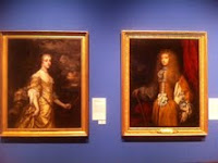
Fascinating exhibition at the Queen’s Gallery looking at the history of Tudor and Stuart dress through pictures and objects in the Royal Collection. In each section there were information boards explaining the men and women’s fashion in a particular period, labeling all the main features and explaining how things had changed since the previous board. These were then surrounded by pictures, documents and items of clothing. There were also good explanations on the audio tour of how the clothes worked and how they were kept clean. It was fascinating to see how people were pinned, tied and sewn into their clothes each day. It must have taken ages to get ready and the clothes must have been so heavy and uncomfortable. I also loved the fact that the labels pointed out major pieces of jewelry and told you which other pictures they had appeared in. I was amazed at two portraits of Frances Stuart, one a classic Lely Windsor Beauty portrait, the other of her dresses as a man! E