Posts

Showing posts from July, 2015

Jan de Beer and workshop: 'The Virgin and Child Enthroned, with Saints': Lunchtime talk

Image
Interesting lunchtime talk at the National Gallery given by James Heard and looking at “The Virgin and Child enthroned” by Jan de Beer. This picture dates from a time when prosperity moved from Bruges to Antwerp following a slump in the wool trade and a silting up of the river leading to Bruges. James looked at the picture in the context of the mannerist style by which is it describe but explained that Antwerp mannerism and Italian were not linked except by their elongated and sinuous style. He also made us think of it in the light of Gossart’s trip to Rome bringing back drawings of classical architecture and this picture combines classical and gothic styles. He talked about the range of work which de Beer undertook which included pageants for the city. He made us look in detail at the picture going through the saint’s attribution and the northern style of showing the attribute in a naturalist way rather than the Italian style which usually see the saint holding up the

Art in dialogue: Duccio and Caro

Image
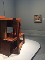
Thoughtful display at the National Gallery showing Duccio’s Annunciation with the modern sculptor Caro’s Duccio Variation no 3. Caro created this work when asked to respond to the picture by the gallery back in 1999 and this is the first time that this painting and sculpture have been seen together. In particular he responded to the architectural elements in the picture. The sculpture is made of wood so the same material that the picture is on. It acts a lot like a stage set and invites you to look at the space in the picture again and think of it as a 3 dimensional space. While in the gallery my friend and I looked up the other variations made by Caro on our phones to see how they differed. It might have been nice if pictures of this works could have been part of the display as they made up a longer conversation with the picture. As this was shown in the space usually used for the Della Francesca’s it was also interesting to see them in a new setting alongside other

The Oasis of Matisse

Image
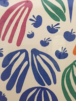
Interesting exhibition at the Stedelijk Museum in Amsterdam looking at the development of Matisse’s artistic practice with an emphasis on the cut outs of his later years. What was interesting was that I had seen the Matisse cut outs exhibition at Tate Modern last year so it was really good to see how the works were displayed by another museum and put in a different context. The ground floor of the show looked at works by Matisse in dialogue with work from work from the museums own collection and how the cut outs developed from this. This gave the opportunity to see works I didn’t know and to get an oversight of the gallery’s collection. I loved the room on the odalisques which places a Matisse’s with a Picasso and a sculpture by Laurens. It was also interesting to see a Matisse costume for a Diaghilev ballet. Upstairs gave space to some of the large cut out works including “Polynesia, the sea” and “Polynesia, the sky” from 1946. There was a lovely display of chasubles

When I give, I give myself

Image
Insightful exhibition at the Van Gogh Museum in Amsterdam of contemporary artists responses to letters from Van Gogh. The work was scattered around the galleries and provided some useful insights into Van Gogh’s work and life as well as producing interesting new work inspired by it. I must admit I was there to ‘do’ Van Gogh I didn’t pay all the works a lot of attention but some caught my eye and made me try to find out more. It was also a good way of getting more of the letters into the displays. I didn’t realise at the time that an interesting sphere on the wall with a grey middle which was saying something about colour was by Anish Kapoor! I liked Maria Barnes comment on fame, four black dripping trophies, reflecting on the fact Van Gogh wasn’t famous in his life time and yet here we were in a huge museum dedicated to his work. The show also included work by writers imaging a letter to them written by Van Gogh which could be read or listened to. My favourite pi

Something thrown in the way of the observer

Image
Interesting exhibition at the Museum Van Loon in Amsterdam by six contemporary artists taking objects in the museum as a starting point in order to question their impact on our lives. I liked Richtje Reinsma’s formally displayed crumpled paper shown under family portraits which I assume was a comment on photography and Batia Suter’s installation on table tops showing photocopies of wood grain which made you look at the material of the table more closely. I didn’t really understand Rosa Sijben’s orange rectangles which looked like bars of soap which were scattered around the space. I thought this was an interesting idea to make you look at individual objects in the museum rather than just the overall effect however as this was the first time I’d been to the house I did find it slightly distracting.  

Alexander, Napoleon and Josephine

Image
Fascinating exhibition at the Hermitage Amsterdam looking at the relationships between Napoleon Bonaparte, his wife Josephine and Tsar Alexander I. The first room looked at their friendship and the start of Josephine’s collection at Chateau de Malmaison. The main room then looked in detail at Napoleon’s invasion of Russia and his defeat there with the retreat from Moscow. Needless to say it was all very War and Peace. I loved the display of weapons in the centre of the room including some which turned. I find displays of guns and swords dry but his made them into an installation in their own right and yet had all the detail anyone who was really interested might need. I also liked the display of uniforms from both sides against a red background. Upstairs looked at Alexanders entry into Paris and how he won over the Parisians. He formed an unlikely affectionate friendship with Josephine and acquired much of her art collection on her death which is why it is the Hermita

Portrait Gallery of the Golden Age

Image
Stunning exhibition at the Hermitage Amsterdam looking at group portraits of the Golden Age. This was a beautifully designed show with a centre piece of a huge room full of large 17th century group portraits and an excellent audio visual presentation which picked out themes and individuals with spot lights. The whole thing gave a real feeling of being back in 17th century Amsterdam surrounded by the people of that time. I loved some of the stories such as that of a man who had held a high position in a militia and was shown carrying its flag on the group picture but he went bankrupt and ended up working as a steward for the same company looking at the grand picture of his former triumph every day. The upper floor with windows onto the lower gallery told the story of urban society in Amsterdam at that time looking at what the city looked like and how it operated. It basically gave the background to the people in the pictures and gave an idea of what their professional a

RA Schools Show 2015

Image
Too cool for school exhibition at the Royal Academy showing works by final year students at the Royal Academy Schools. The best bit about this show was that it was held in the schools themselves so you had a sense of the work being shown in the studios the students had been using so in a few cases there was a nice sense of someone knowing and enjoying the space such as Max Prus’s “Stained” where he’s painted the studio ceiling lights like a stained glass window and had automated blinds revealing and hiding them. However some of the work looked a bit like the rubbish which had been left after the students had moved out! It might have benefited from the hand out not just naming the artists and works be also saying something about the premise of the work. As you know I go to a lot of shows and am fairly savvy but I needed a bit of help! Notes I made as I went round included things like “am I missing something?”. I did however like the work of Max Ager which included a lo

What is luxury?

Image
Interesting exhibition at the Victoria and Albert Museum exploring modern ideas of luxury but I felt it’s narrative got a bit lost at times. The first section looked at the role of craftsmanship in luxury. The value of craftsmanship being not only in time to make the object but also in the time already taken in training and practice. Objects included a Ruger briefcase which had taken 3000 hours to make and a Hermes saddle. There was also a hideous crystal studded monkey on a golfed chest which was OTT and kitsch but I wanted it!   The next section was more muddled. It looked at what luxury is in the modern world. As the world gets busier luxury starts to become things like space and time. Also it addressed issues like ethically sourced raw materials which might be more expensive.   However this bit felt a bit worthy. Reviews Times Guardian Telegraph Evening Standard

Captain Linnaeus Trip: Photographer of India and Burma, 1852-1860

Image
Interesting exhibition at the Victoria and Albert Museum of photographs by Linnaeus Trip, a former army officer and surveyor working for the British East India Company who saw how you could use photography to show other cultures. His work began with taking view of interest to military men but on his return to India in 1854 he used photography to gather information for the British East India Company, one of the largest commercial enterprises at the time, aiming to present information comprehensively and without ambiguity. He therefore photographs building from many angles to give a systematic record. However this also produced beautifully pictures often of buildings which no longer exist such as pictures of Rangoon before it was developed by the British. The show also talked about what a massive undertaking the production of his portfolios of pictures was as a total edition consisted of 171,765 prints all of which had to be printed by hand. This show was a fascina

Shoes : Pleasure and Pain

Image
Wonderful exhibition at the Victoria and Albert Museum looking at the history of shoes and the place they have in different cultures. OK of course I was going to like this exhibition having a bit of a shoe thing and it didn’t disappoint. My only criticism is that I’d have liked one display with the history of the shoe and the technological developments. The displays were themed and were great but a chronological context to start you off would have been a good added extra. Anyway to wade into the fun stuff! A fascinating display looking at the role of shoes in Fairy Tales including the latest Disney Cinderella shoes, Seven League Boots and even the “urban shoe myth” from “Sex in the City” ie Monolo Blahnik Mary Janes! A display looking at how shoes change how a body moved including 1890’s high heeled button boots and Marilyn Monroe’s Ferrigamo’s. A display on boots including Tom of Finland type boots, winkle pickers, cowboy boots and Musketeer’s boots. Then just random

Wot? No fish!!

Image
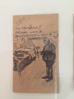
Delightful exhibition at the Festival Hall of drawings done by Ab Solomons for his wife   done on the back of his wage packets for over 55 years. These pictures were so charming and told the story of their life together, both the ups and downs of daily life. In all the collection includes over 3000 images starting with simple doodles and growing in complexity. Ab’s wife Celia appears in every picture. The story has been made into a play. There seemed to be a running theme of Ab dressing badly with one lovely picture of him holding up a tweed jacket and her pointing out he needed a dinner jacket for the Golders’s Green Hippodrome.   Their lovely yellow kitchen appeared at lot. Occasionally a wall appears between them which I guess means they’d had an argument.   Some of the pictures were quite saucy in a seaside postcard sort of way. I think my favourites were the one I’ve used as a picture plus one where she sits knitting and he’s standing in his overcoat, she is sayin

Echoes and reverberations

Image
Annoying exhibition at the Hayward Gallery looking at how sound has been used by six contemporary artists and how it can “conjure and challenge cultural memory”. OK having been to a few shows that use sound in the work I need to get something off my chest! If you have a show with sound in it each piece needs to be heard alone. Either deliver the sound via headphones if space is an issue or if you have room use proper sound proofing or maybe play each piece one at a time! In this case one piece in the first room by Magdi Mostafa called “Wisdom Tower” had 84 speakers in a panel and was very loud so the sound dominated all the other works. I am sure that was part of the desired effect but if felt like aural bullying. Also to be honest I really don’t want to have to give lots of time in a gallery to listening (or watching) long pieces. I want an art work to act like a painting in that you can take a quick look and draw some conclusions or you can choose to spend more time with

Beneath the surface

Image
Interesting but bitty exhibition at Somerset House of early photographs from the Victoria and Albert Museum collection loosely on the theme of things which are hidden. I loved the early section with view of London by William Strudwick who was the photographic store keeper at the V&A itself. There were pictures of the Embankment area before it was built and of old coaching inns. They often had blurred ghosts of children in them who’d moved through the shot while it was taken. They also had pictures of Prout’s journey along them Thames recording it from the 1860s which I am sure I’ve come across before. There was a room which looked at water both above and below the surface including early examples of photo manipulation and Elizabeth Walker’s picture of the surface of water. From it’s opening the V&A employed an in-house photographer, the earliest being Charles Thurston Thompson as Henry Cole recognised the important of photography for recording the collection a

Unseen Waterloo: The conflict revisited

Image
Delightful exhibition at Somerset House of photographs by Sam Faulkner of Waterloo re-enactors. I know it sounds odd but this show had a real sense of majesty and destiny! The pictures had been taken since 2009 at various Waterloo re-enactments in a improvised studio. They were shown in a large format like an art gallery and hung against a background of red Hainsworth fabric, which was the material British uniforms were made from which gave the name of Red Coats.   The chandeliers in the room had been bagged giving it a slightly feeling of the Waterloo Ball from Vanity Fair. The detail of the recreation and photography of the uniforms was stunning and it was easy to forget that these were not early 19th century soldiers but happy modern geeks! Despite the detailed and lovely uniforms you really focused on the faces.   Since seeing this show I have seen a set of photographs of veterans of Waterloo in their original uniforms and there was a real dialogue between them and the

Jonathon Richardson by himself

Image
Contemplative exhibition at the Courtauld of self-portraits by John Richardson, the 18th century artist. Richardson was a portrait painter and art theorist who had a huge collection of drawings. He began making self-portraits at the age of 61 drawing himself every few days so that they became a record not just of how he looked, but also of his mood changes. In some he goes back and reimagines his younger self. He based some of the pictures on drawings he owned such as one of him in a hat based on a Rembrandt and one based on a Bernini drawing. It was interesting to walk round and thing about what they said about age but also to think of them as one man’s intellectual exercise so you get glimpses of him working through ideas.

The Second Hand: Reworked Art over Time

Image
Interesting exhibition at the Courtauld looking at works of art that had been worked on over time by more than one artist giving them a layering of meaning. The show is curated by the students on the MA course in Curating the Art Museum. Their annual show is always interesting and makes you look at works in a new way. Works included a drawing by Coxie which had been reworked by Rubens to thin the figure down and another by Parmigainino which of two female figures and a cupid to which a later artist had added an architectural setting. The second room concentrated more on new works which had been heavily influenced by an older one so they were a reworking of an idea. The star of the room was “Candle Bathing” by Johnannes Phokela of Ruben’s “Samson and Delilah”. At first my eye thought it ws a copy they you realise the Samson is black, the old woman is smoking a cigarette and the soldiers coming into the room have been replaces by a naked woman. It is interesting to see such

Unfinished… Works from The Courtauld Gallery

Image
Stimulating exhibition at the Courtauld Gallery of works from their collections, paintings, sculpture drawings and prints from the Renaissance to the early twentieth century, that have all been described   as 'unfinished'. In his writing on art Pliny said that an unfinished work was more precious as it let us see into the artists mind and many of these works are now seen as valuable teaching tools for art history. The idea of what is finished is less clear in art since the early 20th century. The poster girl, a virgin and child by Parmigianio was a good example of what w e can learn from an unfinished work. Her face allows us to see the cartoon tracing underneath and we can see how the drapery outline was done freehand with a brush. Most interesting was the speculation that the picture was abandoned due to the Sack of Rome. The show included Manet’s “At the Ball” a lovely sketch of a woman from behind showing the movement of her body in a few strokes of paint.

Frida by Ishiuchi Miyako

Image
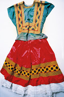
Nice little exhibition at the Michael Hoppen Gallery of photographs by Ishiuchi Miyako of the possessions of Frida Kahlo. Following Kahlo's death in 1954 her husband Diego Rivera placed her personal effects into the bathroom of their Mexico City house which later became the Museo Frida Kahlo. He gave instructions that this room should remain sealed until fifteen years after his death and it remained unopened until 2004 when the museum decided to organise and catalogue the contents. Ishiuchi Miyako was invited to photograph these artefacts.   The photos were displayed in a large format at the colours were as bright as Frida’s pictures. It was fascinating to see pictures of her iconic clothes and see how those complex looking outfits fitted together. It was also touching to see picture of personal items such as sunglasses and her artificial leg complete with red decorated boot. The show and accompanying book felt like a study of whether you could create a portrait o

Pangaea II: New Art from Africa and Latin America

Image
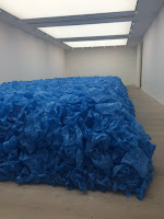
Interesting exhibition at the Saatchi Gallery looking at work by South American and African contemporary artists. I went the Pangea I last year and it was interesting to see new work by artists in that show. However it is a few weeks since I went and I didn’t take notes so it’s interesting to see from checking through the website what has stuck in my mind and what’s moved on! I thought the room putting Jorge Mayet’s small tree sculptures showing both the branches and the roots with Diego Mendoza Imbachi’s huge paintings looking up in to the branches of tress was a clever hang. Both focused on the structure of trees but one in a very small format and one in a large one. I loved Eddy Ilunga Kamuanga’s large colourful pictures of women which brought a real zest and life to the show. However my favourite piece was a room full of blue carried bags in a neat rectangular shape by Jean-Francois Bocie called “Everything must go”. According to the girl on the desk the artists h

Dead: A celebration of mortality

Image
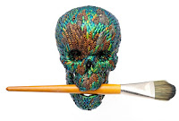
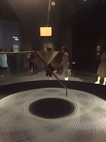
Thought provoking exhibition at the Saatchi Gallery looking at how contemporary artists have dealt with the subject of death. The first room looked at representations of dead bodies. I found these the most disturbing images in the show. One sculpture was of a body crushed by books and I ended up discussing in too much detail whether they were real books with a fellow librarian friend I went round with. I’m afraid the pile of bodies in rubbish sculpture in the corner was just too real for me and I couldn’t spend much time in the room. I had seen many of the exhibits in other exhibitions at the Saatchi Gallery such as the bog person and the photos of Russian graves stones with elaborate etchings of photographs on them with the person’s possessions. I quite like the effect of the levitating Madame Blavatsky by Goshka Macuga in the photo I’ve attacked and David Falconer’s “Vermin Death Stack”, a pile of dead mice. All in all it was interesting to see a group of work on pa